That's kinda fun, right? BUT... whatttttt have they done to my photograph?!
By all means, go to the site and vote for your beloved blogger! I'll love you forever, I'll send you chocolates, buy you flowers...
But, while you're at it, note how they've cropped the living freaking daylights out of the original photo, and lightened all vestiges of moodiness right out of it. And, as if that weren't bad enough, they proceeded to use this photo as the cover image for voting group 2... Just imagine my surprise when I learned that our entry is in fact contained within group ONE!
This is the actual image I submitted:
Architectural Digest wanted images that demonstrated the use of fabric in an interesting or creative way. In this room, the back wall is silk (applied with cornstarch—oh my god, was that a day), and the side wall (unfortunately, cropped out of AD's image) is hand blocked. The pillow was sewn from a silk scarf, the bed has hand sewn silk trim, and the "molding" is actually grosgrain ribbon. It's one of my favorite "tricks" in a pinch for rooms without actual moldings, as that is something that always bothers me. Sort of like an impulse to wrap up a gift and finish it with a bow. All of the paintings on the wall were done by either my mom or grandfather (save the red poppies) .
Here's another photograph, of the opposite wall. This one isn't on the AD site. (Now would be a good time to tell you, I love a good red room.) :
Here, you get a better picture of the red wall—blocked from a stencil we cut— and the commode, hand painted with leopard trim (yes, you're well acquainted with our love of animal everything!), and metallics (that too, ha). The wall also has metallics in it, although it's subtle, and hard to catch on camera. We painted the jewelry box and mirror to work with the ensemble. Oh! And the door is faux bois (you must say that with an exaggerated French accent, dahhlings). It's wood, but it's playing dress up.
So yes, off you go, to vote!
Photography, styling, painting, and pretty much everything else except for the carpet, by (IN)DECOROUS TASTE.
Showing posts with label Architectural Digest. Show all posts
Showing posts with label Architectural Digest. Show all posts
2.08.2010
(IN)DECOROUS TASTE is on Architectural Digest's Site
Labels:
Architectural Digest,
interiors,
my interiors,
our work,
red room
11.11.2009
These Walls Don't Lie, Or Maybe They Do
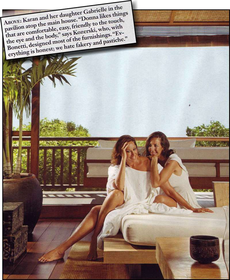
"Everything is honest; we hate fakery and pastiche." - Kozerski on Donna Karan's British West Indies retreat, Architectural Digest, Dec 2009.
Kozerski and Donna Karan might hate fakery and pastiche, but personally, I loathe the implication that certain designs are morally inferior to others. "Honesty" in design? For real? What's next, chairs that go to church?
I suppose, according to Kozerski, I partake in a whole lot of "dishonest" design. And you know what? I have fun parading form without function, faux finishes that pose as organic material, new furnishings that look like antiques. Furthermore, there's nothing I relish more than the confrontation of all of these elements— antique, lookalike, and contemporary— all mashed up in one happy, confusing sea of loveliness. Especially when it's confusing.
But really, who doesn't relish that moment when someone has to touch the flower to see if it isn't wax, or caress the table top to assess it's status as marble? Does knowing the secret ruin the decorative effect? Worse yet, is it somehow morally inferior to a "genuine" counterpart? Come on Donna, a little game of decorative tromp l'oeil can be exciting.
Is it pastiche? Who knows. You might call it that, but I prefer to think of it as high-low decorating. And in a time of economic crisis, it's never seemed more appropriate.

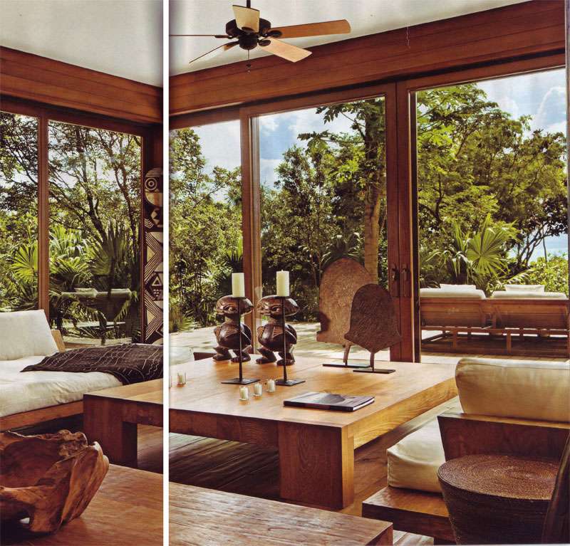
Scans from Architectural Digest, Dec 2009. Photography by Durston Saylor.
Kozerski and Donna Karan might hate fakery and pastiche, but personally, I loathe the implication that certain designs are morally inferior to others. "Honesty" in design? For real? What's next, chairs that go to church?
I suppose, according to Kozerski, I partake in a whole lot of "dishonest" design. And you know what? I have fun parading form without function, faux finishes that pose as organic material, new furnishings that look like antiques. Furthermore, there's nothing I relish more than the confrontation of all of these elements— antique, lookalike, and contemporary— all mashed up in one happy, confusing sea of loveliness. Especially when it's confusing.
But really, who doesn't relish that moment when someone has to touch the flower to see if it isn't wax, or caress the table top to assess it's status as marble? Does knowing the secret ruin the decorative effect? Worse yet, is it somehow morally inferior to a "genuine" counterpart? Come on Donna, a little game of decorative tromp l'oeil can be exciting.
Is it pastiche? Who knows. You might call it that, but I prefer to think of it as high-low decorating. And in a time of economic crisis, it's never seemed more appropriate.

Scans from Architectural Digest, Dec 2009. Photography by Durston Saylor.
Labels:
Architectural Digest,
donna karan,
interiors,
people
5.04.2009
Notes on Color: I Want To Stroke Your Walls
One of the best uses of color that I've ever encountered is at the Fåborg Museum of Art in Denmark. The museum (incidentally, located in the middle of nowhere) left quite an impression on me, indeed.
It wasn't just the neoclassical simplicity of structure combined with the subtleties of color framing, but the texture of the color. I know I've been going on about texture a lot lately (and plaster, too, for that matter...hm), but this color is so rich, so velvety and translucent you just want to TOUCH it. The secret? The walls were painted fresco style! Meaning, the pigment is applied to wet plaster, allowed to dry, and polished after the fact. Check out the cobalt and the subtlety of the pink/gray combination. It seems that these nuances are really what separate amateur from artful in the use of color.

 Fåborg Museum of Art, Denmark. Images from Flickr.
As for the use of velvety rich color in an interior , Axel Vervoordt's Venetian palazzo instantly came to mind. His terracotta colored walls seem to have the same matte depth as the museum at Fåborg, and they play well against the deep blue oil by Verheyen and cream slipcovers:
It wasn't just the neoclassical simplicity of structure combined with the subtleties of color framing, but the texture of the color. I know I've been going on about texture a lot lately (and plaster, too, for that matter...hm), but this color is so rich, so velvety and translucent you just want to TOUCH it. The secret? The walls were painted fresco style! Meaning, the pigment is applied to wet plaster, allowed to dry, and polished after the fact. Check out the cobalt and the subtlety of the pink/gray combination. It seems that these nuances are really what separate amateur from artful in the use of color.

 Fåborg Museum of Art, Denmark. Images from Flickr.
As for the use of velvety rich color in an interior , Axel Vervoordt's Venetian palazzo instantly came to mind. His terracotta colored walls seem to have the same matte depth as the museum at Fåborg, and they play well against the deep blue oil by Verheyen and cream slipcovers:
Labels:
Architectural Digest,
art,
Axel Vervoordt,
colors,
Danish Art,
Faaborg Museum,
Fåborg Museum,
frescos,
interiors,
primary color,
Venetian palazzo
Subscribe to:
Posts (Atom)


