Showing posts with label graphic interiors. Show all posts

9.06.2009

Red Alert!

Carolyne Roehm may have a passion for blue and white, but I have one for black, white, and red. And so does designer Anouska Hempel, evidently (all of the black/white rooms below are hers, the red is the boudoir of Maria Alexandrovna, 1853, in the Hermitage Museum). No one does stripes quite like Hempel:


The look is forceful, but sometimes we need a little punch in our lives, right?

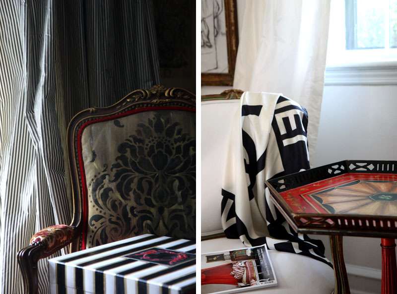
My own
red hot voyage began with a couple of accent pieces Lydia has been working on: the pungent red pie table and the graphic striped silverware box.

My goal: Grunge it up with something glam, gilded, leathery... something... dirty.
Solution
: Painted canvas upholstery, painted canvas...pillows?
I played around distressing the metallic tones, tearing apart the canvas and sanding the matte damask motif that I applied over the gilding.


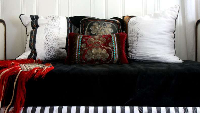
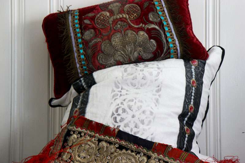
Rich red velvet and more painted canvas adorn pillows set against a bright, glossy white wall. The top pillow is an amalgamation of my favorite antique metallic embroidered textile fragments, mounted on cranberry velvet with some bizarre shots of robins egg blue and lavender ribbon. For the center pillow, I hand-dyed white linen and applied painted canvas straps at the sides. As for the textile at the bottom, it's of questionable origin. General consensus seems to point toward it being a horse blanket of sorts.


Oversize pillows are a godsend. Inspired by the antique metallic embroidered fragment on the cranberry pillow, I painted a larger-scale version of the very Turkish design, mounted it on black velvet, and trimmed it with striped silk and hand painted leopard print silk ribbon. (It sits in the center, behind the pillow by which it was inspired).

3.05.2009

Graphic Design

On my agenda: Incorporating graphic elements into an otherwise non-graphic space. There's something fresh about the softness of rococo roundness and confused patterns encountering a pungent black and white combo. My latest experiments:


www.maisonarchinard.com

Black white and red look lush together.

Interesting facts that are somewhat useless: 1.
If a language has only two color terms, they'll likely designate "black" and "white." The third color term, if a language has only three, is red. 2. The contrast between black and white attracts the attention of newborns only seconds old. (Leading to the theory that it's likely that they learn to recognize a mother by her hairline, typically the highest contrast area on the face.) 3. The artist Alexander Calder favored the black/white/red color combo because he believed it most clearly displayed the motion of his mobiles.

What does all of this mean? That my affinity is shared by others and that the color combo might appeal to my reptilian brain. Comforting.
Related Posts Plugin for WordPress, Blogger...