5.27.2009

A Day in the Life (of a Stepford Wife?)

According to Amazon, customers who bought a vacuum cleaner also bought:

1. A pillow, filled with gel (??!!!!)
2. A CD: "Just a Little Lovin'"
3. A blender
4. A book: "Passionate Marriage: Keeping Love and Intimacy."

Really? And this is my reaction before I even stopped to consider the concept of a pillow filled with paste.

Dearest Amazon, please tell me you're joking!


5.19.2009

Gimme an A for Attitude

Above Left: Ray Johnson Letter to Lucy R. Lippard, 1969, Smithsonian Archives of American Art. Above Right: Ray Johnson collage, artnet.com.

"I chose a profile portrait of Andy Warhol. Ray told me the price and foolishly I made him a counteroffer, maybe 80 percent of the price he'd quoted. Ray agreed and said he'd send me the piece in about a week. And of course a week later the Warhol profile arrived in the mail with 20 percent missing from the bottom right corner. I still have the bill here somewhere, charging me for 'most of a Ray Johnson collage.'" -Peter Schuyff, on artist Ray Johnson.


Ray Johnson, I heart you. If you haven't seen How To Draw A Bunny, I highly recommend it. Really interesting, extremely humorous.

XX Lauren

5.18.2009

Tractor Love, Tom Ford, and Hermès Orange, Oh My!


"...this is the guy who had an orange tractor at his property in New Mexico spray-painted black because he couldn't stand the color,
okay?" -
New York Magazine , on Tom Ford.

One of my favorite little anecdotes. I feel ya Tom, I really do. If I were subjected to this unsightly horror on a daily basis, I would also feel compelled to crack out mass quantities of spray paint and put the construction crew to work doing something useful:


Sometimes, small (large) details make all the difference. Case in point: the '97 Martha incident (you remember, when Martha Stewart tried to run down her neighbor after he erected an 8 foot fence and put in shrubs that "suburbanized" the neighborhood?). I used to have one of these babies (see image below). No joke, I threw it out because the concentrated field of candy corn pumpkin orange was nauseating to me.


Are Tom and I alone in our phobia of this color? Certainly, my sentiment isn't shared by everyone. Take, for instance, the orange tractor fanatics ,who, for sheer viewing pleasure, upload photos of themselves merrily using their orange equipment. (The internet turns up all sorts of gems.)

Of course, you can dismiss our friends over at the orange tractor site as a truly isolated segment of the population, far removed from design concerns of any sort, but then what excuse can you make for people who decorate with Hermès boxes?

Is this a trend or something? Or have boxes replaced books in the world of props that are meant to attest to the cultivated tastes of their owners? If a book (used as a prop) is meant to convey diversity of taste and education, is a logoed box intended to convey taste through association with a brand, or else association with cost? That's almost as vomitous as this color orange.

Developing brand identity is not a replacement for developing taste, kids. And decorating with logo laden cardboard boxes= so not chic. An exception can be made for Andy Warhol's Brillo containers.

Here, I present you with a compulsion to brand oneself at its very worst (see below). Seriously, what's this woman stashing in all of her boxes!? She must have a collection of horse scarves to clothe an army. Either that, or she's bedecked in enough colliers de chien to approximate a couture version of Johnny Rotten. (I sincerely hope it's the latter, in which case, someone send me a picture. Stat.).

Above, Designer Sara Story's creations, originally published in Domino.

Admittedly, the effect isn't quite as bad when the box doesn't take center stage. It's passable as a pop of color. Questionable, but passable. :

Designer Schuyler Samperton's apartment, from Elle Decor


I wonder what Tom Ford would say.

5.16.2009

NEVER.

Lately, I've been an avid subscriber to the "never say never" philosophy. This is probably due to the realization that I've embraced (with ZEAL) things that were once solidly in the "never-ever-EVER" category (or so I thought). Take, for instance, shoulder pads. Or fringe. Or cellophane drapes. Or minimalism. Or neon patent. It's gotten to the point where if I hate it, I have to conquer it. The worse it is, the more I want it to work (fanny packs, anyone?).

However, flipping through this gloriously authoritative Doubleday Book of Interior Decorating from 1965, I hesitantly realize that perhaps some things are best left untouched. Forever. For example:

1. Weird greenish brownish wood plastic paneling. Actually, anything that replicates the color of bile. Especially anything synthetic. Please Google image search "bile"— the closeness of the match is truly disquieting.

2. Paris Hilton's bathroom. I jest. But seriously, you know you've taken color coordination too far when you have a MATCHING PINK BIDET.

3. Astroturf is NOT a proper substitute for a rug, no matter what the Doubleday chapter on "Good Taste" insists.

4. Similarly, cheap shower curtains are not functionally or aesthetically equivalent to actual curtains. And industrial nylon carpeting? This is not Loehmann's dressing room, it is a living room. Or so I imagine it was intended.

Lesson learned. Sometimes it's okay to say never.

Scans from The Doubleday Book of Interior Decorating by Albert Kornfeld, 1965.

5.15.2009

Faucets in Space


Scan from World of Interiors, May 2009.

Please tell me I'm not the only one who found this market story particularly humorous. Yeah, kitchen hardware in itself doesn't really float my boat, but hey, at least it floats in space, courtesy of The World of Interiors.

Two questions.

1. Why is it that faucets-as-satellites in orbit around Earth are so much more interesting than their silhouetted-against-a-white-background counterparts? Something to consider.

2. What substances were the editors that produced this using? Please inform, I would like some too. And send some over to the U.S. while you're at it. Our shelter mags are in need of it.

Yours truly,

XX Lauren.

5.13.2009

Yoes, Yes!


Scan from May 2009 World of Interiors.Photo by Annie Schlechter.


One look at this fantastic perspective-bending, spatially disorienting Modernist masterpiece of a kitchen in the April World of Interiors saw me FEVERISHLY Googleing its maker, artist Amy Yoes.

Of course, I wonder how I'd manage to prepare my morning coff
ee without some degree of vertigo, but then, my love of the space doesn't necessarily stem from my desire to live in it. It does, however, provide comfort to know that there are people who relish taking tea in a work of art!

That having been said, at the crux of my appreciation is Yoes's melding of decorative and structural elements.

The space is ambiguous and confusing: it's not clear what's protruding, what's receding, which surfaces are flat, and which are bent and shattered. And this whole effect is achieved with a combination of structural protrusions and painted blocks and angles, a dialogue between paint, form, and 3d space that ultimately jumbles, shatters, and warps something as functional and common as a kitchen.

Count me impressed.

5.11.2009

The Gates of Hell

Well, not quite. But these ironwork monstrosities (in the VERY best way, and you know I mean that) are so sublimely beautiful I needed to share. Gothic font, quatrefoils, arches, rococo waves, art nouveau forms, forged ironwork... how I love you. And how interesting is the perspectival illusion of depth in the below right image?!


Screen, 18th century. Church of St. Ulrich, Augsburg


From Decorative Ironwork by Umberto imelli and Giovanni Vergerio.

5.07.2009

Context is KING


"Although these things, heirlooms, portraits, furniture, silver, etc., are in themselves both beautiful and interesting, they seem to me to have a great deal more significance when seen as an integral part of the house. When we see them in their original settings, and against a background in which they were originally used, they mean more; there they seem to tell their whole story, not only of how they were used, but also of the kind of people who created and used them."

-Henry F. du Pont (1880-1969), horticulturist and American decorative arts and furnishings collector, in The Fifty Best Historic American Houses

Couldn't have said it better myself.

5.04.2009

Notes on Color: I Want To Stroke Your Walls

One of the best uses of color that I've ever encountered is at the Fåborg Museum of Art in Denmark. The museum (incidentally, located in the middle of nowhere) left quite an impression on me, indeed.

It wasn't just the neoclassical simplicity of structure combined with the subtleties of color framing, but the texture of the color. I know I've been going on about texture a lot lately (and plaster, too, for that matter...hm), but this color is so rich, so velvety and translucent you just want to TOUCH it. The secret? The walls were painted fresco style! Meaning, the pigment is applied to wet plaster, allowed to dry, and polished after the fact. Check out the cobalt and the subtlety of the pink/gray combination. It seems that these nuances are really what separate amateur from artful in the use of color.


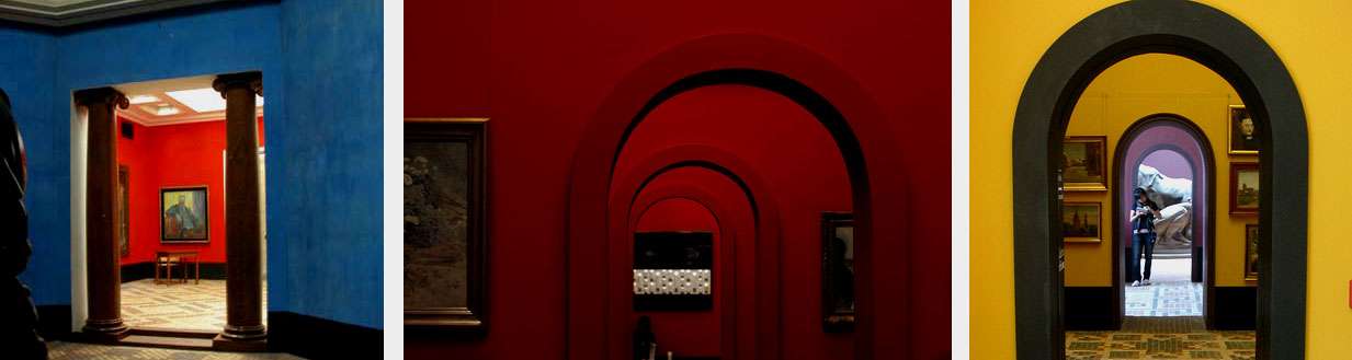
Fåborg Museum of Art, Denmark. Images from Flickr.


As for the use of velvety rich color in an interior , Axel Vervoordt's Venetian palazzo instantly came to mind. His terracotta colored walls seem to have the same matte depth as the museum at Fåborg, and they play well against the deep blue oil by Verheyen and cream slipcovers:

Photos by Mario Ciampi, from Architectural Digest September 2008
Related Posts Plugin for WordPress, Blogger...