11.29.2009

A Portrait of Possessions

Although I wasn't even ten years old at the time, I remember being really captivated by Peter Menzel's Material World: A Global Family Portrait.  The concept is simple— cultural portraits in the form of photographs of "average" families presened alongside their possessions.  A sort of stripped down, dissected interior editorial, minus the style element, in a way.  Anyway, I hadn't seen the book in YEARS, so when I had a chance encounter with it at the library this week, I knew I had to take a look.

The photographs might be a little dated, but the idea that from possessions, you can extract dreams, lifestyles, and cultures, is timeless.  What do your possessions say about you?

Russia, The Kapralovs, 1993:


 China, The Wus, 1993:


Kuwait, The Abdullas, 1993:


Scans from Material World, by Peter Menzel, 1994.

11.25.2009

Eat THIS, Martha Stewart!

Happy early Thanksgiving, dear American readers!  Are we all preparing for our feasts tomorrow? Whipping out those yardsticks to ensure even tablecloth overhang? Checking that the place settings are spaced at perfect 16" intervals? Measuring everything from the center of the table for exacting symmetry? What's that you say, you haven't started?! Better get crackin', this could take all night.

Following scans from LIFE magazine, November 5, 1965.  "Exacting Ritual of Preparing for a Party" with Mrs. Marjorie Merriweather Post:


11.24.2009

Mantel Worship

A few days ago, I was reading an article on the history of the mantel as a "family altar" in a 1985 Art & Antiques magazine. Fireplaces are magical, insisted the article, and so it's only natural that since the seventeenth century, the mantel has been used to display what we as a culture hold nearest and dearest. (In 1985, the past was all the rage, although I wonder just what it is we're worshiping today.)

What a lovely, romantic idea, I thought, especially with the onset of the holiday season. Yet, it occurred to me that sometimes, you've gotta work with what you've got, even when what you've got isn't really what you want.

Take, for instance, this extremely earthy looking fireplace. It imparts a very ski lodge-y feel to an entire room, even if a ski lodge isn't exactly the altar at which you'd like to worship.

So, in the interest of keeping alive the dream that we should all be able to choose where and what we'd like to worship, I painted, gilded, and distressed a canvas cloth to fit the fireplace. Put it on, take it off, hide the altar, change the scene...worship the altar of change, the ability to morph and be something new at the drop of a hat. How ideal is that?

The fireplace pre- transformation:


And after:


11.19.2009

Grit, Grime, and Gilding.

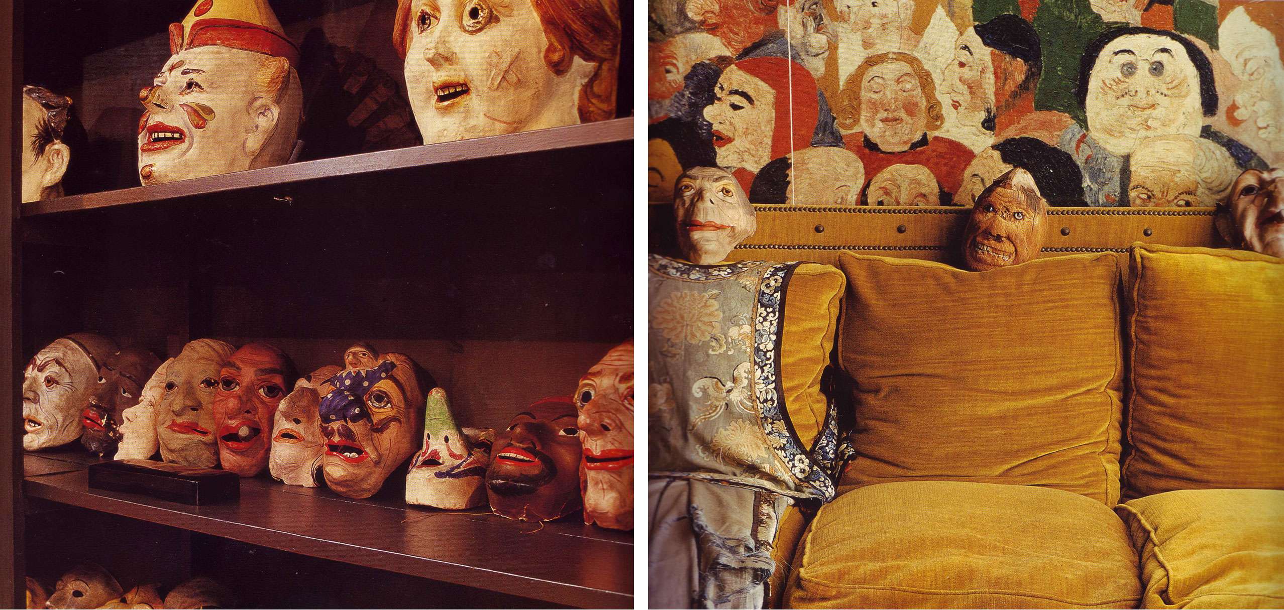
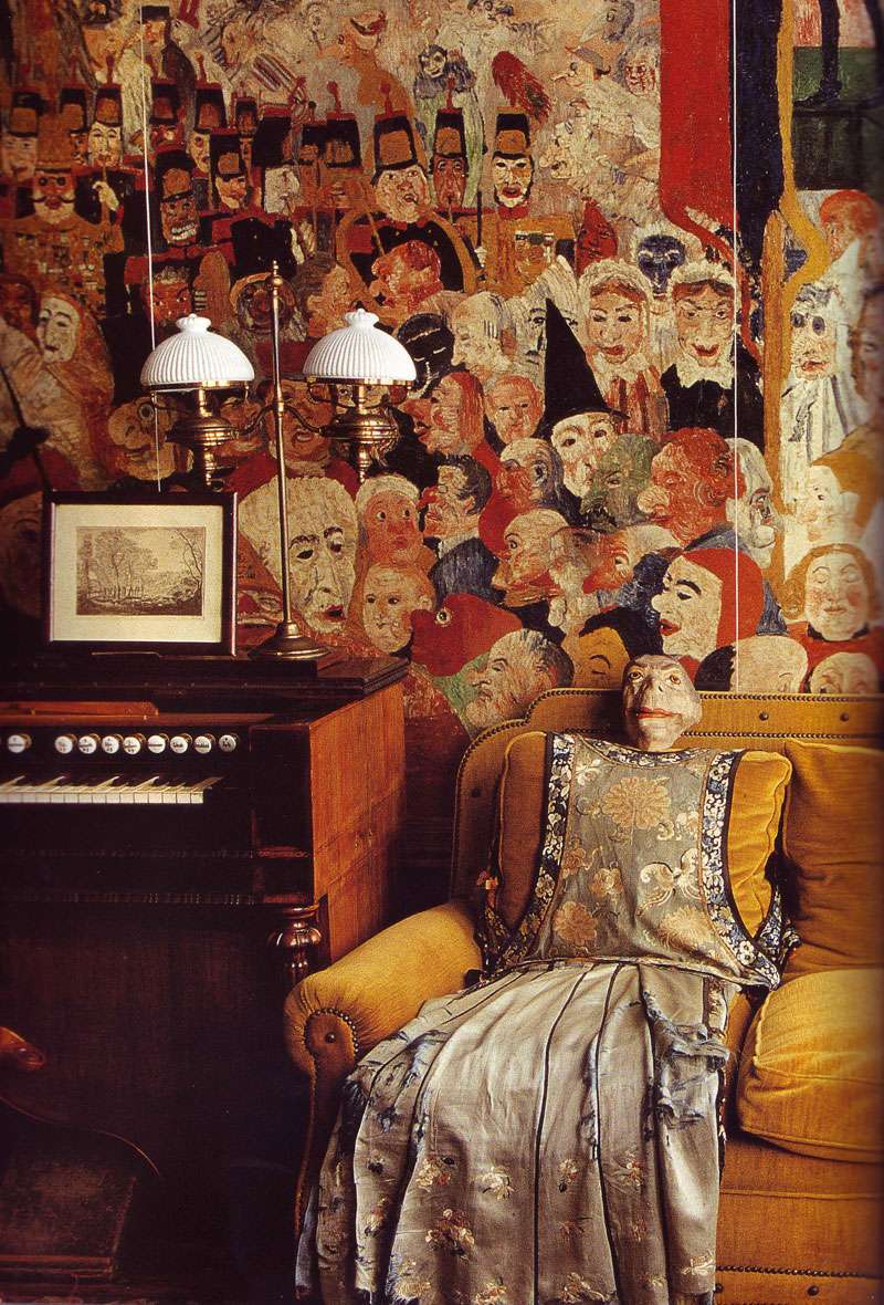
Rose Cumming had her "ugly room," my mom and I have a studio space.

Rose's was filled with furnishings rejected by clients; ours was overrun with a variety of non-integrated projects and wispy flyaways that failed to "work" elsewhere.   Harmless enough, until, at some point, a line was crossed.  What was once a halfway house for homeless decor morphed into a life-sucking vortex that took victim many an unwitting decorative element.  An overhaul was utterly necessary.

We attacked the space with great zeal.  So great, in fact, that we only realized after the fact that there wasn't a single "before" shot to be had.  Such is life.  Perhaps, I justified after the fact, it's better this way, for the sake of preserving an aura of mystery.  But no, I'm certain it would have been better had you seen the truly pedestrian junkiness of the space beforehand.

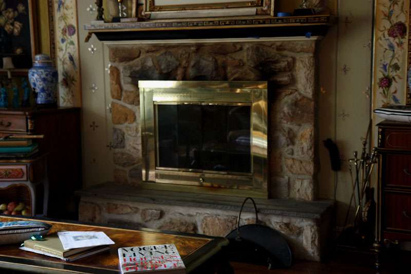
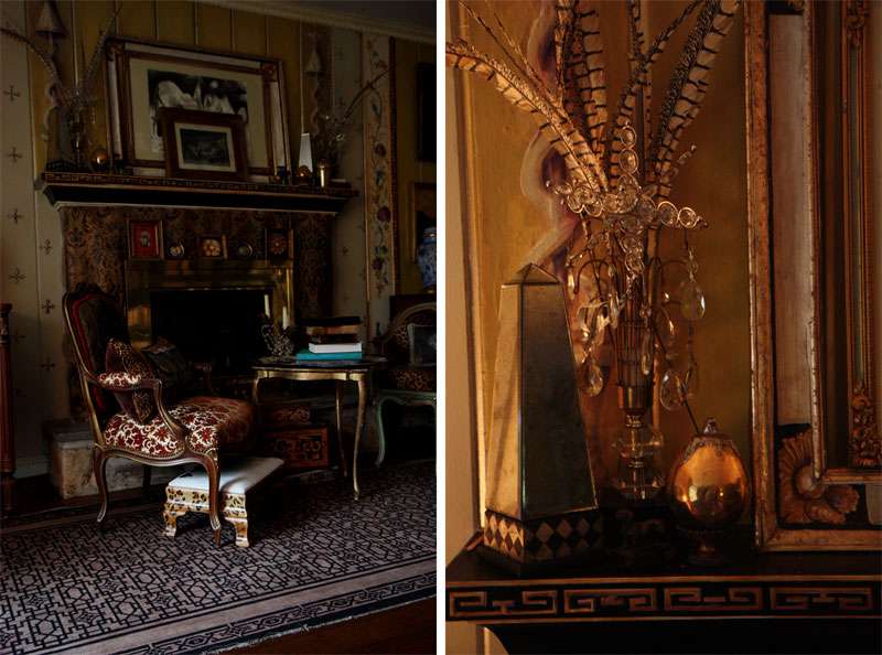
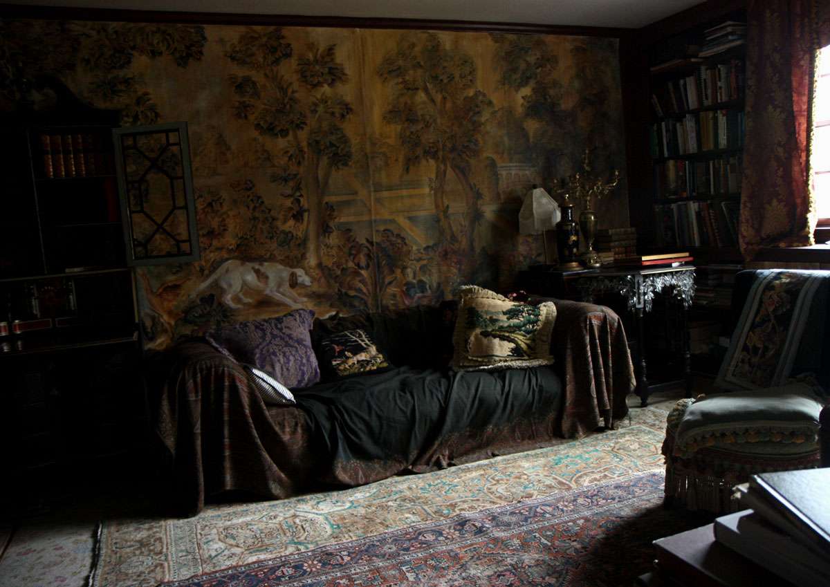
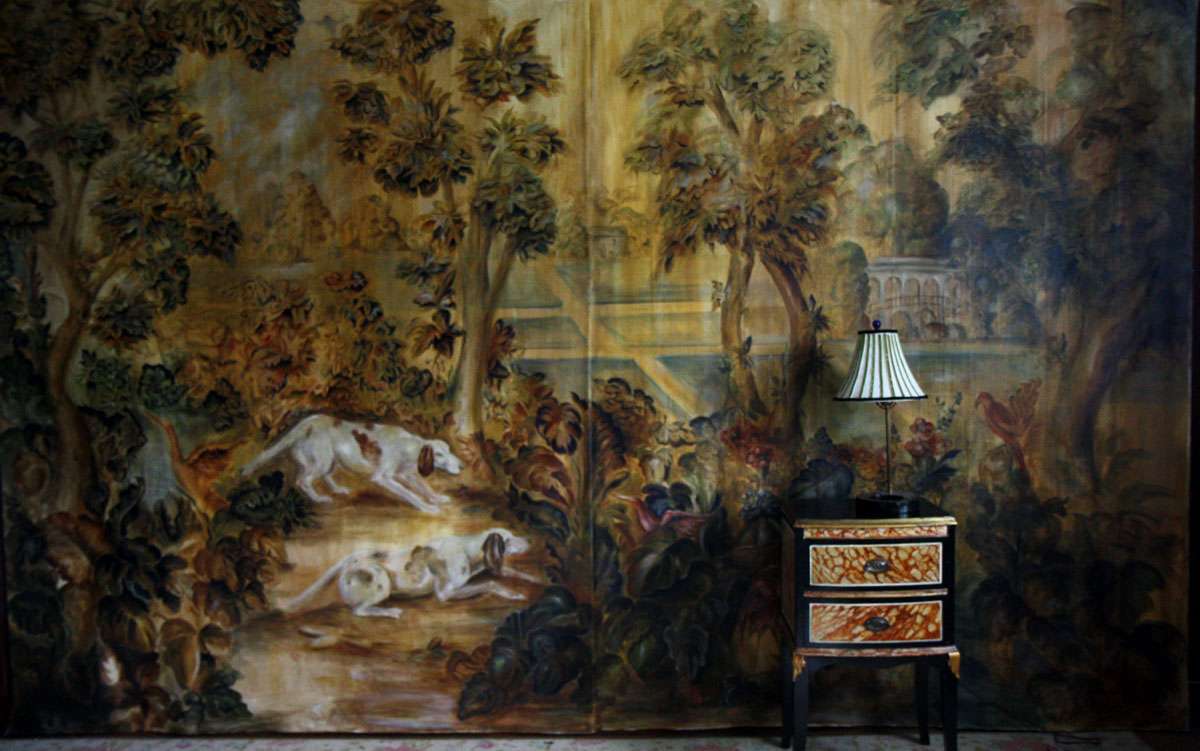
In shelter mags, some decorating maxims seem to pop up ad nauseum.  One that has always perplexed me is the "build a room around a carpet" philosophy.  Sure, that helps with cohesion, but why a carpet? Much more wall shows than floor, and seeing as I'm not acquainted with any carpet weavers, a painted wall hanging allows us much greater control over the general atmosphere of a space. So, we decided to tie the entire room together with a dirty, dank, aged (looking) tapestry-inspired hunting scene.

I should let you know, I have my own decorating mantras. First and foremost: 
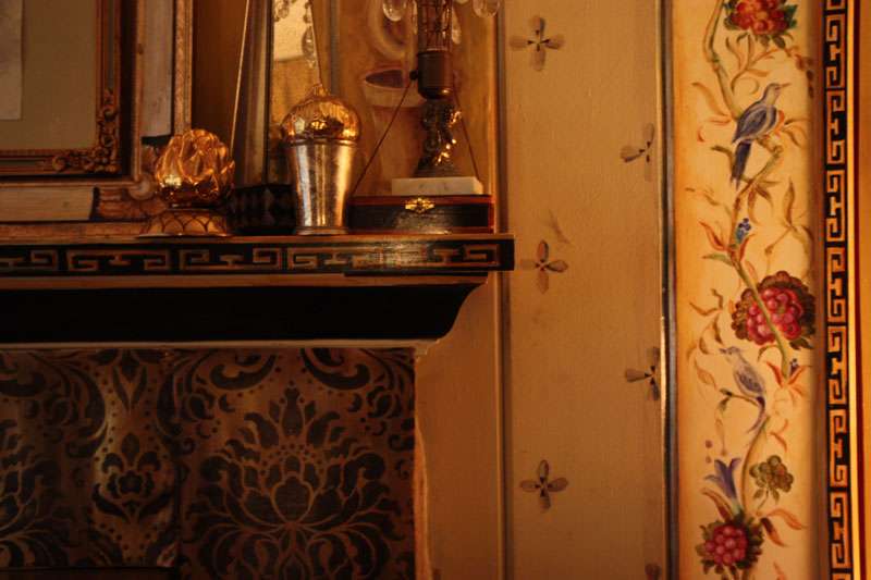
Nothing pulls a room together like grit, grime, and gilding.  At three canvas panels wide, my mom painted this "tapestry" to knock out the entire (previously dark wood paneled) wall.  My other favorite oft-repeated mantra? Go big or go home.


Big? Yes. Extravagant? Always.  But, we really pulled together this studio space with spit and glue.  In fact, there is not a single new piece of anything in this room, at all.

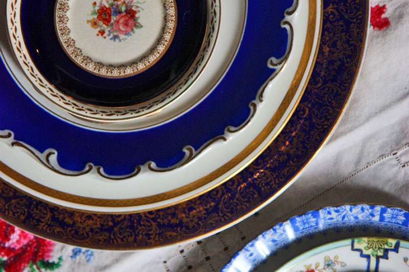
Trick #1: Layering carpets.  Behold the floral carpet that I've LOATHED for years, deeply buried (oh, thank the lord) under an Oriental carpet found extremely inexpensively on eBay.  The catch? A large part must have been damaged, because the thing arrived surgically stitched together, and well, the pattern doesn't exactly match up.  But hey, when you're layering, these things are minor details.

Trick #2: Covering the plastic sofa. Oh my, I cannot believe I just admitted that under this lovely wool blanket, exists a brown, PLASTIC beast of a Chesterfield sofa in a rather ideal shape and size. 

Trick #3: Using old fabric remnants.  Make pillows from them. You don't want your guests to see the plastic sofa, and you don't want them to feel it, either.  Actually, the curtains are old panels as well, and the lampshade is embellished with remnant ribbon.


Trick #4: Covering the paneling with canvas. We even went so far as to cover the cabinets with stenciled gold/ black damask (and ended up liking it so much, we made another panel of the damask for the wall).  It's very easy to attach with cornstarch/water paste, and doesn't do permanent damage, so foreseeably, you could change your rooms daily if you felt so inclined.


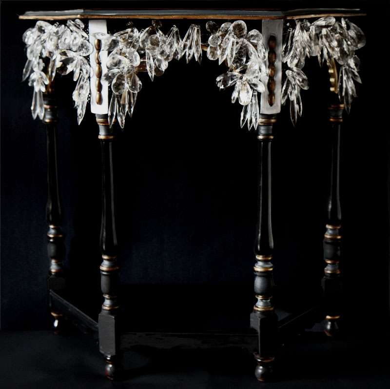
Trick #5: Working with old pieces of furniture.  Recognize the stalactite table and the velvet secretary? All of these pieces were thrift-store finds, reworked or painted, down to the faux-marble accent table.

11.16.2009

Beasts, For the Feet

I want these. In an ideal world, I'd wear them while relaxing in a Michel Haillard (1959) chair.  Somehow, they remind me of crustaceans.  Yum.


Alexander McQueen shoes, Spring/Summer 2010. Images via style.com, vogue.co.uk.

11.13.2009

Mix-Match

Surely, you've heard it before, but wholeheartedly, you'd better believe that's it's okay pretty fabulous to mix-match place settings, rather than employ one matching set.  All of these old plates were ones I found in thrift shops, on eBay (search Czech plates, vintage plates, or Bavarian porcelain), or, well, in thrift shops... Seemingly random in nature, but all it takes is a united color scheme, or pattern, or degree of gilding, to pull them together.

Besides, you don't want to look like the sort of person who buys his silver, do you?

11.11.2009

These Walls Don't Lie, Or Maybe They Do

"Everything is honest; we hate fakery and pastiche." - Kozerski on Donna Karan's British West Indies retreat, Architectural Digest, Dec 2009.

Kozerski and Donna Karan might hate fakery and pastiche, but personally, I loathe the implication that certain designs are morally inferior to others.  "Honesty" in design? For real? What's next, chairs that go to church?


I suppose, according to Kozerski, I partake in a whole lot of "dishonest" design.  And you know what? I have fun parading form without function, faux finishes that pose as organic material, new furnishings that look like antiques. Furthermore, there's nothing I relish more than the confrontation of all of these elements— antique, lookalike, and contemporary— all mashed up in one happy, confusing sea of loveliness.  Especially when it's confusing.

But really, who doesn't relish that moment when someone has to touch the flower to see if it isn't wax, or caress the table top to assess it's status as marble? Does knowing the secret ruin the decorative effect?  Worse yet, is it somehow morally inferior to a "genuine" counterpart? Come on Donna, a little game of decorative tromp l'oeil can be exciting.

Is it pastiche? Who knows. You might call it that, but I prefer to think of it as high-low decorating.  And in a time of economic crisis, it's never seemed more appropriate.


Scans from Architectural Digest, Dec 2009. Photography by Durston Saylor.

11.09.2009

Ice Queen

Stalactite, Greek origins, meaning "to drip," or "that which drips." A dripstone that hangs from the ceiling of limestone caves.

And so, my never ending love affair with crystal continues.  Except this time, it's oddly seasonally appropriate, as my latest piece reminds me of an icy terrain every time I look at it.

This is an extension of the lamps and dagger heels that I made a while ago, but on a larger scale. 

I like things that have a certain amount of aggression in them.  Aggressive shoes, aggressive fashion... aggressive tables?  Sometimes it's difficult to capture that same sort of ferocious elegance in an interior, without it coming off as overly sparse and minimalist.  

What this lacks in color, it makes up in light.


Created and photographed by (IN)DECOROUS TASTE.

11.05.2009

Kreativ Blogger, Or, 7 Things You Never Wanted to Know About Me

EONS ago, the fabulous Little Augury tagged me with the "Kreativ Blogger" tell-everyone-7-things-about-yourself thing. (Thanks for thinking of me, I'm flattered!) Again, that was weeks ago, but better late than never, right? So, seven visual tidbits, some with explanations, some without...

1.


2. I love looking at photographs of other people's desks.  I guess it's only fair that I show you my own:


3. Clearly, I have a tendency to overindulge in the accessory department.  There are heaps of jewelry everywhere. On my desk, my bureau, my bedside table, under the bed, in the closet, hanging from the dummy, attached to the chandelier...  It's gotten to be a problem. 


4. Incidentally, I also love looking at books hidden in corners and crevices of photoshoots, almost as much as I enjoy a good desk shot.  I always wonder which books the owner has read, which are purely props, and which are BIBLES (because everyone's got those, right?).  As far as this stack goes: I adore Anthony Burgess (oh my god, he's hilarious) and I have yet to work my way through Edith Sitwell, despite an embarrassing number of attempts.  Regarding some of the misfit books: once upon a time I was a cognitive science major at Vassar. I LOVED studying it, but a life of research isn't so much my cup of tea.


5.  Cloisonné vases, capodimonte floral porcelain, and turquoise foo dogs/figurines (to which I affectionately refer as "the foo family") are not just for old ladies.


6.  More than anything else, I value a sense of humor.  This has resulted in my love and appreciation of some horrendously tacky things.  Like hair metal, sequins, enormous furs, hot pants, and Todd Oldham's apartment c. '92.  A shoot for another day.


7.  I show a lot of color on this blog, but I wear none. Gotta love those blacks, grays, taupes, ivories, and weird murky shades in between. My favorite designers? Riccardo Tisci, Rick Owens, Junya Watanabe...

11.04.2009

Posh Prisons and Pinstripes

Gangster Style!

Gangster Al Capone (1899-1947)'s prison cell at Eastern State Penitentiary, where he served 9 months for a gun charge:


Above image via Wikipedia Commons

"Bonnie Comes with a Stylish Bang: Faye Dunaway in 30s Revival," fashion editorial from LIFE magazine, January 12 1968, after Bonnie and Clyde:


11.03.2009

Fake Plastic Flowers

Before I took the plastic straws (do they make them in non-offensive colors???) off these daisies, they looked positively PLASTIC. So bizarrely plastic, in fact, that I couldn't resist photographing them.


I like to imagine that these vaguely approximate the wax tulips that Lucy planted in her neighbor's flower bed after the lawnmower mishap.  You know, before the tulips melted:


Artists' Studios

 William Merritt Chase (1846-1916)'s studio:


Above, The Tenth Street Studio, William Merritt Chase, c. 1880

Marcel Duchamp (1887-1968)'s studio:


John Singer Sargent (1856-1925) in his studio:


James McNeill Whistler(1834-1903), in his studio:

11.02.2009

Halloween's Over, But...

...some macabre things deserve to hang around all year.  Like the paintings of Belgian artist James Ensor (1860-1949) and his GLORIOUS apartment in Ostend.

Ensor took delight in macabre nightmarish fantasies, like the one he portrayed in The Banquet of the Starved. Guests sit around the Last-Supper style table, clad in grotesque masks and engaged in a variety of sinful activities, inspired by the German occupation of Belgium and accompanying period of starvation:


Above, The Banquet of the Starved, 1915.  The Metropolitan Museum of Art.


Above, La Vanité Dansante, 1945. Image via Michael Tollemache Fine Art

Ensor's family owned a curiosity shop (Ostend was a famed carnival resort-town), from which he drew much inspiration. (Look at all of the fantastic masks!) Of course, I'm apt to feel great affection towards anyone who dresses up their sofa and GIVES IT A HEAD.


Ensor's paintings are breathtaking within the context of his apartment. Interiors like this one make it obvious how deficient a gallery setting can be at times...

Below, an image of a shelf of masks from the souvenir shop.  From one of his letters: "I spent my childhood in my parents' shop, surrounded by strange creatures of the sea, by magnificent shells of pearly iridescence, and by the bizarre skeletons of sea monsters and marine plants."

Late in life, Ensor reminisced about the shop and its influence on him:
In my parents' shop I saw the undulating lines and sinuous shapes of beautiful shells, the iridescent gleam of mother-of-pearl and the rich tones of fine chinoiserie, and above all the sea, vast and constant, made a profound impression upon me.
Artists' Houses, by Gérard-Georges Lemaire


Scans and quotes from Artists' Houses by Gérard-Georges Lemaire, Photographs by Jean-Claude Amiel, 2005.
Related Posts Plugin for WordPress, Blogger...