3.31.2009

The Luxury of Not Caring

Yesterday's post left me craving more Denning & Fourcade. Unfortunately, Fourcade died of AIDS in the early 90s and the firm closed after Denning's death in 2005, but given their popularity in the 80s, you'd expect copious photographs of their work to be floating about. At the very least, you'd expect there to be some sort of compilation of their interiors, right? No such luck.

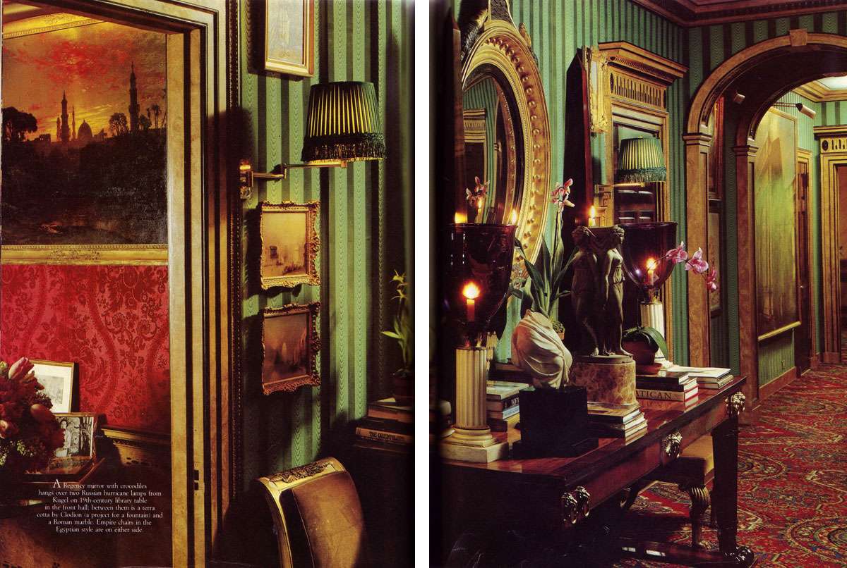
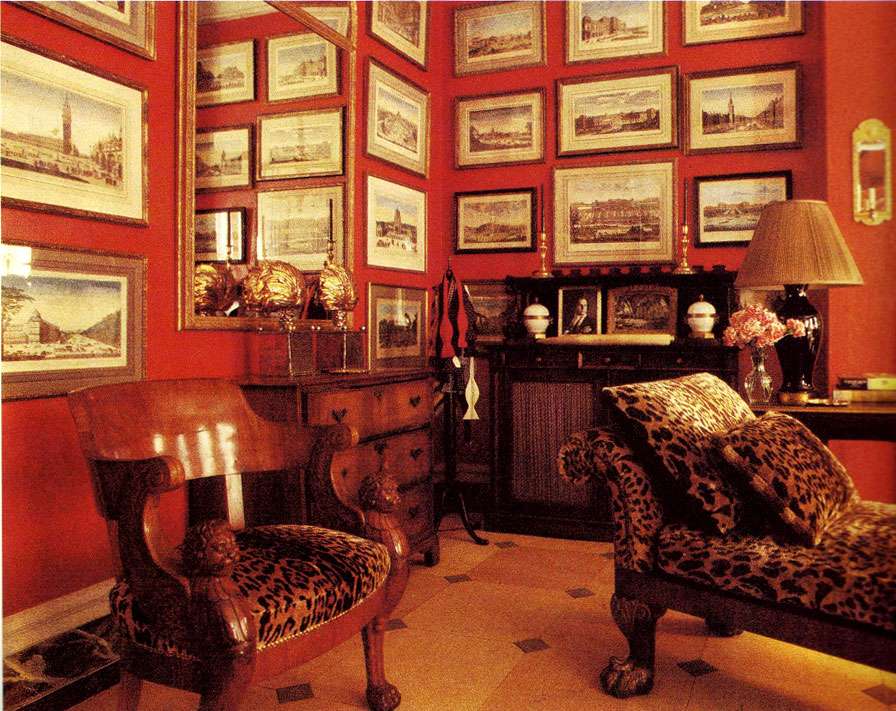
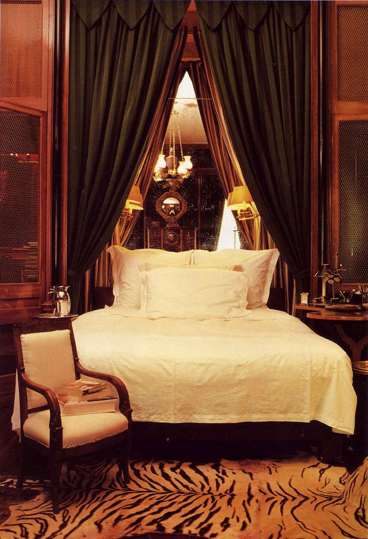
As if it isn't apparent from the images, the duo was known for their opulent interiors.
What interests me isn't that they used the very finest antiques and fabrics (what do you expect when the Wrightsmans are your clients?), but just how alarmingly comfortable and undone their luxury was.

In a nutshell, it captures the aristocratic luxury of not caring, a nonchalant approach to living with beautiful objects but not isolating them on a pedestal to create a disarming sense of preciousness that puts one ill at ease. And really, isn't that a philosophy that everyone can embrace?


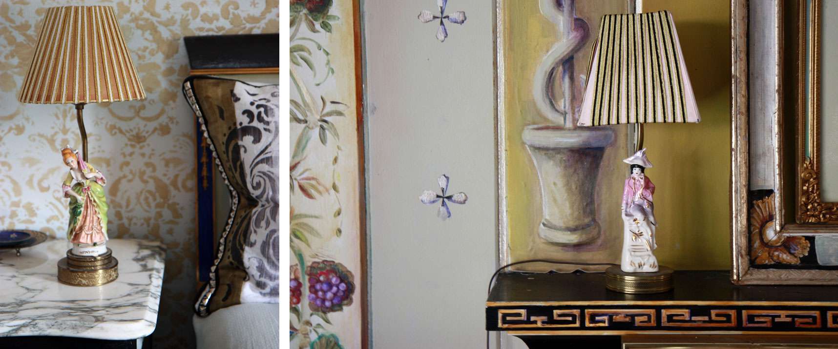
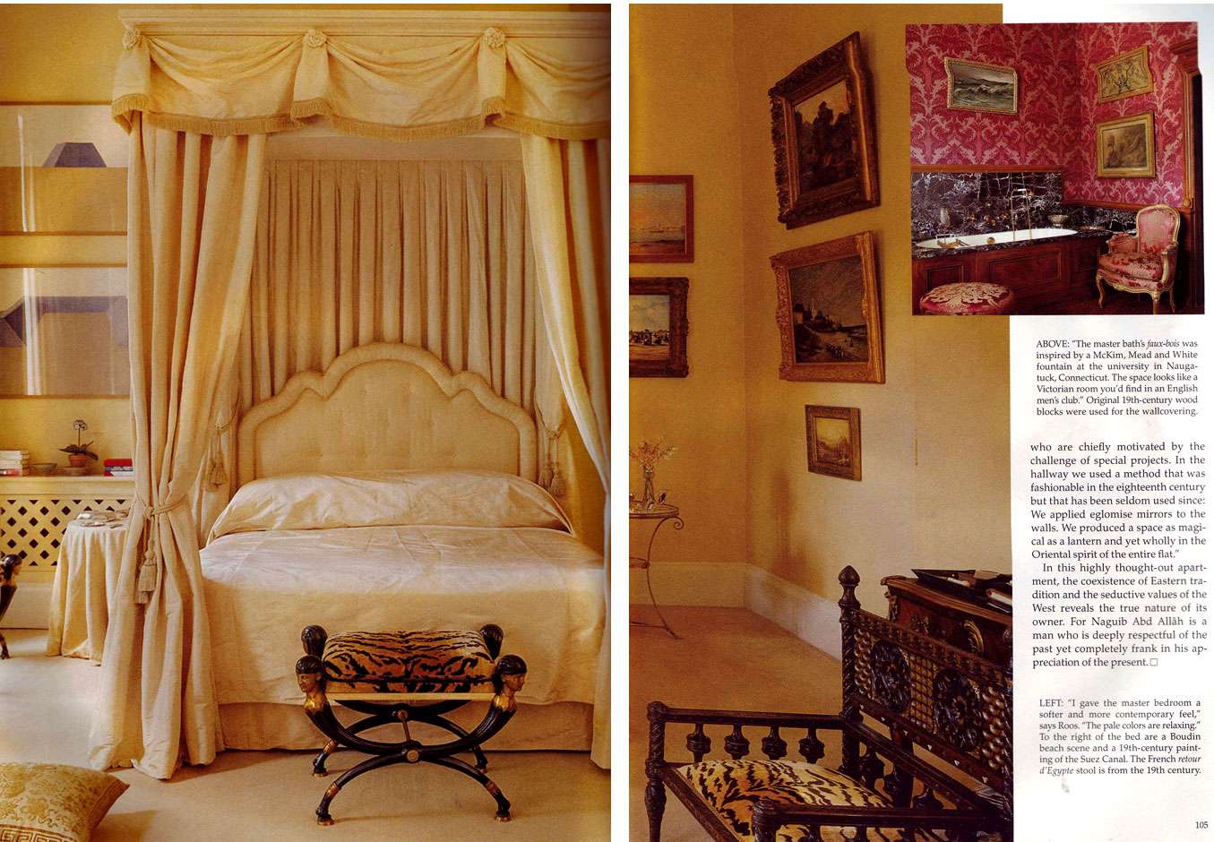
1. Left: A guest bedroom in the New York residence of Vincent Fourcade, from Beds by Diane von Furstenberg.
2. Right: Master bedroom from Denning & Fourcade's Paris residence. Photo Credit: ArchitecturalDigest.com.


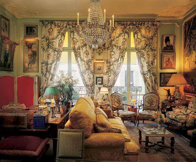
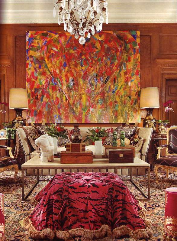
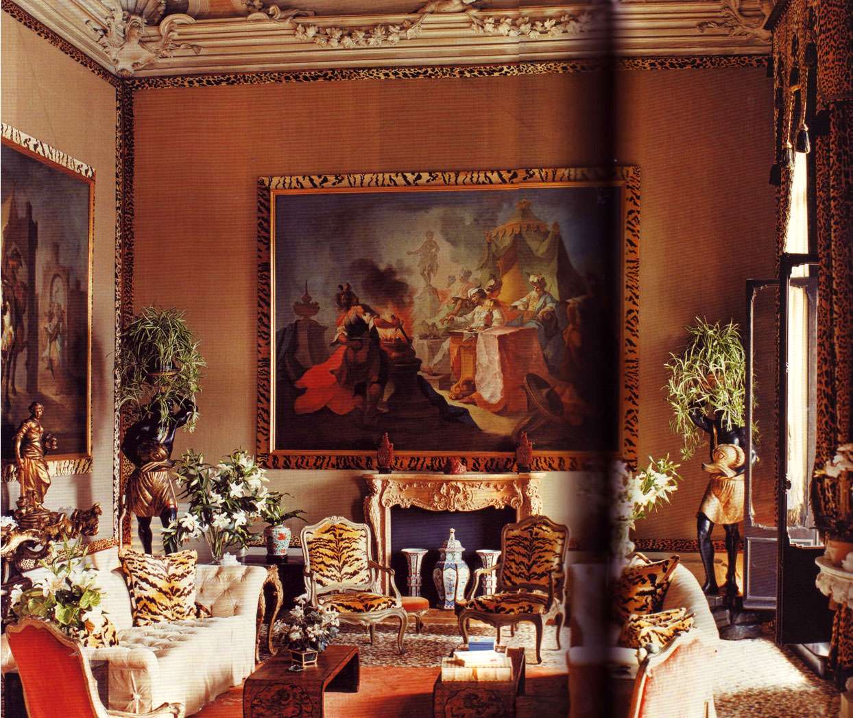
3. The living room from Denning & Fourcade's Paris residence, decorated in the 1980s. Photo credit: ArchitecturalDigest.com.


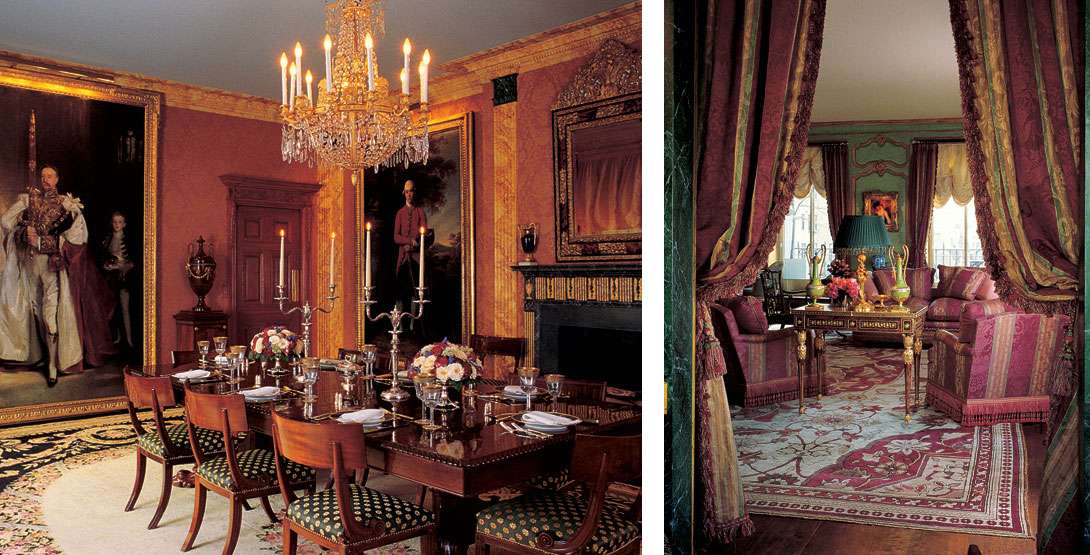
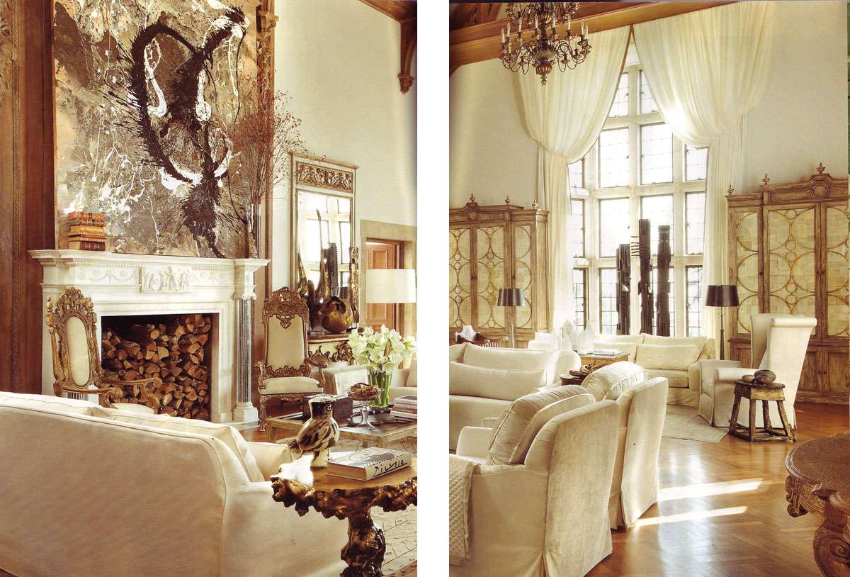
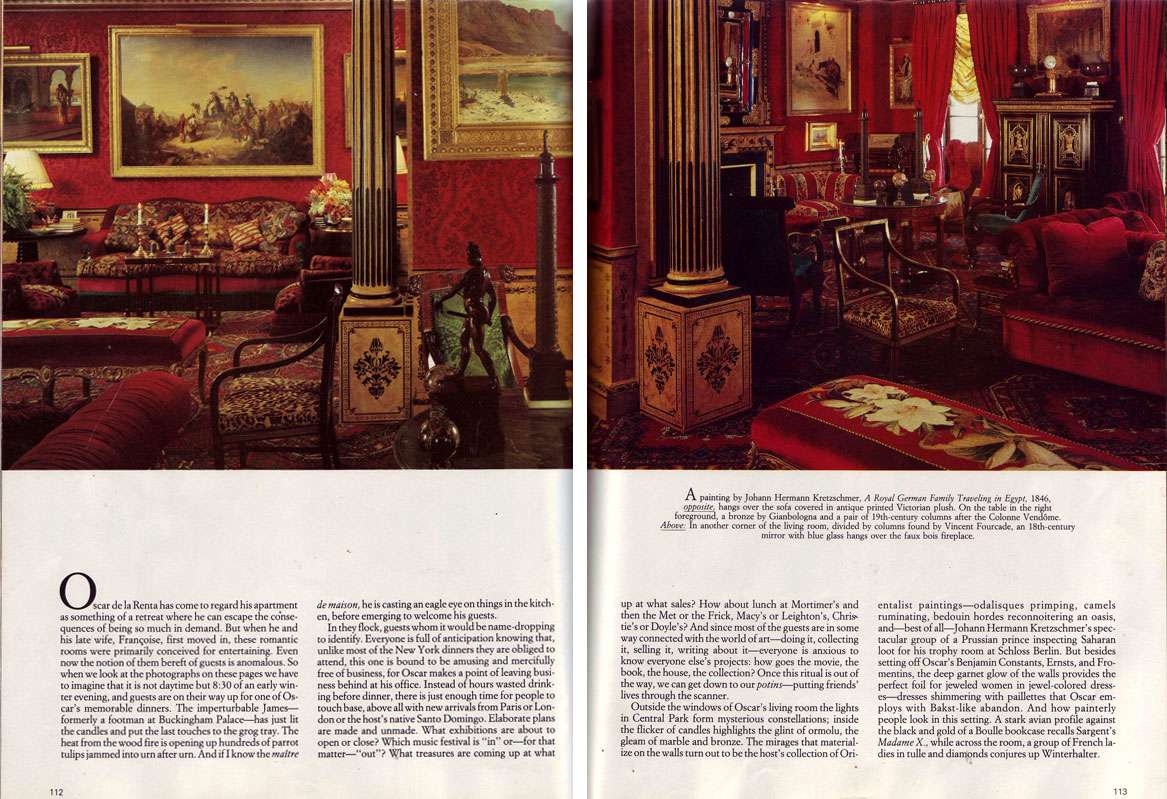
4. The dining room (left) and living room (right) from the apartment of Henry Kravis and Carolyne Roehm, decorated in 1985, and parodied in the movie Bonfire of the Vanities. Photo credit: ArchitecturalDigest.com

3.30.2009

Red Room

In discussion of red rooms, especially amongst bloggers, Diana Vreeland's receives raving accolades time and again. It's not an understatement to say that she was wholeheartedly committed to the red thing (Google Image search "Diana Vreeland red" to see what I mean), and I appreciate this commitment, but sometimes I wonder if a love and admiration for Vreeland blinds us to the fact that her red room is a little much to stomach.

For me, the absolute apex, pinnacle, PEAK of red rooms is Denning and Fourcade's for Oscar de la Renta. Why, no—HOW—does it escape discussions of the color red?!?! It's gorgeous, succulent, luxurious, plush, cool, everything a red room should be. And it doesn't make me think of matadors, tomato sauce, or the hot desert sun (oh Diana, don't worry, I still love you) which is always good.

House & Garden, December 1985. By John Richardson, Photos by Oberto Gili.

 
The whole apartment is heavenly, definitely one of the reasons that Denning & Fourcade are at the top of my list of all time favorite design teams.

3.29.2009

Fun and Frippery

Beauteous weekend romping. Definitely paying for it today. Expect a post as soon as the smashing sensation of construction in my skull ceases.


Plastered Chair. Courtesy of me.

3.27.2009

The Best Martha

Confession: The idea of domesticity makes me uncomfortable.

This is awkward in light of the fact that design is certainly intertwined with matters of "home" and all of the baggage that comes along with it, for better or worse. Usually, in the case of popular conception, it's for worse. Especially for a 20 something female who occasionally wonders if she's too stereotypical for her own good.

Martha Rosler's 1975 "Semiotics of the Kitchen" expresses this sentiment much better than I ever could. Her video also functions as an hilarious antidote to domesticity when one is needed, at least for yours truly.


Every now and then I channel Martha (noooo, not Stewart) and pull a Zorro on my broccoli.

Kisses.

3.25.2009

Hole in the Wall

No, I'm not referring to a dive bar, I'm talkin' closets here. Specifically, the way that teensy closet spaces lend themselves rather miraculously to experimental design. Throw caution to the wind, design like you're doing a holiday window display! After all, if the manifestation of your fantasies morphs into a horrible nightmare, you can always remedy the situation by shutting the doors.

Ordinarily, I'd be hesitant to indulge my spur of the moment day-glo desires, but happily, my dreams of technicolor won the best of me. Interestingly, when I keep the doors open, the closet casts this lovely rosy glow all over my white room. Dreamy.

Wall color: Home Depot Glidden flat finish paint in "Strawberry Swirl," hand blocked metallic fleur de lis; Photography and styling by (IN)DECOROUS TASTE. Hand painted chest and chair also by (IN)DECOROUS TASTE.

3.23.2009

Lobster Light

Captivated by these interesting oddities/beauties from the April 2008 Casa VOGUE supplement. Why is it that VOGUE Italia always leaves me lamenting the fact that I can't read a damn word of Italian?


From "Wonder Light" Casa VOGUE April 2008

3.20.2009

La La Lalanne

In case you were confused by my blathering about the atrocity of Lalanne's sheep being lost in Fernandez's farmland room disaster at Veranda's Greystone Show House (see last post), I spent the better of this morning paging through roughly 852,434 magazines to locate this incredibly engaging and beautiful editorial on Claude and Francois-Xavier Lalanne's (1927-, and 1927-2008 respectively) 1998 retrospective. And all so that you can see the sheep in a space they deserve (arranged by the artists), along with some of the Lalanne's other fantastical works. Note that I would die to sleep in Francois-Xavier's bird bed:


House and Garden, September 1998


The husband/wife duo are known for their surrealist, playful sculptures inspired by nature. Claude's tend to be lighter, smaller, and organic in form, while Francois-Xavier made larger works involving animals. Xavier-Francois's "Rhiocrétaire" from 1964 is particularly jaw dropping:


As is this crocodile table, also by Francois-Xavier. The metallic texture is rather godly:


And some of Claude Lalanne's feathery light pieces:


Images from artnet.com

I love that the functionality of their art ignites a sort of childlike desire to participate, engage, play, (and laugh!) with the pieces, which Francois-Xavier acknowledged, declaring that "...the fact that you can squat on [the sheep] reduces the risk of this inappropriate devotion."

Does my inexplicable desire to live in the bird bed in the Bagatelle's folly qualify as inappropriate devotion? Questionable...

3.18.2009

Old MacDonald Decorates!

Veranda recently sponsored a benefit showhouse at the Greystone Estate in Beverly Hills. Decorators aren't always my "thing "; in general, I prefer interiors that have been layered and collected with personality and enthusiasm (even of the haphazard sort!!) any day, so it was rather idly that I came upon the issue.

Yeah, so the show rooms are boring, bland, commercial, matchy-matchy. Whatever. What's extraordinary is that somehow this highly generic look has been achieved with some really interesting, fine pieces of art! Here, lovelies, is one of life's finest lessons in decorating the intrigue out of otherwise interesting art and objects. Man, I love this stuff.

1. Exhibit One: Old MacDonald Had a "Salle de Réception," e-i-e-i-o. Good to know that Claude Lalanne's sheep and the cow that is the sofa have some grass to graze on, although I'm not sure what the barnyard owls will be munching. I know I ordinarily wax on about the wonders of a graphic marriage of black and white, but the cow print against the marble floor is beginning to give me vertigo. Note- how is it that Fernandez made Lalanne's fantastic sheep look like they came from a toy shop?!


Veranda, March 2009."Salle de Réception" by Waldo Fernandez.

2. Exhibit Two: Jim Dine (painting) battles what appears to be an ottoman/beast upholstered in Def Leppard's castaways. Surprisingly, when I look closer, I realize that there's so much here that I'm into individually, like the Dine, the rock crystal chandelier, the Louis chairs upholstered in a weird leathery (latexy?) zig zag... I'm even drawn to that beast of an ottoman. Too bad I'm gonna get a sun burn if I look at this a second longer. All together, really, in the same room?


Veranda, March 2009. "Upper Gallery" by Eubanks and Brown.

3. Exhibit Three: Beige on Beige on Beige on Beige on Beige on Beige on BLAHHHHHHH... Notice the finer details. For example, the faux-carved, baroque dictator-style spindly chairs (who's coming to dinner, Michael Jackson?) and streaky faux job on the large cabinets do wonders to cheesify even the finest Maison Jansen mirror and consoles. As does the sad excuse for a chandelier that I almost didn't see as it's so tiny, the room is guzzling it alive. Scale, anyone?
EDIT: Holy hell, are those Nevelson totems in the window?! Poor Louise is likely rolling in her grave.


Veranda, March 2009. "Grand Ballroom" by Jack Fillips.

3.16.2009

Quickie

Because in the realm of DIY, I always prefer quickies...

It takes about 5 minutes to wrap lampshades in ribbon, but it does so much to create mood lighting and texture. Seriously, what is it with me and texture lately?


Metallic ribbon remnants on vintage lamps.


Secured with glue, because I'm like that.

3.13.2009

Ring It Up

According to Peggy Post (of the Emily Post Institute), napkin rings were once used informally at dinner when a household was too large to keep up with the wash. Each person had a unique ring to mark a napkin as their own, so that the napkin could be reused several nights in a row.

1. Thank god for washing machines.

2. Why'd we throw out the baby with the bath water? Cheap metallic rings and those ubiquitous wirey beaded bands are uninventive and make for a boring, repetitive place setting. A boring place setting makes it all the more likely that guests will notice bad food. This obviously isn't an option if you share my (lack of) cooking skills.For more engaging tablescapes, use zippers, chains, pins, bows, bracelets, buckles, ribbons, bow ties, or fresh flowers. Scrounge!! Hell, I'd even use trash if looked appealing.

3. So that your dinner is at least visually delicious:

Napkin rings, left to right: chain belt, vintage pin on zipper, antique cut steel belt buckle, Victorian era bracelet and baroque pearls on velvet bow, vintage Weiss pin, vintage pin on zipper, vintage dress clip on zebra ribbon.


Tablescape with vintage belt buckle and grosgrain ribbon used as napkin ring. Assorted dishes and vases all vintage.

3.11.2009

Florine, My Ondine

I like slippers of gold / I like oysters cold / And my garden of mixed flowers / And the sky full of towers / And traffic in the streets / And Maillard’s sweets / And Bendel’s clothes / And Nat Lewis hose /And Tappés window arrays / And crystal fixtures / And my pictures / And Walt Disney cartoons / And colored balloons. - Florine Stettheimer

Imagine my delight when this wondrous dressing room peered up at me from within the pages of January's Architectural Digest:


Dressing room, by Samuel Botero, in Architectural Digest, January 2009

Let's see what we've got here: emerald crystal, mirrors (x10), a Fornasetti-meets-Edward Gorey mat, a graphic cameo cabinet. Naturally, this fantastical and arguably weird throwback to Victoriana with an eccentric flourish appealed to me. Yet, I had this unsettling feeling every time I'd look at it. Sure, it's unapologetically girlish, and yeah, I'll admit that it sort of has a hall-of-mirrors-in-a-fun-house thing going on. But that wasn't it; it was more like an experience of deja vu. And then, today, I realized why: this dressing room, in spirit and execution, intensely reminds me of the work of the artist Florine Stettheimer (1871-1944), known for her portrayal of the New York avant garde art scene in the 20s and 30s. And it's not just her paintings, but also her sets, poems, and interiors, all of which have the same frolicky quality, and bizarre underlying (or maybe overt) fantasies of girlish eccentricity.

Two of my favorite Stettheimer paintings. Florine wanted her paintings destroyed upon her death. Thank god her sister had the sense not to listen to her:
Italic
Left: Spring Sale at Bendel's, 1921 Right: Natatorium Undine, 1927


Stettheimer's set for Four Saints in Three Acts, a play by Virgil Thompson and Gertrude Stein:


And her New York City apartment:


House and Garden, May 1991

If there's anyone who makes me want to wrap myself and my interior in swaths of cellophane, it's Florine. And trust me, that's not something I would think about ordinarily. I generally run for the hills when I see plastic, but in this case, will you look at those drawing room drapes?!


3.09.2009

Magnificent Excess

Been thinking a lot about texture lately (clearly). These images from Craig McDean's editorial in the February Vogue Italia are especially appealing in that regard. A thousand textures, surfaces, and patterns do make the shots magnificently excessive. What's most impressive is that it's pulled off in a very spare black and white palette.

It's so easy to create excessive richness with color, and let a minimal palette lend itself to structural minimalism. This is infinitely much more interesting, no?


"Magnificent Excess" by Craig McDean, in Vogue Italia, February 2009
images hosted on imageshack.us

3.07.2009

Ancestral Texture

If there were a ranked collection of my most beloved images, this one of Hardwick Hall's Green Velvet Room would make the top 5. Apart from the fact that it's visually stunning, it also may as well be a lesson in texture. I am now convinced that the combination of threadbare luxurious velvet damask, heavily carved 17th century stools, and oversized nubby rush matting is a recipe for happiness. In particular, I'm craving a rush mat with a gigantic weave to offset the gilding and pick up the decay inevitably a part of the objects and decor that I'm so fond of.


Hardwick Hall in World of Interiors, November 2008.

I'm in love with ancestral homes to an embarrassing degree; there is nowhere that rivals these dwellings when it comes to decor that is perfectly disheveled and exquisitely luxurious simultaneously.

3.06.2009

A Tin in a China Closet

Who says curio cabinets should only be stocked with priceless porcelain? Vintage tins can be just as lovely. The cherry on the cake is that it's easy to find interesting ones on eBay for under $20. Look for old English ones; you usually can't go wrong with those.


Assorted vintage tins. Image hosted on imageshack.us

3.05.2009

Graphic Design

On my agenda: Incorporating graphic elements into an otherwise non-graphic space. There's something fresh about the softness of rococo roundness and confused patterns encountering a pungent black and white combo. My latest experiments:


www.maisonarchinard.com

Black white and red look lush together.

Interesting facts that are somewhat useless: 1.
If a language has only two color terms, they'll likely designate "black" and "white." The third color term, if a language has only three, is red. 2. The contrast between black and white attracts the attention of newborns only seconds old. (Leading to the theory that it's likely that they learn to recognize a mother by her hairline, typically the highest contrast area on the face.) 3. The artist Alexander Calder favored the black/white/red color combo because he believed it most clearly displayed the motion of his mobiles.

What does all of this mean? That my affinity is shared by others and that the color combo might appeal to my reptilian brain. Comforting.

3.03.2009

In Defense of the Tiger

A little while ago I caught part of Laura Bush's tour of the White House (CNN? Ah, I forget.). To be perfectly blunt, the private rooms were abysmally boring in a weirdly suburban sort of way, and the public rooms... were, well...per usual, with all of their historically laden rigidity. The one thing that did stand out was Laura Bush's Directoire settee, which she had proudly reupholstered in tiger-print velvet, apparently to the dismay and horror of her mother-in-law:


Photo from People Magazine, Photography by Sam Jones

This made me smile in an I'm-so-warm-and-fuzzy moment, for a few reasons: 1. I'm a sucker for anything neo-classical. 2. I love a well done tiger (print, ha), especially on classical furniture. 3. Bush policies aside (blahblahblahbleh this is a style blog), the story is endearing, no? Particularly because she was so enamored with her decision.
Italic
Anyway, while searching for a photo online, you can imagine my surprise when I learned that not everyone shares my sentiments. People magazine, for one, deemed that the velvet upholstery was more suited to "Elvis Presley's jungle room" than the White House. Um, WHAT? This baffles me. Animal patterns have been used in very traditional contexts for a very long time. Think Elsie De Wolf. Leopard print was one of her signatures, and she's about as classical as they come. Or how about the Ancient Egyptians? They not only draped hides over chairs but also painted faux hide on the seats. Here are a few of my favorite uses of animal pattern, all about as far from Elvis as I am from, let's say, upholstering my head with polyester shag carpet. And that's far, kids, that's far.

1. A gorgeous leopard print plays off of red walls and draws out the richness of tonally warm antique wood.


Interiors, Ed. Min Hogg and Wendy Harrop, 1988.


2. A tiger skin rug conjures up images of game hunting and romantic 19th century notions of "exotic" travel in jewelry designer Kenneth Lane's bedroom.


From Beds by Diane Von Furstenberg, 1991.


3. Richly variegated leopard adds texture and brings out the soft gilded detail in a Napoleon I bed.

From Beds by Diane Von Furstenberg, 1991.


4. In a more serene setting, designer Francis Roos used a lush tiger velvet as an accent on a 19th century antique French Egyptian-revival stool.

Architectural Digest, January 1995.


5. And my all time favorite use of tiger and leopard: The drawing room at the Palazzo Brandolini, by Tony Duquette. Faux leopard moldings, drapes, tiger frames, pillows, and upholstery mingle with baroque Venetian palazzo architecture, 18th century Venetian armchairs, and countless other antiques.

From Tony Duquette by Wendy Goodman and Hutton Wilkinson, 2007.


6. And lastly, ...Welcome to the jungle, natural habitat of the leopard and tiger. Not to be confused with Elvis's jungle room. It pains me to say this, but perhaps it would be wise to keep Jim Beam out of decisions involving animal pattern.
Ahhhh, screw it. Who am I kidding? This is over the top fabulousness.


A caveat: all leopard is not created equal. When it's bad, it's really bad. And by this I mean, be wary of anything designed to be used in a car, placed on or in a toilet, or glowing like a radioactive bio-hazard:


Things one should never do with leopard.

Oh my god, my eyes hurt.

EDIT: Recently came across an Art and Antiques magazine that cited the Duchesse de Berry (1798-1870) as a key player in popularizing velvet leopard print fabrics. Go figure.

3.01.2009

I Want My Geese to Lay Gold Egg(plant)s for Easter...

At least a hundred a day!


And by the way...

Some people are inclined to equate golden decorative vegetables divorced from a Christmas context with egregious tackiness. I beg to differ. Actually, what better way to look forward to spring than with golden vegetation? If only the damn things would sprout out of the ground in this kind of gleaming glory.


Vintage gold glazed porcelain fruits, displayed on vintage tray.
Related Posts Plugin for WordPress, Blogger...