6.30.2009

All Tied Up...

Link
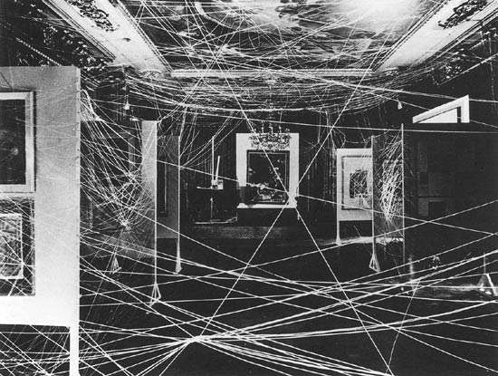
Marcel Duchamp, Sixteen Miles of String, 1942

BACK after a brief hiatus in blogging.

Lately, I've been tied up like the gallery Marcel Duchamp wrapped in 16 miles of string (except I don't look nearly as fabulous or haphazardly elegant). A couple of new things to watch out for in the near future:

1. New collections for MAISON ARCHINARD. Think jewels, blue and white porcelain, and richly layered organic materials...

2. The addition of an online shop! Hello e-commerce.

So excited.

X Lauren


6.08.2009

Paint it Black

Style rules are made to be broken. Especially the one that mandates that small rooms can't be painted in dark colors. I don't know how many times I've heard this, but it makes me sick to the stomach each time.

It's always been my philosophy that the smaller a room is, and more importantly, the less light it gets, the more it could benefit from a dark treatment. Dark colors provide a backdrop for objects, accents of color, light refracting crystals, and metallics. They also make small rooms feel cozier—softer—and do a nice job at concealing a lack of architectural bone structure.

So my question is this: why the obsession with trying to "open up" small spaces?!?! EMBRACE THEM! Paint them dark; a glossy black is a great place to start! Why not take advantage of the small size and turn a tiny room into an intimate, cozy and cavernous jewel box? Small spaces can be magical in a way that large ones—even with killer bone structure— can't. Most people don't have enough objects and furniture to fill large spaces that lack decent architectural structure anyway. Harsh, but sometimes the truth hurts.

This gorgeous interior is a perfect example of what I'm talking about. Small black rooms are extremely sexy:


Andrew Tauber's one bedroom Manhattan apartment, from Architectural Digest: Traditional Interiors, 1979.

6.05.2009

Boxed In

Lately, my adoration for all things dilapidated has reared its head as a frenzy for sturdy old boxes and random old tools.

Sometimes, you find that ideal combo of structure , texture, and story in the most unlikely places. Sure, it would be nice to purchase a forcola a la architect I. M. Pei, but architectural forms abound in places other than Venice; one just needs to look!

As a plus, the coke box feels a little pop-art, and the insanely textured patina is ideal for contrasting with prissier interior elements— say, all things crystal, gilded, silk, pristine, clean, you get the idea.


6.03.2009

Matchy Matchy Much?

TOO. MUCH. TOILE.

Lest you ever get the idea to use those 200 yards of remnant toile in ONE ROOM, I kindly offer you this, as a reality check.

And, from the caption: "Black and white toile adds a crisp, lively touch." This is a pinch more than a touch, my dears.

Photo by Langdon Clay. Southern Accents, January-February 1994.

6.02.2009

The Art of Artichokes

I haven't quite figured out what to do with these babies in the kitchen, but I do know that they look quite elegant in a vase.

In fact, I can't decide whether I want to eat them or look at them more.

They're aggressive, they're architectural, and that's how I'm taking my bouquet today, thank you very much.

Oh, and except for the fact that they're organic, did I mention that they're about 10 times cheaper than roses? But, you know, since I'm a firm believer that one needs to "own" the economic crisis, this isn't about "making do", it's more about... doing better.

And artichokes, in my opinion (which is king around here), are definitely superior to your humdrum grocery bouquet, cost entirely aside.

X Lauren

6.01.2009

Domestic Graffiti?

Add to the list of things I am reconsidering (rapidly becoming obsessed with): graffiti.

A year ago, I would have called you insane if you had suggested putting this raucous art form in a domestic setting. But seriously, what's wrong with me? Why wouldn't I like it? It's aggressively DIY at its core. And plus, there's something fundamentally compulsive about painting on —embellishing— everything. Is graffiti a contemporary Rococo, a more recent manifestation of that same compulsive decorative impulse?

New York artist Kenny Scharf's Brazilian retreat is covered (and I mean covered, down to the chairs) in graffiti. Admittedly, graffiti in the home is a bizarre concept. While I appreciate his attempt, I have to say that I would do it differently. The fact that the house itself is without electricity and generally lacks in furnishings makes it feel a little too authentically crack shack for me:


Scans of Kenny Scharf's home from House & Garden, October 1985

This work, by Blek Le Rat (who was trained at the Ecole des Beaux Arts, interestingly enough) is, in contrast, a nice balance of grandeur and decrepitude: the architecture of the building, decrepitude due to age, classical nature of the graffiti figure, and then the underlying element of vandalism that comes as part of the graffiti territory:

From Graffiti World Street Art from Five Continents, by Nicolas Ganz

Or how about this wallpaper given the graffiti treatment by Australian artist Rok 2? Definitely an innovative way to incorporate this into an interior, I love the way it looks like the wallpaper is chipping away to reveal a weirdly sinister graffiti-dimension beneath it:

From Graffiti World Street Art from Five Continents, by Nicolas Ganz

I'm interested to know what other people think about this- Y / N to graffiti in a domestic setting? Gaudy mistake or brilliant exercise in contrasting elements?

Related Posts Plugin for WordPress, Blogger...