Showing posts with label bad design. Show all posts

10.09.2009

Seductive Sythetics: Living in a Plastic Bubble

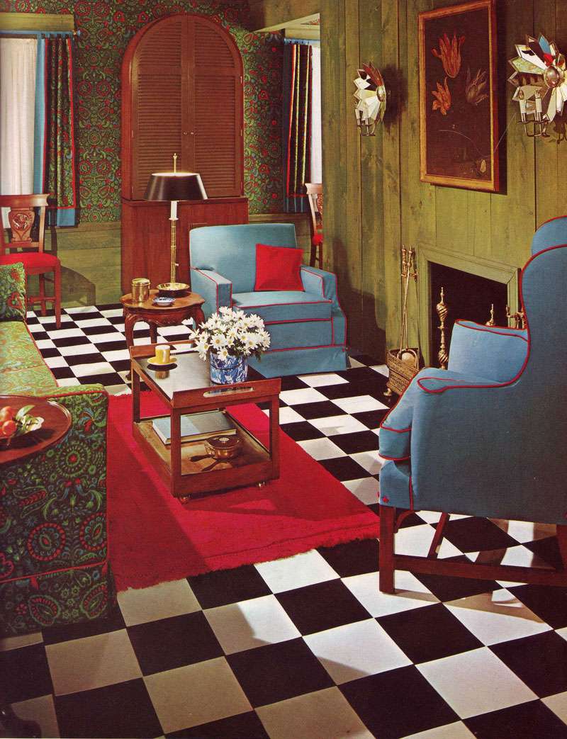
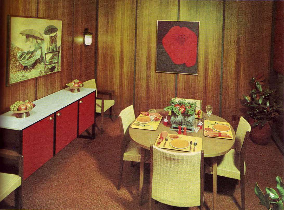
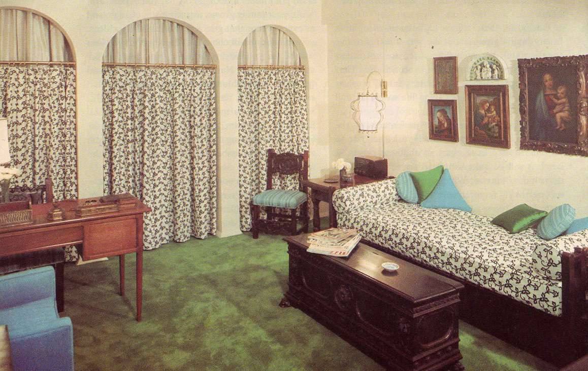
Decorating Ideas For Every Room In Your Home, 1969.  A GEM.  At least in the sense that the editors exhibit an unusual zeal for all things vinyl, Caprolan (??), rayon, laminate, olefin and nylon.   Their enthusiasm is infectious, yet I can't help but think that after the fact, some of these designers would rather have had the public not know about these deep, dark, design secrets.

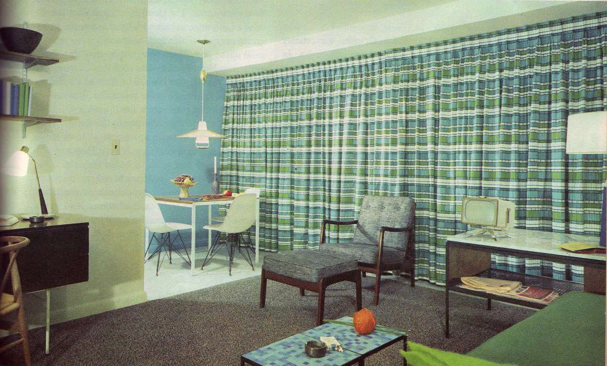
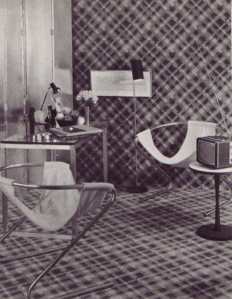
Check out this upholstered room  by Mark Hampton, for instance.  Can you believe the nylon plaid that crawls right off the floor and UP THE WALLS!? I can only imagine it would be difficult to watch that tiny television. Surely, one's head would be spinning from all the plaid:


 Above "Bold plaid design of all nylon carpeting covers the floor and then goes up the wall; its splash of color echoes the steel-strong mood of the room." Design by Mark Hampton.


Above, "Fabrics lend flair to a living room made attractive and inviting by the well planned juxtaposition of pattern color, scale and texture.  The key print [is a] a weave of Avisco rayon and cotton [and] flooring is vinyl tile." No designer credited.  (Well planned juxtaposition? They're so serious!)


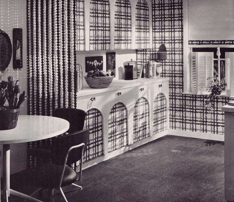
Above, "Dining rooms are formal and informal...Entire kitchen and bookcase can be closed off by wood-grained folding doors, but when they open (ed: get ready for it) they reveal plastic-faced cabinet screen printed to match fabric on upholstered pieces.  Red formica topped table serves for dining." No designer credited.


Above: "Vinyl floor by Amtico was custom-colored to match print and wall tones."


Above: "A great way to add style to your kitchen, and easy maintenance too— a wall to wall kitchen carpeting such as the bright blue carpet by Thomas Pride Mills, used in attractive kitchen [above]. Made of all-Herculon olefin fiber, carpet eliminates waxing, mopping and polishing..." A carpet in a kitchen is easy maintenance? Clearly, they haven't been in my kitchen while I cook.  I shudder to think what bright blue olefin looks likes.  Am I EVER glad this image is black and white. 


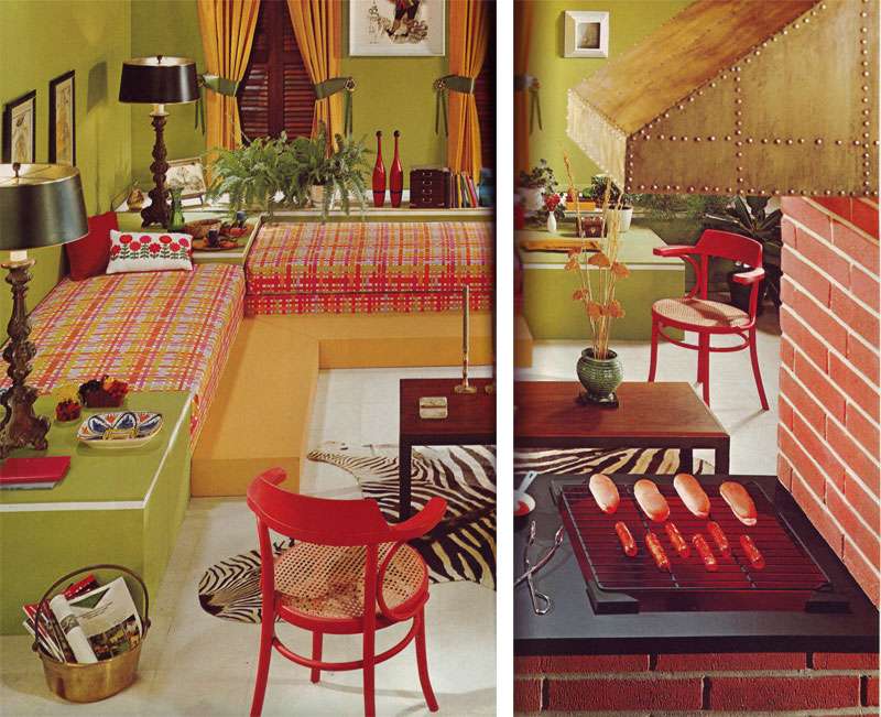
Above: "Family room sets the mood for fun and games...practical white vinyl floor... gets the punch of a zebra skin trophy..." Are those hot dogs vinyl too?

6.03.2009

Matchy Matchy Much?

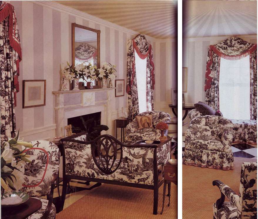
TOO. MUCH. TOILE.

Lest you ever get the idea to use those 200 yards of remnant toile in ONE ROOM, I kindly offer you this, as a reality check.

And, from the caption: "Black and white toile adds a crisp, lively touch." This is a pinch more than a touch, my dears.

Photo by Langdon Clay. Southern Accents, January-February 1994.

5.16.2009

NEVER.

Lately, I've been an avid subscriber to the "never say never" philosophy. This is probably due to the realization that I've embraced (with ZEAL) things that were once solidly in the "never-ever-EVER" category (or so I thought). Take, for instance, shoulder pads. Or fringe. Or cellophane drapes. Or minimalism. Or neon patent. It's gotten to the point where if I hate it, I have to conquer it. The worse it is, the more I want it to work (fanny packs, anyone?).

However, flipping through this gloriously authoritative Doubleday Book of Interior Decorating from 1965, I hesitantly realize that perhaps some things are best left untouched. Forever. For example:

1. Weird greenish brownish wood plastic paneling. Actually, anything that replicates the color of bile. Especially anything synthetic. Please Google image search "bile"— the closeness of the match is truly disquieting.

2. Paris Hilton's bathroom. I jest. But seriously, you know you've taken color coordination too far when you have a MATCHING PINK BIDET.

3. Astroturf is NOT a proper substitute for a rug, no matter what the Doubleday chapter on "Good Taste" insists.

4. Similarly, cheap shower curtains are not functionally or aesthetically equivalent to actual curtains. And industrial nylon carpeting? This is not Loehmann's dressing room, it is a living room. Or so I imagine it was intended.

Lesson learned. Sometimes it's okay to say never.

Scans from The Doubleday Book of Interior Decorating by Albert Kornfeld, 1965.

4.27.2009

The (Not So) Sexy Seventies

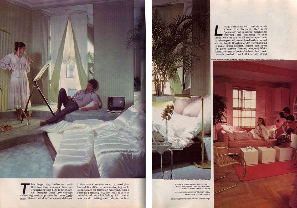
One of life's simplest joys is perusing womens' mags from bygone (read: antiquated) eras. Take, for instance, this delightful Cosmo fr0m the 70s.

My question is this: How did people survive 1978?! Where, oh where, do I begin?

I mentioned yesterday that decor from the 70s often looks extraordinarily dated. Case in point follows. Not even in my wildest dreams could I imagine, however, the horror apex of perfection that results when you add in a matronly lady wearing more lace than Queen Elizabeth, seducing a splayed-leg archetypal porn-star plummer. I mean, seriously, are we to believe that our lady friend has just rolled out of bed in her polyester jammies with intentions of perfecting a new painting technique that involves holding her brush like an, uh, bat, and sucking on it? This is questionable.


Moving right along, Richard Simmons doles out advice on "spending a healthy weekend with your mate." Perhaps the couple above took his advice to heart, sort of like the couple rollerskating in tube socks (but somehow, the poor things have forgotten their pants!) below. I didn't know that Richard Simmons (sans afro, below) produced stories for Cosmo. No, really. This isn't a joke. Richard Simmons is actually credited as the producer.


And hey, if healthy living isn't your thing, take tips from the stars on staying svelte in "How to Stay Thin," (or, "How to Develop an Eating Disorder"). The real cherry on the cake is Geraldine Chaplin: "I tell myself food is horrible...or I think of all the romantic heroines who died of consumption." Say WHAT? Did our dear Geraldine actually believe that the heroines ate themselves to death?!! This is a frightening image. Someone, inform the girl that consumption=tuberculosis! On another note, I wonder if Babs is still avoiding cholesterol.


Scans from Cosmopolitan, July 1978.

3.18.2009

Old MacDonald Decorates!

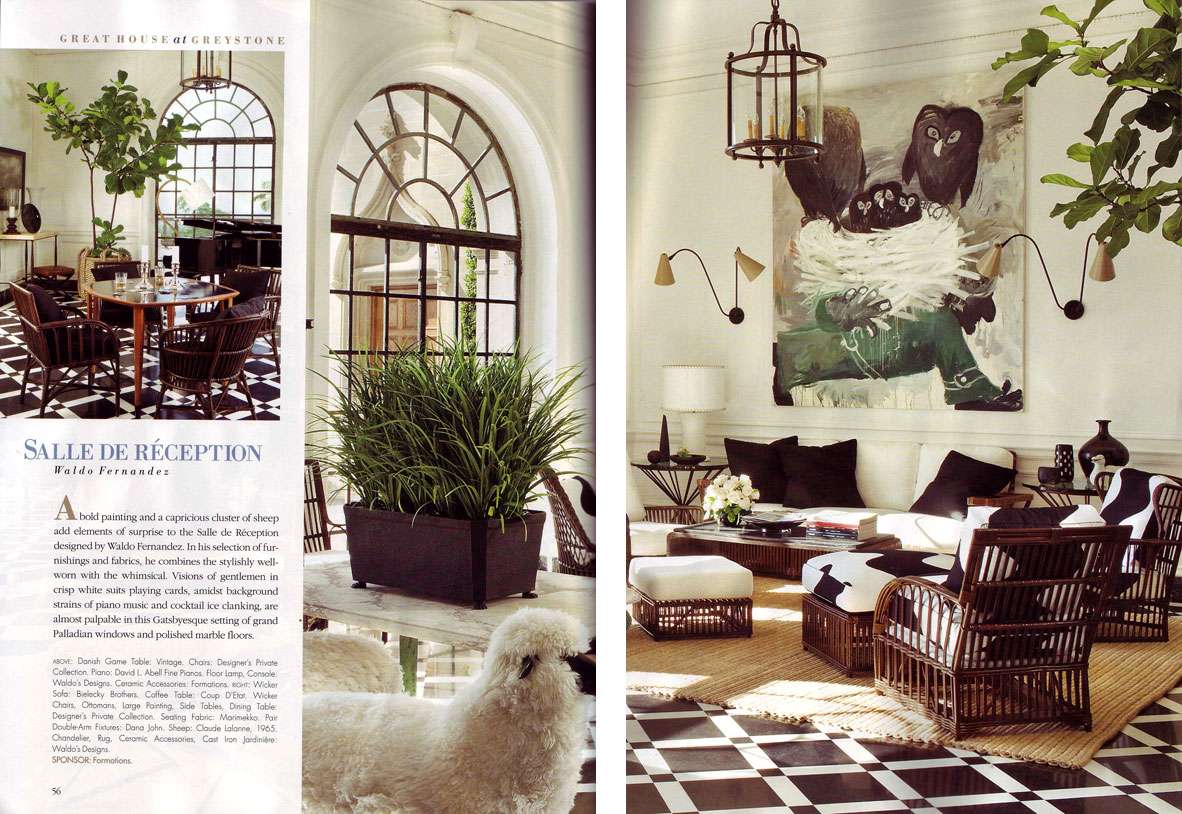
Veranda recently sponsored a benefit showhouse at the Greystone Estate in Beverly Hills. Decorators aren't always my "thing "; in general, I prefer interiors that have been layered and collected with personality and enthusiasm (even of the haphazard sort!!) any day, so it was rather idly that I came upon the issue.

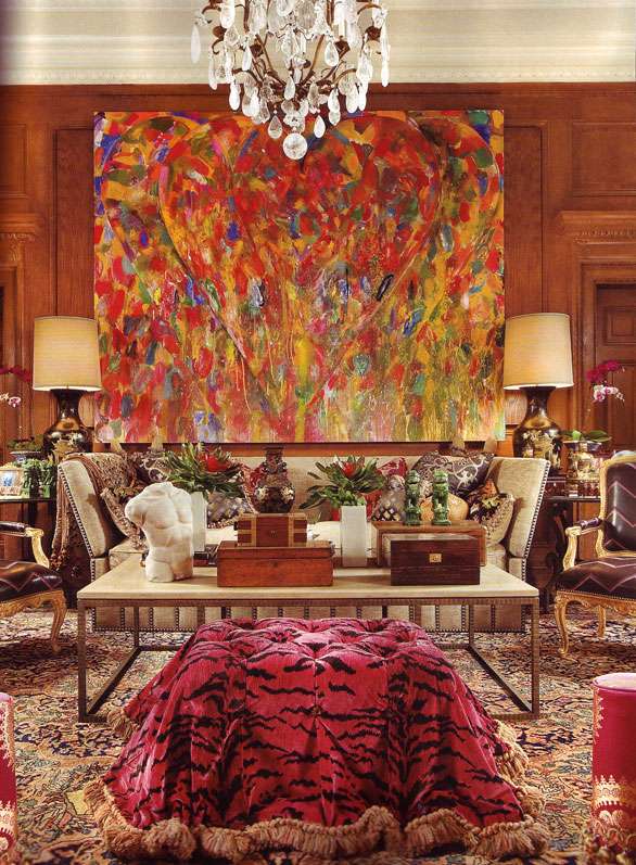
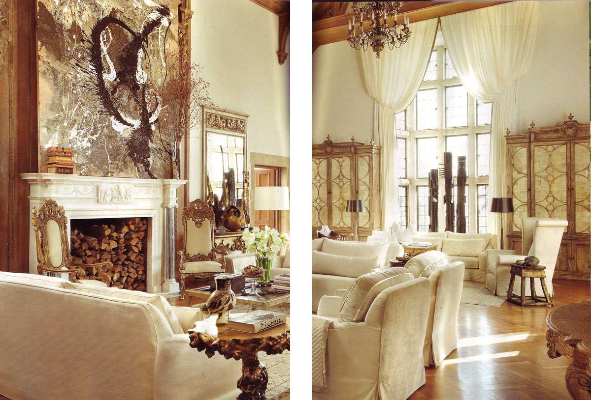
Yeah, so the show rooms are boring, bland, commercial, matchy-matchy. Whatever. What's extraordinary is that somehow this highly generic look has been achieved with some really interesting, fine pieces of art! Here, lovelies, is one of life's finest lessons in decorating the intrigue out of otherwise interesting art and objects. Man, I love this stuff.

1. Exhibit One: Old MacDonald Had a "Salle de Réception," e-i-e-i-o. Good to know that Claude Lalanne's sheep and the cow that is the sofa have some grass to graze on, although I'm not sure what the barnyard owls will be munching. I know I ordinarily wax on about the wonders of a graphic marriage of black and white, but the cow print against the marble floor is beginning to give me vertigo. Note- how is it that Fernandez made Lalanne's fantastic sheep look like they came from a toy shop?!


Veranda, March 2009."Salle de Réception" by Waldo Fernandez.

2. Exhibit Two: Jim Dine (painting) battles what appears to be an ottoman/beast upholstered in Def Leppard's castaways. Surprisingly, when I look closer, I realize that there's so much here that I'm into individually, like the Dine, the rock crystal chandelier, the Louis chairs upholstered in a weird leathery (latexy?) zig zag... I'm even drawn to that beast of an ottoman. Too bad I'm gonna get a sun burn if I look at this a second longer. All together, really, in the same room?


Veranda, March 2009. "Upper Gallery" by Eubanks and Brown.

3. Exhibit Three: Beige on Beige on Beige on Beige on Beige on Beige on BLAHHHHHHH... Notice the finer details. For example, the faux-carved, baroque dictator-style spindly chairs (who's coming to dinner, Michael Jackson?) and streaky faux job on the large cabinets do wonders to cheesify even the finest Maison Jansen mirror and consoles. As does the sad excuse for a chandelier that I almost didn't see as it's so tiny, the room is guzzling it alive. Scale, anyone?
EDIT: Holy hell, are those Nevelson totems in the window?! Poor Louise is likely rolling in her grave.


Veranda, March 2009. "Grand Ballroom" by Jack Fillips.

2.22.2009

Siegfried and...Saddam?

Bear with me today. I tend to be reticent in calling even the ugliest of taste a "crime" but sometimes this is the only word that comes to mind.

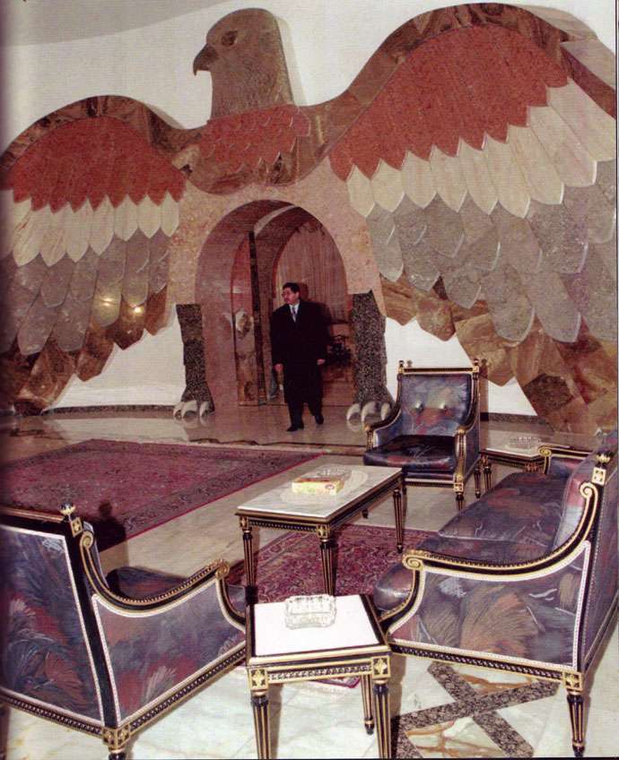
First: One of Saddam Hussein's many palaces, from Dictator Style by Peter York.
No surprises here. Exactly what you'd expect from a Middle Eastern dictator:


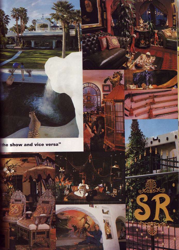
And second, Siegfried and Roy's Las Vegas abode, in House and Garden, May 1991:


And yet another gem of a collage from the Siegfried and Roy shoot in House and Garden, May 1991:


My first thought when I saw these images was whether Saddam Hussein shared a decorator with Siegfried and Roy. Then I wondered: was it Saddam who called Siegfried asking for a muralist specializing in 70s style renditions of porn star demigods, or the other way around? Witness Saddam's prized painting of Medusa the stripper unleashing a giant green snake upon Rocky who is incidentally missing his gold lamé booties, all while being supervised by a blueberry colored Mr. Clean who has sprouted devil horns:


From Dictator Style, by Peter York

Part of me wants to forgive at least Siegfried for these monstrosities, being that it was '91 and just 2 years past the hurdle that was the '80s,
but honestly boys, don't we have to draw the line somewhere?! And if there is a line, surely it has been LONG crossed by the time you reach Siegfried's Wonka-goes-to-Never Never Land Ranch gates and open your eyes to the wonder that appears to be an animated version of the Sistine Chapel. As for the panoramic view of the neon-lit TIGER WATER FALL, well, I won't even go there. It's as bad as a wolf shirt except with no ironic value and about 6,000,000,000,000 times the size and cost.

Oh Siegfried and Roy, how I hope things have changed since 1991...
Related Posts Plugin for WordPress, Blogger...