
Every month, there's a certain subset of design mags that inevitably run stories on neutral color schemes. You know the drill: "Neutrals are anything but boring!" "Neutrals are the new trend!" "Neutrals you can live with!" Etc. etc. etc.
I love neutrals as much as the next person but there's such an abundance of really generic, uninspired design in this arena that it's easy to forget how great a room can look when someone who really understands color and tactility puts it together. And this is precisely why I was captivated by his work!
His own residence in San Francisco is hitting all the right notes for me right now. Apparently, it was one of the most heavily photographed interiors in its day. Textured walls, subtle play of warm creams and ochres, complete with the density and dryness of his plaster heads and furnishings contrasting against the shiny surfaces... it's heavenly. Now THIS is a neutral well done:

As you might know, I've been feeling (this is an extreme understatement) white on white vignettes as of late. I've been contemplating doing my own involving ostrich eggs for some time. Seeing this image on the left has confirmed that desire. Can you tell that Dickinson worked in window display before becoming a decorator? And that building facade on the right ? Oh, that's a carved wood closet. Is your jaw dropping yet?
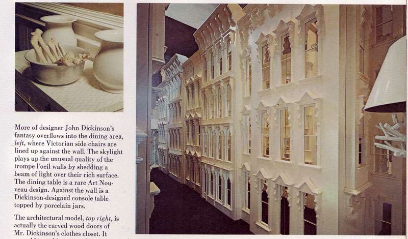 Above images from The New York Times Book of Interior Design and Decoration by Norma Skurka, 1976.
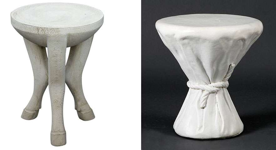
For those interested, there are a few of Dickinson's pieces up on 1st Dibs at the moment, including one of his famous footed plaster tables (asking price is $35,000.00). Anyone interested in buying me an early birthday gift? Ahh, if only.
No comments:
Post a Comment