10.21.2009

In House: It Came!!

Today, I received my much awaited copy of In House by Derry Moore with Mitchell Owens.  Beautiful book, lovely design, gorgeous images...and I haven't even gotten to the text yet.  Anyone else get theirs? Thoughts?? Favorites? Opinions??!

A quick smattering of interiors that caught my eye:


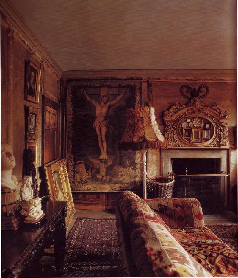
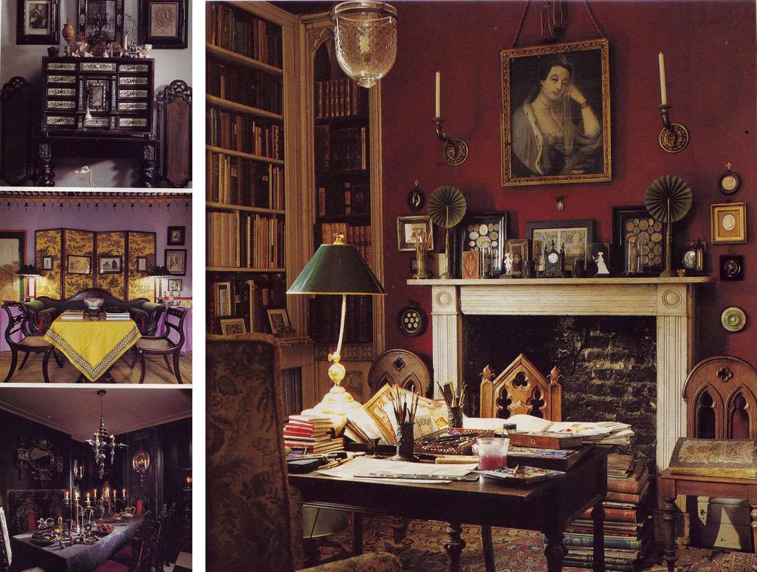
Above, Malplaquet House

This might be my favorite interior in the book, if for nothing else but the AMAZING collection of memento mori,  succulent red hues, and tiger skin.


Above, Malplaquet House

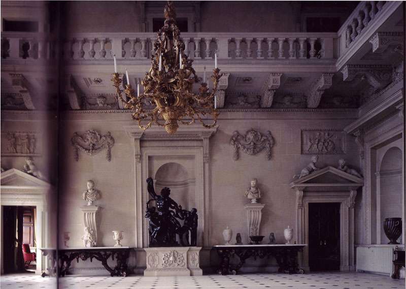
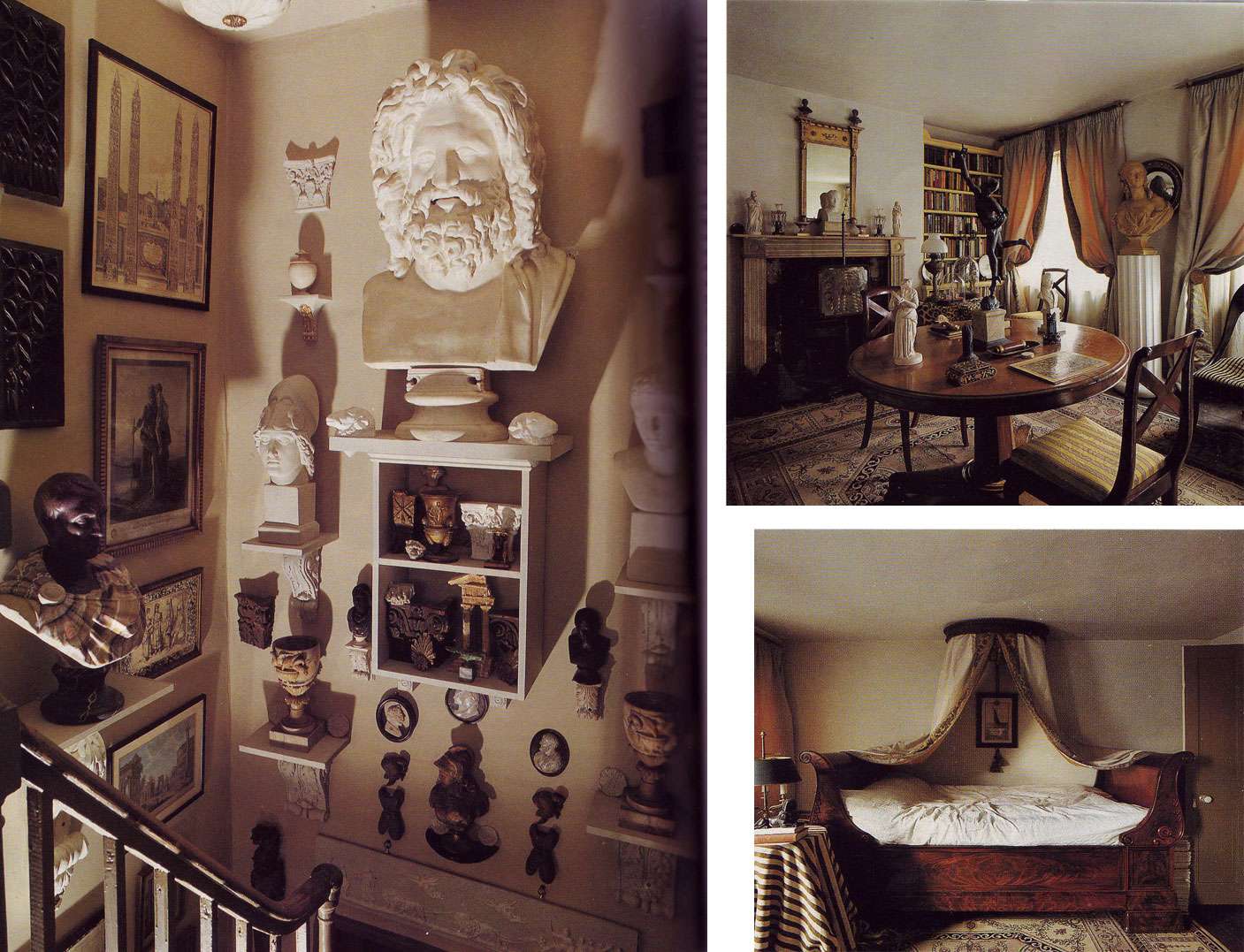
Above, Houghton Hall

10.20.2009

A Venetian Party

Halloween needn't be a cheesy affair.  Although, surely, that isn't without its own merits...

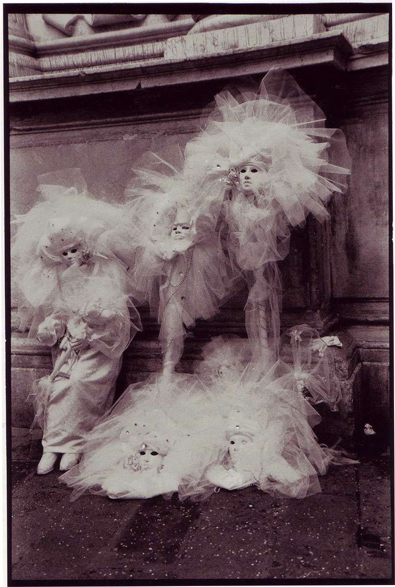
As I've been spending my time fabricating dripping skin and formulating ways to mimic Meryl Streep's rotating head from her character in Death Becomes Her (my costume this year, ha!), I found myself in need of a more...elegant escape.  I love Venice, in all its maze-like glory, and have been seriously infatuated with this photograph from Venice, A Personal View by Andrea Baldeck:


Halloween is coming  up soon— if you don't have a costume, look no farther, get yourself to a dance store, and buy up their stock of tulle! I almost regret not doing this myself.  Although, maybe that's why people have early parties...

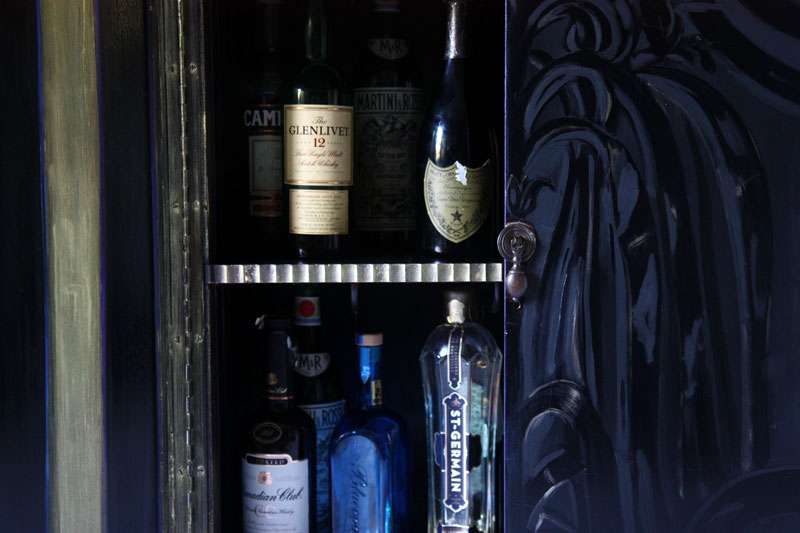
In any case, this photo, and a generally Venetian mood, was my latest inspiration for a light-hearted piece I painted- a beat up former record cabinet that is now... a liquor cabinet.  Everyone needs a pretty place to keep their booze for the holiday season, right?


Especially one that opens up to metallics! (I have to laugh. It's almost comical how attached I am to these metallics...) I love the glimmer of beautiful liquor bottles, why aren't the interiors of liquor cabinets usually more adorned? They spend so much time open, after all...


Above, by Andrea Baldeck, from Venice: A Personal View


10.18.2009

A Desk Fit For A Princess

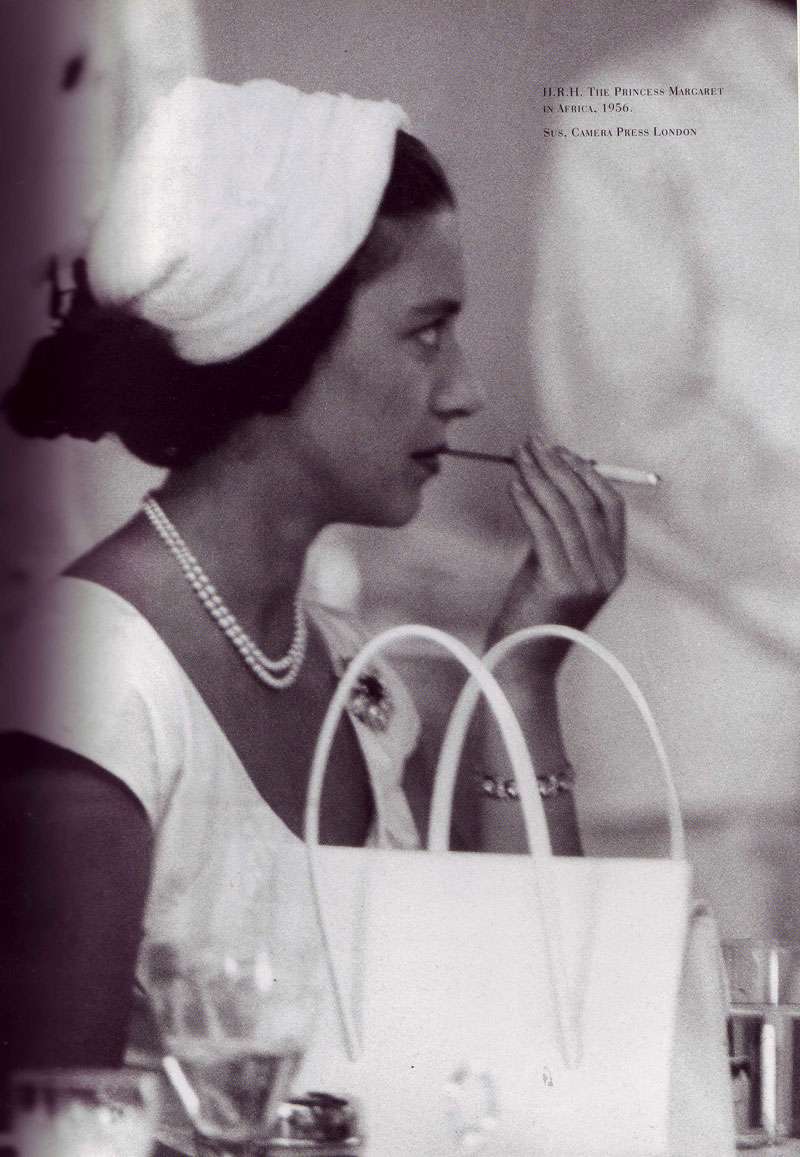
Princess Margaret (1930-2002), younger sister to Queen Elizabeth II, at her desk, Kensington Palace.  Amazing the things people keep on their desks, right? (Who knew the princess needed so much Kodak film?)


Some of the items from the Christie's auction of her estate...


Above, a Meissen three-tiered nine-light chandelier, c 1900 


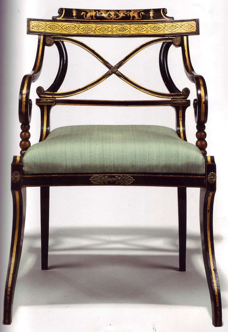
Above, one of a pair of George IV black and gilt japanned 'klismos' open armchairs, c 1820, decorated in the late 19th century. 

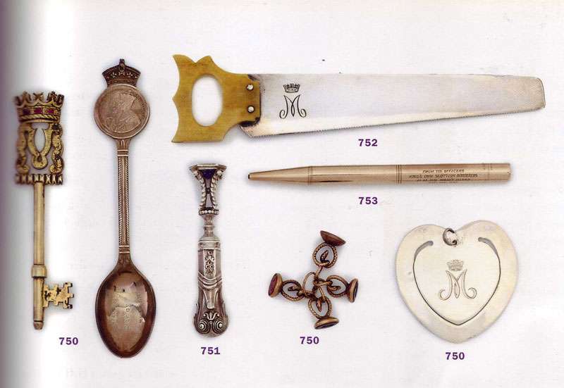
Above, Various items owned by the princess, including a gilt metal key, silver hand-seal c. 19th century, silver-plate ivory miniature saw c. 19th century, and gold propelling pencil, 1947

10.16.2009

A Baroque Fascination

"Though the association of the Baroque with excess was well understood by the august Victorian and Edwardian(s), the rediscovery of the essential eccentricity and bizarre nature of the Baroque, and the recapturing of its all-but-forgotten whimsicality, has been a phenomenon of the modern era." - Stephen Calloway, in Baroque Baroque

Calloway's depiction of the Baroque is seductive, isn't it?  The Baroque is usually associated with pompous decoration and round, undulating flourishes affixed to grand-scale architecture.  I love (LOVE) Calloway's books because he probes beneath the surface and attempts to capture the essence of the Baroque.  What does he find? An era of experimentation, a state of flux.  Indecorous taste shifting into decorous taste, the gray space in between; you get the picture.  Surely, this is something I can relate to.

What I find so interesting is something he characterizes as a "baroque" fascination with the grotesque and unusual. From Baroque Baroque:
"In the history of taste there is a great fascination in the way in which things once despised are gradually found to have a certain curious charm.  Some continue to gain ground aesthetically, finally to enter the sacred canons of Good Taste."
 The word "baroque" was first used to describe rare, misshapen pearls that 16th and 17th century noblemen came to collect and treasure in their cabinets of curiosities. You know, those moments when something looks so bad, it could be good? Often the things I end up loving most are things I hated on first exposure. Now, I embrace that bizarre gut response when I'm lucky enough to encounter it.


Above, Virginia Bates's vision of shattered and decadent decay, from Divinely Decadent, by Stephen Calloway.
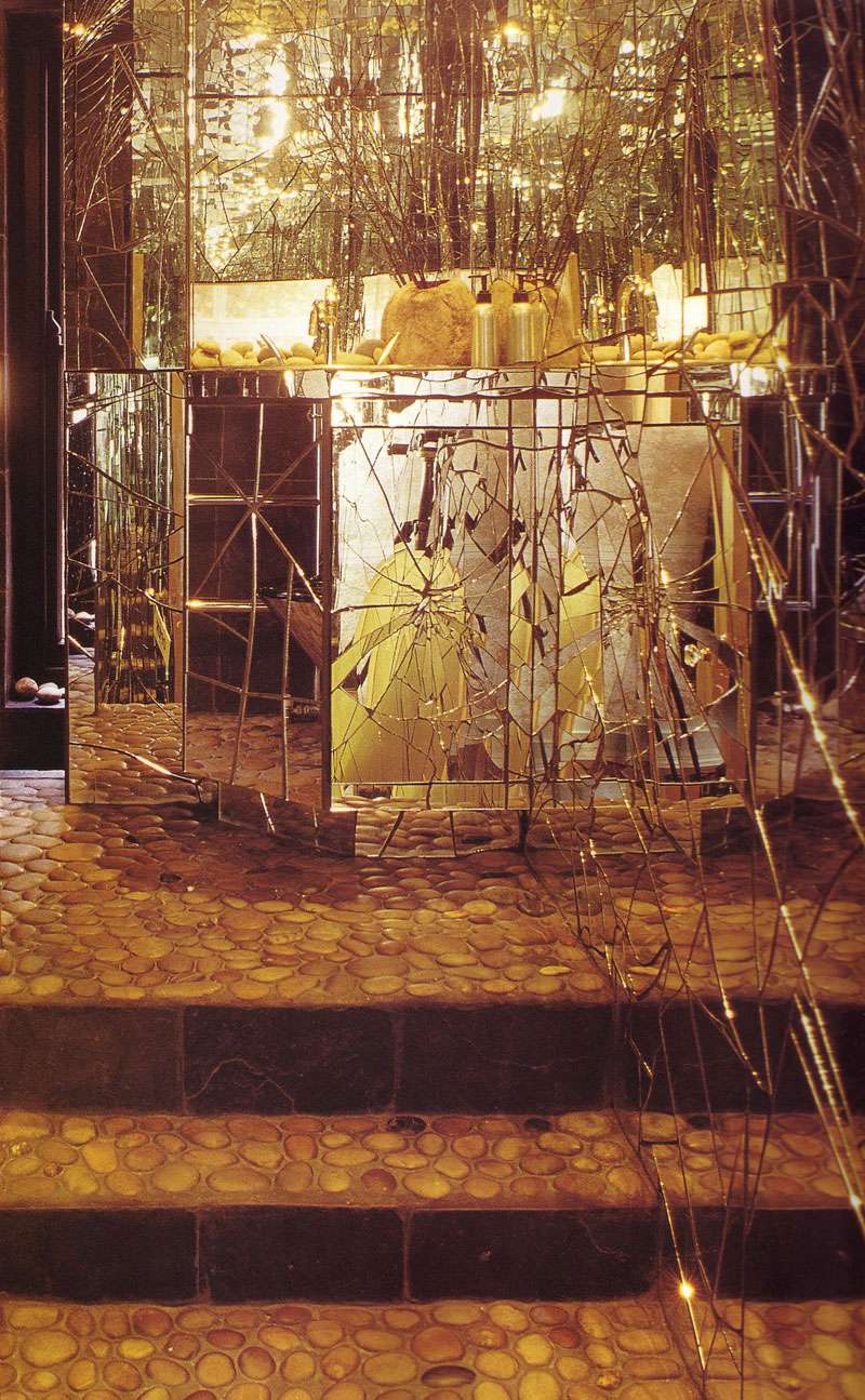


Above, Shattered mirrors in an interior by Carolyn Corben, from Divinely Decadent by Stephen Calloway


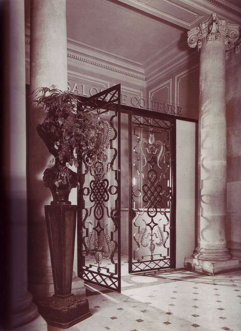
Above, Entrance gate at the Salon de Coiffure, Institut Harriet Hubbard Ayer et Alexandre de Paris, photograph c 1946 by Gilbert Poillerat, from Baroque Baroque by Stephen Calloway.


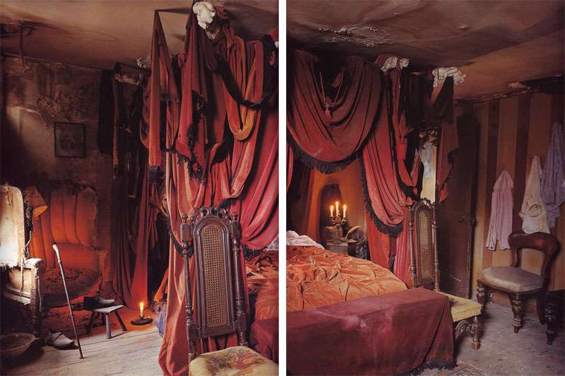
Above, an interior by Dennis Severs, inspired by Charles Dickens' Christmas ghost stories. From Divinely Decadent, by Stephen Calloway. 

As I was perusing these jaw droppingly gorgeous images from Calloway's books, it suddenly dawned on me that I'd SEEN HIS RESIDENCE!!!!  These are the moments I giddily relish (it's like a behind-the-scenes peek- the man behind the curtain!)  Not surprisingly, the accompanying article was about using your living space as an experimental "taste laboratory."  I liked this idea, and so, I've scanned Calloway's apartment to share with you:


Above, Calloway and his wife, artist Oriel Harwood. From House and Garden, April 1991.

For me, this space isn't so much about perfection in taste (I don't necessarily even LIKE certain aspects of it), but it's not about that.  It's more about the excitement of seeing someone's vision and design journey; its an appreciation of the extremely personal nature of the apartment, even if it's almost too personal to love wholeheartedly unless you're the designer.


In other words, I'm intrigued. And appropriately so. After all, what could be more baroque than that?


Scans of Calloway's residence from House & Garden, April 1991.

10.14.2009

Black Lacquer and Velvet: An Interior Life

In a New York Times article, designer Rick Owens said of his work, "...it wasn’t about displaying one’s wealth, but rather giving the woman a selfish pleasure. It is about using sable as the lining under a very humble jacket, the luxury is all hers.”  
This statement has stuck with me for a while; I like thinking of luxury in this way. Luxury shouldn't be about flaunting wealth, but making yourself happy, indulging your own whims.  Luxury can be subdued and indulgent, all at the same time.

I was toying around with these ideas while thinking about secretaries.  As furniture, secretaries are unique in that they're entirely transformable— they have two separate sides, an exterior facade and a secret interior life. 


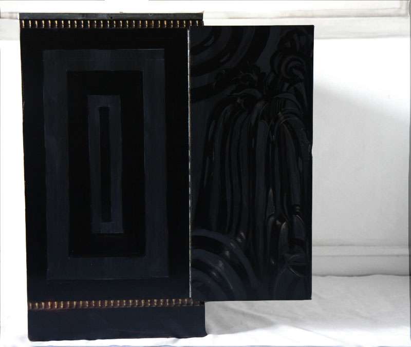
THE EXTERIOR: For the exterior, I planned on black.  Problem is, black isn't black.  Aside from color variations (green black, purple black, blue black...), there are differences in finish.  Black can be glossy, black can be matte.  Wouldn't it be interesting, I thought, if the two were played against each other? I envisioned a moment where velvet meets lacquer.  All monochromatic, totally black, and only visible from certain angles, when the light hits the finish in a certain way.  Entirely indulgent, but partly a secret, never fully revealing itself.


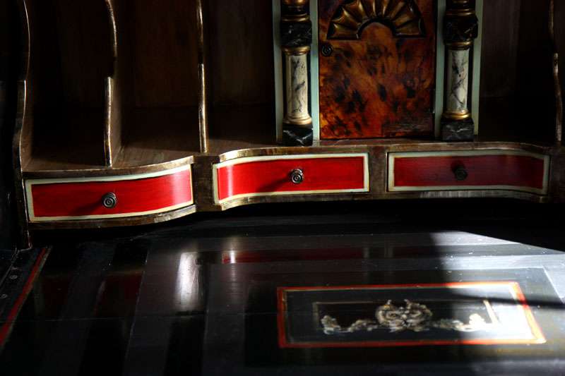
THE INTERIOR: Fling the doors open and pull down the desk top, and the secretary's "inner life" is revealed in the form of tortoise, metallics, marble, distressed canvas, tromp l'oeil ornaments, tomato red and powdery aqua accents.  But the choice is yours how much you'd like to show.  Place books on the shelves and you cover the tortoise, papers on the desk and you obscure the grotesque, envelopes in the letter slots and you mute the metallic.  Or, just close the desk entirely...


Secretary, styling, and photography by (IN)DECOROUS TASTE.

10.13.2009

All That Glitters...

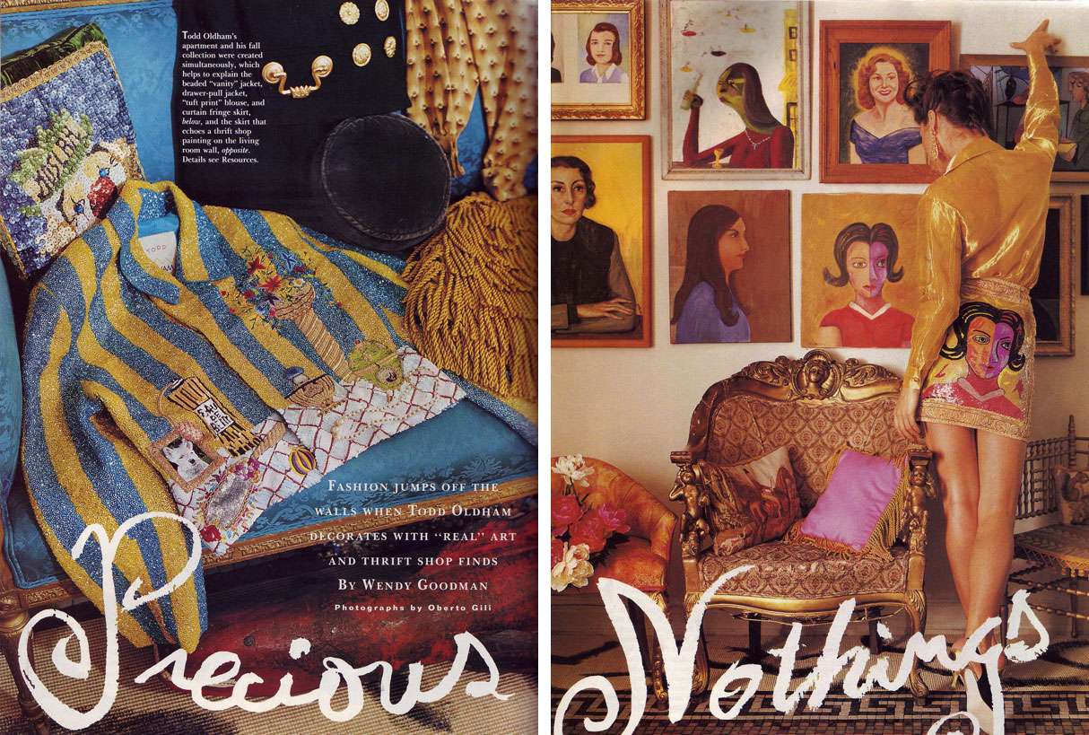
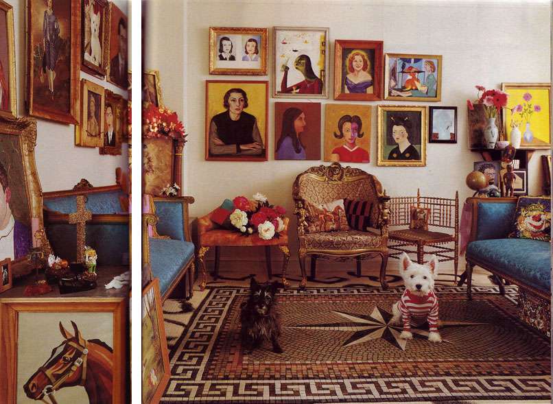
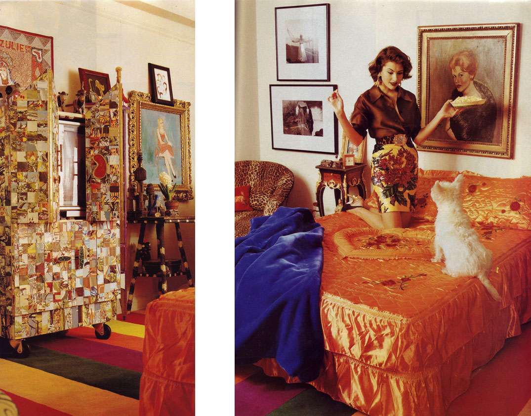
...apparently resides in Todd Oldham's apartment.

Fashion designer Todd Oldham on his apartment with partner Tony Longoria:
We blend the real and the precious— which is usually what we call junk.  I have such a strong understanding of luxury and a strong understanding of junk and the way they can be combined.  It's not a reference point that is immediately accessible to a lot of people.
                                                                                                             House & Garden, September 1992


Scans from House & Garden, September 1992

10.12.2009

Parachute People

Not too long ago, I wrote a post about Norma Kamali's apartment from 1988.  Her most recent collection  (below) looked suspiciously (no wait— exactly) like her drapes, leading to some speculation that Kamali had pulled a Maria von Trapp and fabricated clothing from her Austrian blinds. 

Today, someone left a comment and set me straight:

HELLO PEOPLE!!!! THESE ARE NORMA'S FAMOUS PARACHUTE CLOTHES MADE FROM ACTUAL ARMY PARACHUTES.

HER SIMILAR PARACHUTE DESIGNS ARE ON DISPLAY AT THE METROPOLITAN MUSEUM OF ART IN NY..

WWW.NORMAKAMALICOLLECTION.COM

WELL. In that case!  Dearest Norma, I am sorry for the confusion. Your models did not in fact teleport/time travel from the '88 apartment as I once believed, they actually PARACHUTED!!!

Lonely Light: Hammershøi, Ilsted, and Holsøe

Sometimes, ideal color palettes present themselves not in the form of a decorator's advice or a paint swatch, but connive their way into your brain via photographs, images, and paintings.

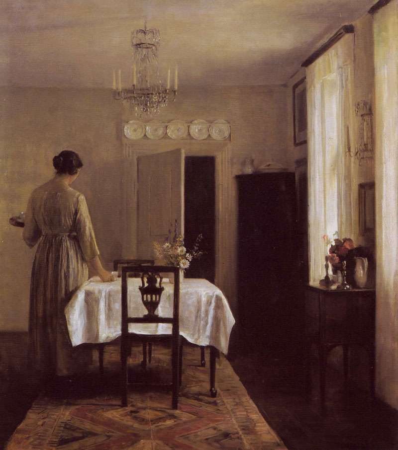
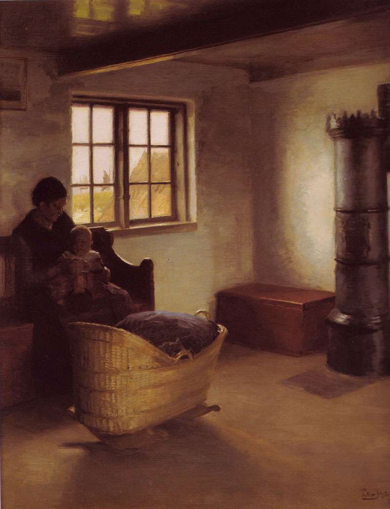
Such is the case with works by Danish artists Carl Holsøe (1863-1935), Peter Ilsted (1861-1933) and Vilhelm Hammershøi (1864-1916). Plunging the depths of my inspiration file, you might be surprised to learn that I have saved a whole SEA of their paintings, all depicting stark, minimal interiors.

Yes, yes, I know! I am, at times, (you know, every now and then, just a little) predisposed to liking what one might call a "maximalist" space. But Hammershøi, Ilsted, and Holsøe have a lot to teach about color.

A sampling of their dead-spot-on tonal values, soft light, and delicate, lonely, interiors:


Above, Interior with Piano and Woman in Black, Vilhelm Hammershøi, 1901


Above, Artist's Wife Setting the Table, Carl Holsøe


Above, Interior with Young Man Reading, 1898, Vilhelm Hammershøi


Above, Interior, Strandgade 30, Vilhelm Hammershøi 1899


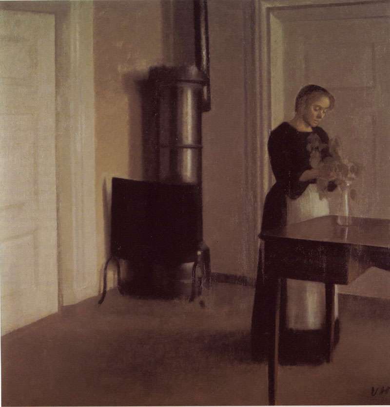
Above, Interior with Woman Placing Branches in Vase on Table, Vilhelm Hammershøi 1900


Above, Untitled, Vilhelm Hammershøi 1914


Above, Mother and Child, Peter Ilsted, 1892 

10.10.2009

Guess Who's Coming to Dinner?

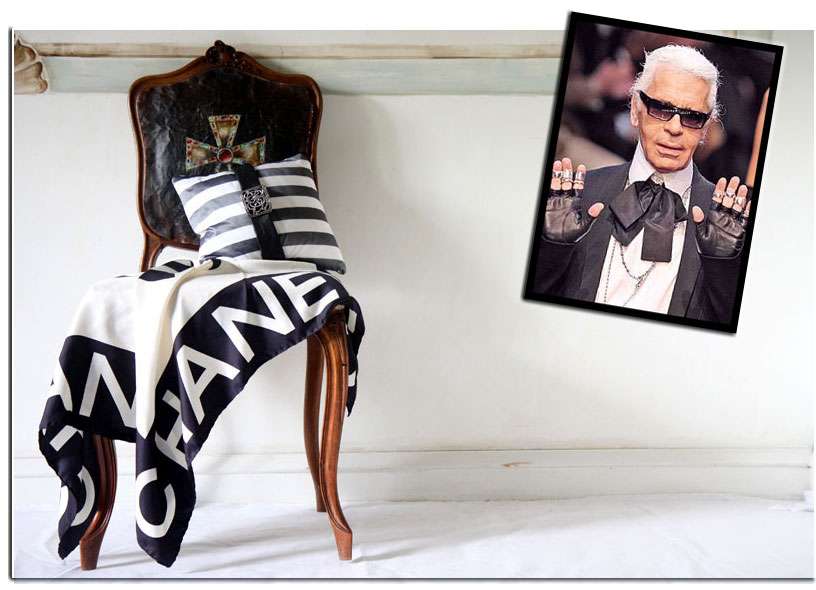
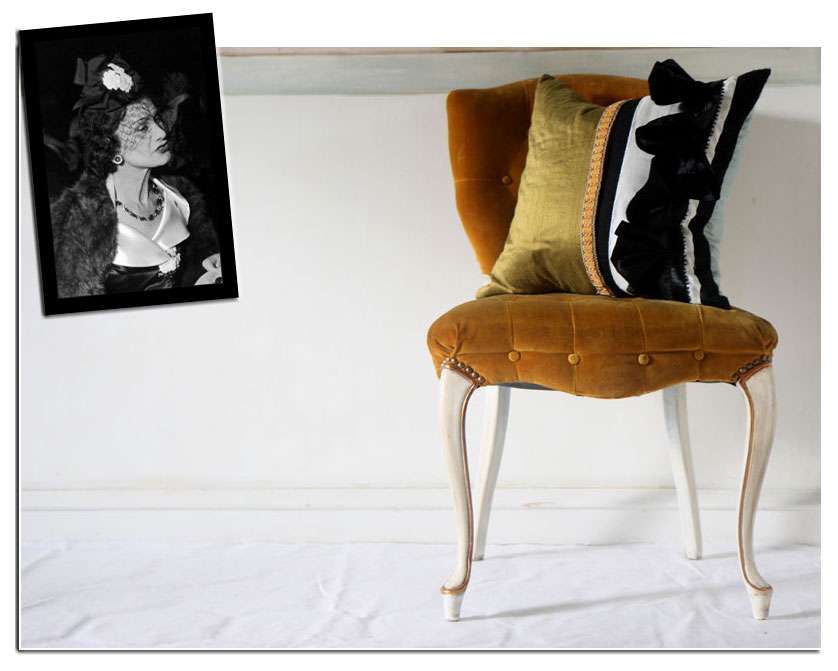
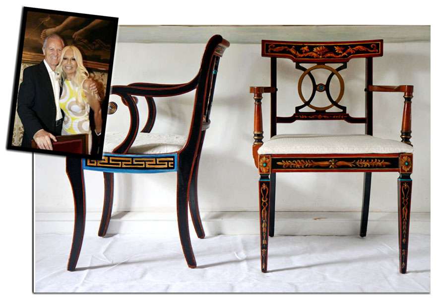
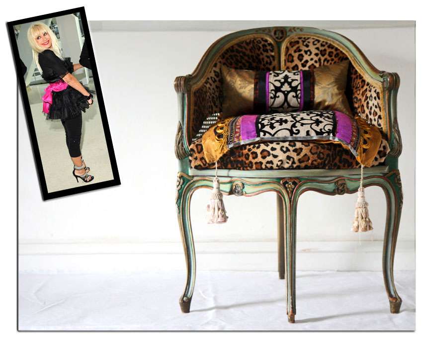
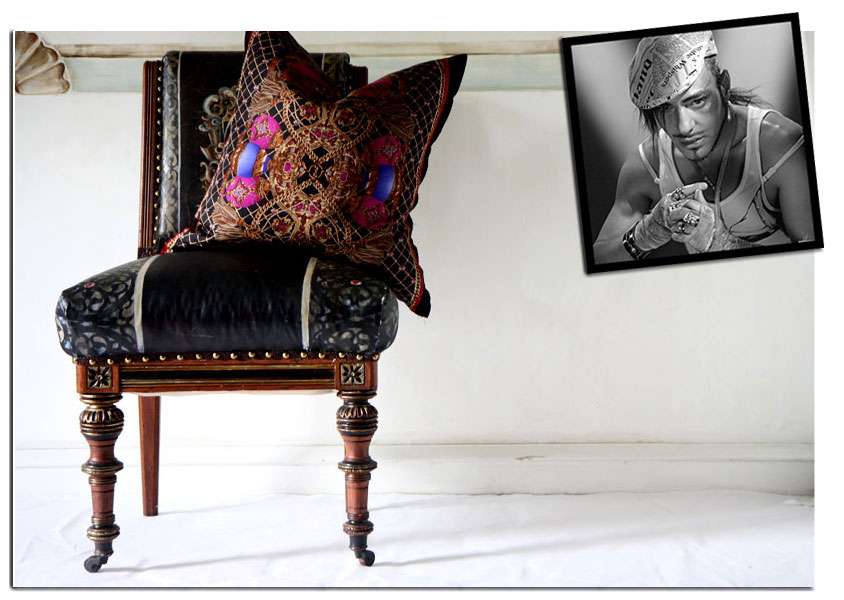
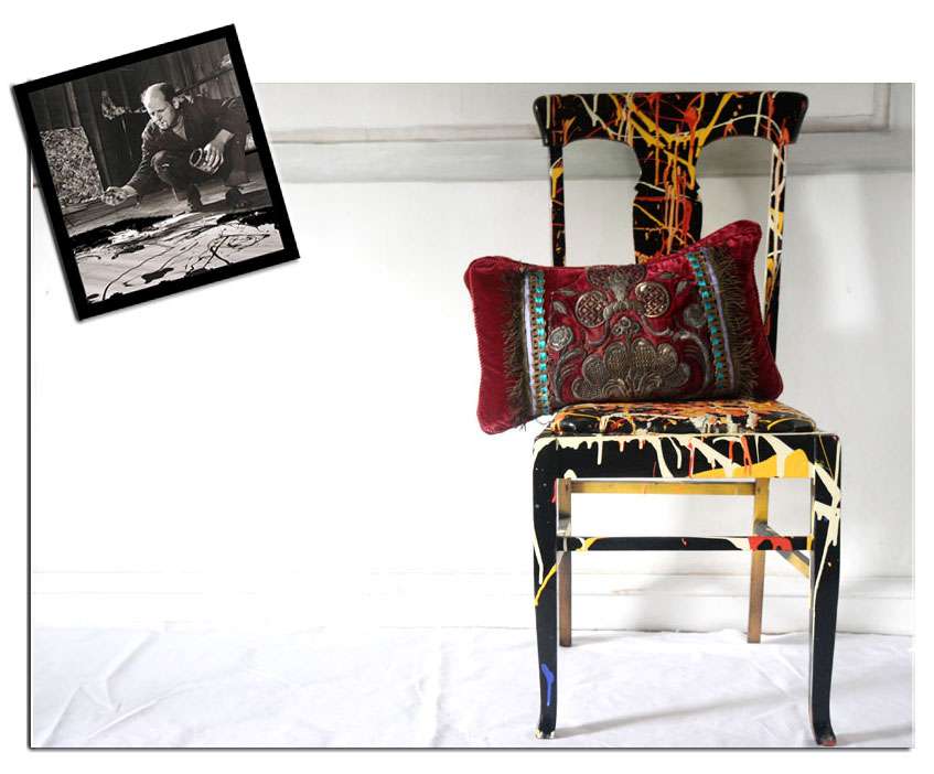
I have a running joke with my mom that some of the chairs we've created over the years have (very much inadvertently, if you can believe it) taken on the personas of major fashion designers and artists.   Put them in a room together, and you have one heck of an A-list party...of chairs.

We even refer to them by their given names: "Have you seen Karl (Lagerfeld)?" "Last I saw him, he was in the closet with Betsey (Johnson)." Or, earlier: "You can sit on Jackson (Pollock). Gianni (Versace)'s seat is too pristine." Peculiar set up, to say the least.

So who's coming to dinner, you ask?

Karl Lagerfeld, clad in painted canvas upholstery:


Coco Chanel, sporting velvet tufting and a clean black ruffle:


Gianni and Donatella Versace, never without their Greek keys and ornamentation:


Betsey Johnson,  looking leggy in a sassy pink silk and leopard print:

John Galliano,  swashbuckling in studs, decked in pillaged gold and silk jewels:
And Jackson Pollock, looking electric and dripping liquid sunshine:


All chairs, pillows, and upholstery, photography and styling by (IN)DECOROUS TASTE.

10.09.2009

Seductive Sythetics: Living in a Plastic Bubble

Decorating Ideas For Every Room In Your Home, 1969.  A GEM.  At least in the sense that the editors exhibit an unusual zeal for all things vinyl, Caprolan (??), rayon, laminate, olefin and nylon.   Their enthusiasm is infectious, yet I can't help but think that after the fact, some of these designers would rather have had the public not know about these deep, dark, design secrets.

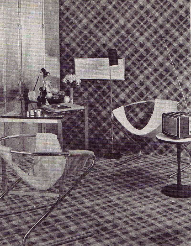
Check out this upholstered room  by Mark Hampton, for instance.  Can you believe the nylon plaid that crawls right off the floor and UP THE WALLS!? I can only imagine it would be difficult to watch that tiny television. Surely, one's head would be spinning from all the plaid:


 Above "Bold plaid design of all nylon carpeting covers the floor and then goes up the wall; its splash of color echoes the steel-strong mood of the room." Design by Mark Hampton.


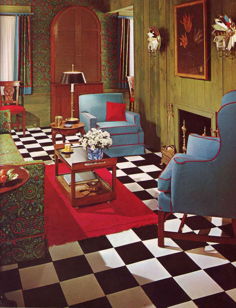
Above, "Fabrics lend flair to a living room made attractive and inviting by the well planned juxtaposition of pattern color, scale and texture.  The key print [is a] a weave of Avisco rayon and cotton [and] flooring is vinyl tile." No designer credited.  (Well planned juxtaposition? They're so serious!)


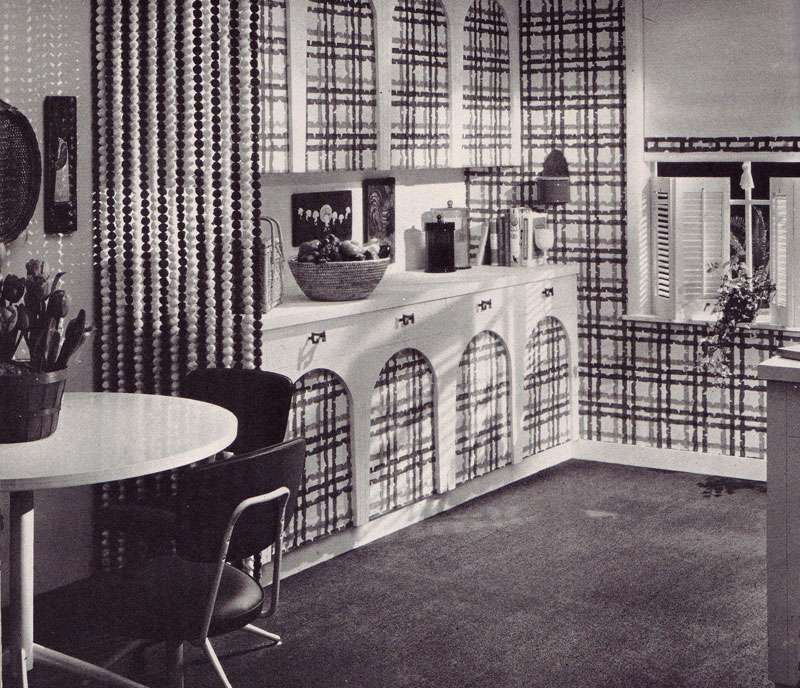
Above, "Dining rooms are formal and informal...Entire kitchen and bookcase can be closed off by wood-grained folding doors, but when they open (ed: get ready for it) they reveal plastic-faced cabinet screen printed to match fabric on upholstered pieces.  Red formica topped table serves for dining." No designer credited.


Above: "Vinyl floor by Amtico was custom-colored to match print and wall tones."


Above: "A great way to add style to your kitchen, and easy maintenance too— a wall to wall kitchen carpeting such as the bright blue carpet by Thomas Pride Mills, used in attractive kitchen [above]. Made of all-Herculon olefin fiber, carpet eliminates waxing, mopping and polishing..." A carpet in a kitchen is easy maintenance? Clearly, they haven't been in my kitchen while I cook.  I shudder to think what bright blue olefin looks likes.  Am I EVER glad this image is black and white. 


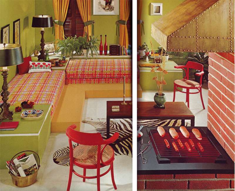
Above: "Family room sets the mood for fun and games...practical white vinyl floor... gets the punch of a zebra skin trophy..." Are those hot dogs vinyl too?
Related Posts Plugin for WordPress, Blogger...