4.30.2009

The Freshest Fragrance


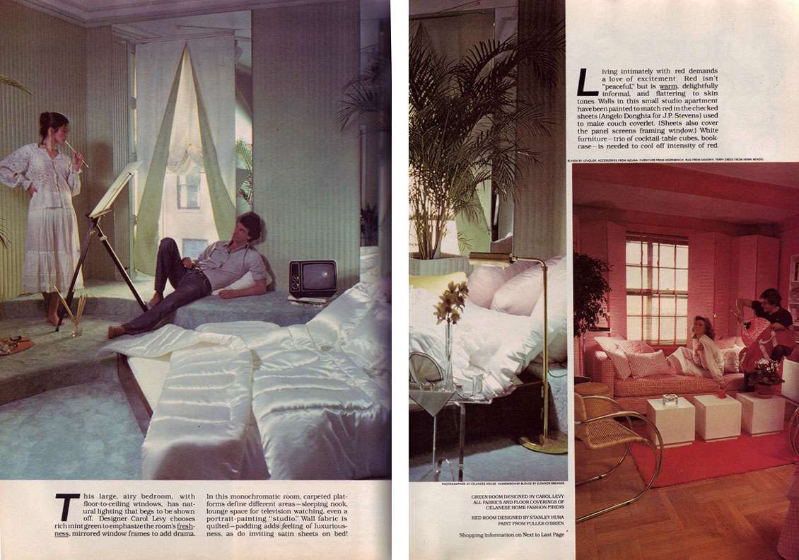
Sometimes, all it takes is a bouquet of fresh flowers to make you realize how deficient even the most expensive perfumes are at making a room smell heavenly.

It occurs to me that magazines frequently run stories on the best home fragrances— in the form of sprays, oils, atomizers, candles, diffusers, potpourri, incense, you name it. And frankly, most of them are god awful. Someone needs to do a story on the various fresh flowers that can be used to fragrance a room. Stat.

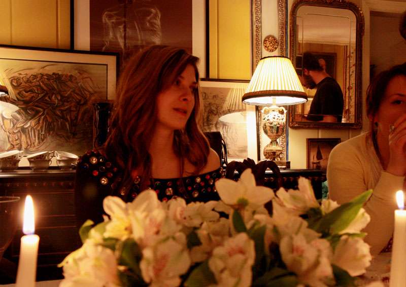
I write this because I currently have a pot of Oriental lilies sitting on my desk and I'm fully convinced I have a new favorite flower. So convinced,
that even though I'm quite aware a photograph can't convey scent of any sort, I still felt compelled to shoot them.

I'd describe the aroma as really thick and sweet, sort of smoky or woody even. It's soft, but it definitely permeates the room. Makes me swoon every time I inhale, actually.

4.29.2009

Forcola Forms

I've always felt that the only thing more gratifying than discovering a beautiful objet d'art is appropriating one from an unexpected context.

Take, for instance, the forcola. These are pretty much a perfect example of what I'm talking about: Hand carved, sinuously graceful forms that are actually designed to hold the oar on a Venetian gondola! In any case, one — or even better — a collection en masse, would make an interesting addition to a vignette. Almost better than a collection of obelisks, even.

I think it's the solid architectural quality that appeals to me most. Actually, I think I may have read somewhere that the architect I.M. Pei was similarly captivated by their form, but don't quote me...

As for my shot of the gondola factory, well... just chalk it up to being in a Venetian mood. And seriously, if anyone is planning a trip to Venice anytime soon (jealous!), there's an amazing cicheti place right across the canal, in Dorsoduro. Mmm... I think I need a vacation.


Forcole from the workshop of Saverio Pastor. Photos by Sergio Sutto, from forcole.com.


Gondola factory in Dorsoduro, Venice, Italy.

4.27.2009

The (Not So) Sexy Seventies

One of life's simplest joys is perusing womens' mags from bygone (read: antiquated) eras. Take, for instance, this delightful Cosmo fr0m the 70s.

My question is this: How did people survive 1978?! Where, oh where, do I begin?

I mentioned yesterday that decor from the 70s often looks extraordinarily dated. Case in point follows. Not even in my wildest dreams could I imagine, however, the horror apex of perfection that results when you add in a matronly lady wearing more lace than Queen Elizabeth, seducing a splayed-leg archetypal porn-star plummer. I mean, seriously, are we to believe that our lady friend has just rolled out of bed in her polyester jammies with intentions of perfecting a new painting technique that involves holding her brush like an, uh, bat, and sucking on it? This is questionable.


Moving right along, Richard Simmons doles out advice on "spending a healthy weekend with your mate." Perhaps the couple above took his advice to heart, sort of like the couple rollerskating in tube socks (but somehow, the poor things have forgotten their pants!) below. I didn't know that Richard Simmons (sans afro, below) produced stories for Cosmo. No, really. This isn't a joke. Richard Simmons is actually credited as the producer.


And hey, if healthy living isn't your thing, take tips from the stars on staying svelte in "How to Stay Thin," (or, "How to Develop an Eating Disorder"). The real cherry on the cake is Geraldine Chaplin: "I tell myself food is horrible...or I think of all the romantic heroines who died of consumption." Say WHAT? Did our dear Geraldine actually believe that the heroines ate themselves to death?!! This is a frightening image. Someone, inform the girl that consumption=tuberculosis! On another note, I wonder if Babs is still avoiding cholesterol.


Scans from Cosmopolitan, July 1978.

4.26.2009

I Like My Neutral Well-Done

Feeding my growing fascination with texture, white on white and beige color palettes, and weirdly fantastical design elements, I stumbled upon the work of John Dickinson (1920-82), a San Francisco based designer who was popular in the 60s and 70s. Funny how work from this era is so prone to looking dated, yet this work looks just as fresh now as it must have then.

Every month, there's a certain subset of design mags that inevitably run stories on neutral color schemes. You know the drill: "Neutrals are anything but boring!" "Neutrals are the new trend!" "Neutrals you can live with!" Etc. etc. etc.

I love neutrals as much as the next person but there's such an abundance of really generic, uninspired design in this arena that it's easy to forget how great a room can look when someone who really understands color and tactility puts it together. And this is precisely why I was captivated by his work!

His own residence in San Francisco is hitting all the right notes for me right now. Apparently, it was one of the most heavily photographed interiors in its day. Textured walls, subtle play of warm creams and ochres, complete with the density and dryness of his plaster heads and furnishings contrasting against the shiny surfaces... it's heavenly. Now THIS is a neutral well done:


As you might know, I've been feeling (this is an extreme understatement) white on white vignettes as of late. I've been contemplating doing my own involving ostrich eggs for some time. Seeing this image on the left has confirmed that desire. Can you tell that Dickinson worked in window display before becoming a decorator? And that building facade on the right ? Oh, that's a carved wood closet. Is your jaw dropping yet?


Above images from The New York Times Book of Interior Design and Decoration by Norma Skurka, 1976.

Finally, two of Dickinson's plaster tables. The dense chalky plaster and mottled slightly warm color make all the difference when pulling off a design that's more, uh, "out there.," like say, for instance, a hoofed table. I remember reading a quote somewhere that it's much easier to pull off avant-garde shapes and proportions when color is kept to a minimum. Of course, it was in reference to clothing, but you know, I think the same holds true for interiors.


F
or those interested, there are a few of Dickinson's pieces up on 1st Dibs at the moment, including one of his famous footed plaster tables (asking price is $35,000.00). Anyone interested in buying me an early birthday gift? Ahh, if only.

4.23.2009

Lick These Windows

The French translation of "window shopping" is "lèche vitrine," which, incidentally, literally means "window licking." I've always thought this was a little bizarre, but sometimes, I can see where they're coming from.

There are few things more inspirational than a well done window display. A beautiful window is like an engaging, voyeuristic snippet for the gossipy Betty in all of us— a 3-D interpretation of surrealism, a fabulous dramatic set without the boring play. Inventive use of materials? Check. Bizarro nightmarish hellbeasts? Check. Gorgeous Clothes? Of course! Something about the medium just lends itself to so much more inventiveness than most people would ever tolerate in an interior.

1. If it weren't a long gone holiday window, I would consider moving into this texture filled white-on-white fantasy for Bergdorf Goodman, under the direction of Linda Fargo.


Photo by Rudy Pospisil, anothernormal.com


2. Another holiday window from Bergdorf Goodman, under the direction of Linda Fargo.

Photo by Rudy Pospisil, anothernormal.com


3.
Windows for Barneys, under the direction of Simon Doonan. The way that Doonan incorporates the most unconventional objects (read: trash) into his creations always amazes me.

From Confessions of A Window Dresser by Simon Doonan

4. Windows for Barneys, under the direction of Simon Doonan.


From Confessions of A Window Dresser by Simon Doonan

5. Windows for Barneys, under the direction of Simon Doonan.


From Confessions of A Window Dresser by Simon Doonan

4.21.2009

Indecorous Cake

Am I the only one addicted to that Food Network show "Challenge" where contestants furiously concoct sugary sculptures 3 foot plus in height? As if these wouldn't stand on their own as centerpieces, it's made so much better by the fact that the medium is...cake.

I wonder what happens when the show is over. People can't actually eat the centerpieces. Can they?


Images from Food Network Challenge.

4.14.2009

You Are What You Read


Well, maybe not. But at the very least, your design aesthetic is informed by what you read and look at; of this, I am convinced.

For that reason, I've always loved looking at the books that are used as props in shoots. It's sort of one of those guiltily satisfying games, you know? Books on display in rooms are funny things: either someone reads them and loves them, or wants you to think that they read them and love them. Involve stylists, decorators, proud homeowners and magazines with international readerships, and well, what you get is a fantastic game of artifice!

That having been said, these are a few of my (genuine) favorites at the moment (clockwise from top left.) As a side note, any of these would make fab gifts for the design minded and creatively inclined:

1. Artists' Houses by Gerard-Georges Lemaire, Jean-Claude Amiel. The lives and personal spaces of creative and eccentric people are a source of never ending interest to me. This book has all of the standards (Church, William Morris) and impressively, some more bizarre finds.

2. Faberge and the Russian Master Goldsmiths, by Gerard Hill, G.G. Smorodinova, B.L. Ulyanova. Gorgeous, glossy images of the famous eggs, jewelry, and other objets d'art. We've all seen the eggs—in my opinion its the copious images of snuff boxes, jewelry, and imperial gifts that make this book really worthwhile.

3. Inside the White Cube: The Ideology of the Gallery Space by Brian O'Doherty and Thomas McEvilley. A really thought provoking look at the confines of the "white box" gallery and the ways in which artists have reacted to it. This one always makes me think about context, and how I choose to display art.

4. Vogue Living: Houses Gardens People by Hamish Bowles. This hefty volume has gotten a lot of hype, but in my opinion, it's well deserved. Of course, glossy images of interiors are always more interesting when there's a character involved, and there's a whole lot of character in here— everyone from Madonna to Julian Schnabel, and plenty in between.

5. Beds by Diane Von Furstenberg. Beds are an intimate window into their owner's lives, and good old Diane has assembled quite an impressive collection of some of the finest bedrooms around.

6. Dictator Style by Peter York and Douglas Coupland. This one is all in good fun. The tone is casual, but the writing leaves a lot to be desired. Some of the images are surprisingly posh, some are riotously hilarious.

7. Tony Duquette by Wendy Goodman, Hutton Wilkinson and Dominick Dunne. The images in here are literally like dreams. Think fantastical sets, elaborate costume balls, and creative, over the top interiors.

8. Confessions of a Window Dresser: Tales from the Life of Fashion by Simon Doonan. The bizarrely cool creative director from Barney's shares stories of eccentricity and comedy, alongside images of imaginative and surreal window displays. What's not to love?

9. Interiors by Minn Hogg, Wendy Harrop and the World of Interiors. Some of the best interiors you'll ever encounter, divided into several decorating "categories". I go back to this time and again. Enough said.

10. The Hermitage: The History of The Buildings and Halls ed. by Nina Grishina and Maria Lyzhenkova. Bar none, my favorite museum is the Hermitage. The way one views art here makes it worth the trip to Russia alone. This book is about the building itself, rather than the artwork hanging on the walls. Take note of the richly textured finishes and luscious use of color.

4.12.2009

Green (and red, and blue, and white) Eggs and Ham

When we were kids, my mom enrolled my brother and I in a mini course that taught the art of dying Pysanky— Ukranian easter eggs. Two things: 1. We're not of Ukranian descent. 2. We were never raised with religion. But who cares? Pysanky is quite beautiful and the process by which it's created is interesting and involved.

Of course, we made the eggs when we were young and they're not refined like ones made by professional artisans, but there's still something redeeming about them.

On another note, I'm kind of obsessed with the architectural quality of clean, blown ostrich eggs. If you didn't know better, you might think they're porcelain. Currently contemplating amassing a ton for a little vignette or something. We'll see.


4.11.2009

Dinner Craze, Part 2

I love pre-spring dinner parties. Feeling obsessed inspired by the last dining room I posted, I whipped up my own version. These first two images look so fresh and cheery; it's funny how nighttime, reflective surfaces, candlelight, and a trashy 80s gem-encrusted number can completely change the ambiance. Or maybe that was just the wine I polished off while cooking dinner... cheers!


4.07.2009

Inside, Outside-In Dining

I've been thinking a lot about outdoor dining lately. Too bad it's cold enough for me to be wearing two sweaters.

While pondering having guests wear gloves and parkas to dinner, I remembered this gorgeous image and promptly recovered from my delusions:


Interior Design by Robert Kime. Photo by Derry Moore. Scan from Architectural Digest, January 1995.

How lush is that?! Copious potted plants create a fantastic wall of greenery, minus the pesky bugs I'm surely going to be complaining about when I do finally have my dinner outdoors. It also doesn't hurt that the Chinese lanterns and soft light remind me of John Singer Sargent's "Carnation Lily Lily Rose." Actually, that's a pretty great source of inspiration for an elegant springtime dinner; I wonder if Kime had it in mind when he designed his conservatory dining room...


Carnation, Lily, Lily, Rose by John Singer Sargent, 1885-86. Oil on Canvas.

4.04.2009

Wall of Mirrors

Soft lights reflected in hazy antique mirrors radiate a seductive beauty that can only be described as sexy. So, boys, take note: Forgo the disco ball, cheepo satin sheets and cheesy pickup lines, and go get yourself some old mirrors and candles instead.

In all seriousness though, I'm all over this look. For a fresh interpretation, you might assemble a mosaic with panels of antique mirrors:


Franz von Stuck's reception room, from House & Garden, March 1986. Photograph by Evelyn Hofer

Or you could try a more traditional approach and arrange framed mirrors on a wall alongside paintings:


Dining Room by Alain Demachy, from Architectural Digest, September 1998. Photograph by Marianne Haas

4.03.2009

A Peek...

Some people make impulse purchases of things like magazines and chewing gum. A rainy day antiquing session led to my purchasing a new bed.

So, the checking account will hurt for a little while. But what can you do when love strikes? I remember once reading an article suggesting that one should only buy furniture out of love, never necessity. The author spoke of being young and abroad and falling for a coffee table that she could barely afford and for which she didn't have the space. She credited this experience for changing her outlook on buying furniture; w
hile her interior changed countless times over the years, it was never without her beloved pieces.

The idea is that if you buy only decor you fall in love with, your interior will take more time to construct, but you'll never grow tired of it, as you'll always find a place for those pieces that speak to you. I adore the interiors of collectors' for this very reason.

As soon as the weather clears up, I'll foray into the world of the French polish. Until then, I leave you with a peak of things to come:


Related Posts Plugin for WordPress, Blogger...