2.28.2010

SHE SHOT MARILYN

Dorothy Podber (1932-2008): Warhol scene girl, performance artist, wild woman:


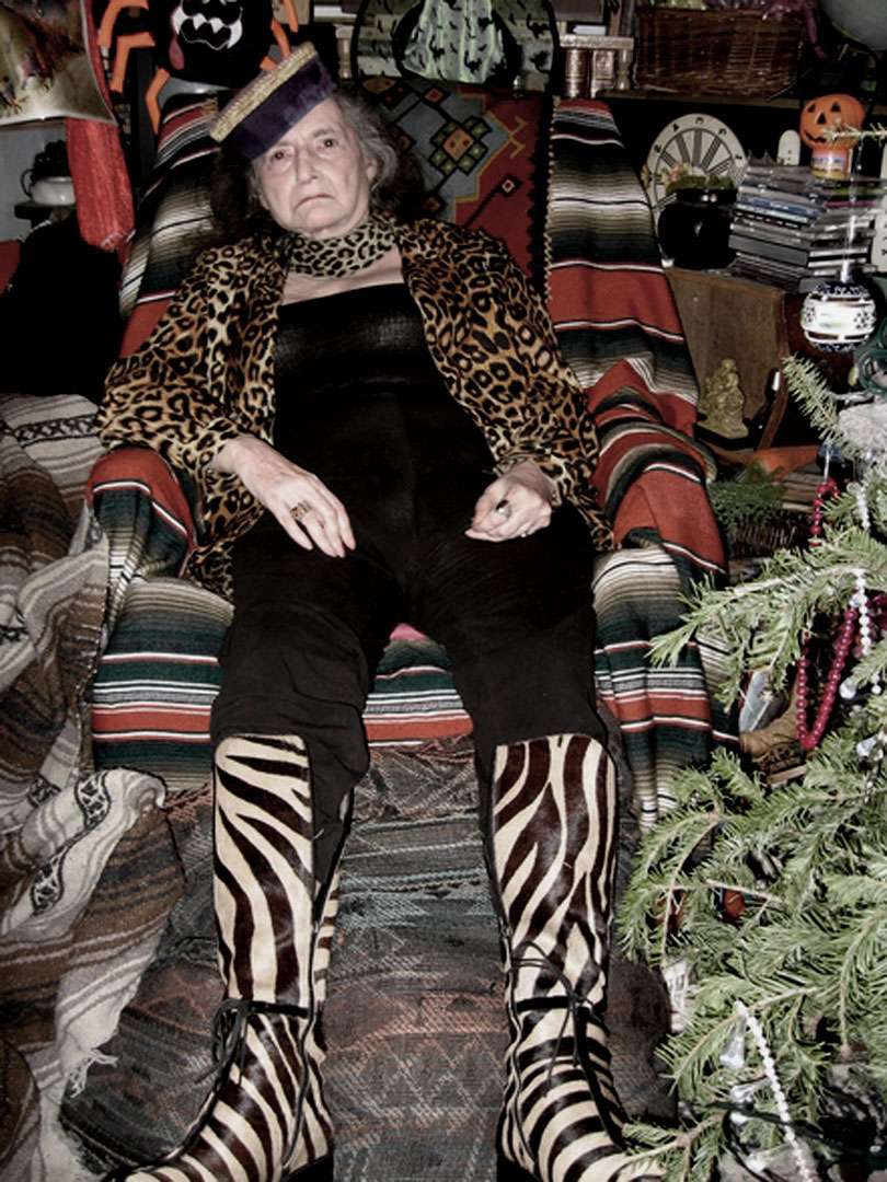
She was most famous for shooting Andy Warhol's Marilyns, literally.  In the forehead. With a pistol.  After which, she was instructed not to return to the Factory.  It's worth noting that the "shot" Marilyns are vauled higher than their unshot counterparts.

From the NY Times obituary:
Certainly the most outrageous [of her exploits] was her unsolicited contribution to a few of Warhol’s “Marilyn” silk-screen paintings. In the fall of 1964 Ms. Podber, a friend of the photographer and Warhol regular Billy Name, visited Warhol’s Factory on East 47th Street in Manhattan with her Great Dane (named Carmen Miranda or Yvonne De Carlo, depending on the account). Ms. Podber asked Warhol if she could shoot a stack of the “Marilyn” paintings; he apparently thought that she wanted to take pictures of them and consented.

But she produced a pistol and fired at them, penetrating three or four. One of them, “Shot Red Marilyn,” with a repaired bullet hole over the left eyebrow, sold for $4 million in 1989, at the time setting a record at auction for a Warhol work.

“After she left,” Mr. Name told Ms. Bergmann, “Andy came over to me and said: ‘Please make sure Dorothy doesn’t come over here anymore. She’s too scary.’ ”
Ms. Podber told Ms. Bergmann that when money was low, as it often was, she generally found unorthodox ways to make it. She once ran a service that dispatched maids to doctors’ offices, primarily as a way to get the keys to the doctors’ drug cabinets. “I never worked much,” she said.
From Joy Bergmann's article, at Sapid and Rapid:
During Dorothy and Ray [Johnson]’s ‘dead animal’ phase, they gave Heide a gift: a clock with no hands. “When you opened the face of the clock, out dropped a rat, spray-painted gold.”

Isabelle Fisher remembers Podber being held at the Women’s House of Detention on Sixth Avenue for running an illegal abortion referral service; according to Podber, an abortion was also performed in her apartment...
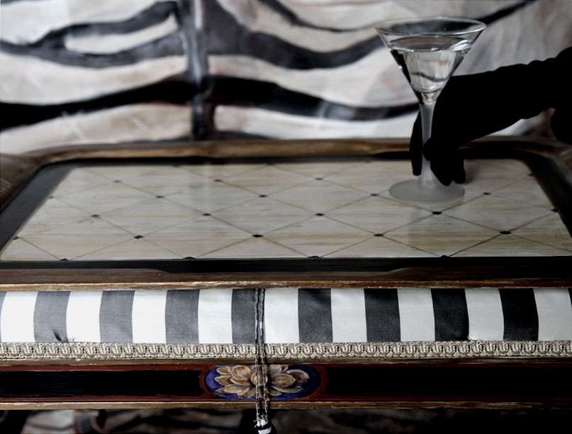
Another time Johnson invited a collector up to his Norfolk Street apartment for a viewing. Upon arrival, the space was completely bare, save for an armoire in the corner. Johnson reportedly said, “This is my work,” opened the cabinet and Podber jumped out, laughing weirdly.  
Madness embodied. Is it any wonder? She was known for the generously sized bowl of crystal meth she kept on her coffee table.

Best friends with Ray Johnson (see here).

Oh, and she kept a pet marguey.—you know, a type of ocelot.

2.26.2010

YOUNG ONES

And, while we're at it, it's always interesting to see the collections from design schools.  These, from Central Saint Martins, FW2010.

Human topiaries? COUNT ME IN.

Shao-yen Chen, Central Saint Martins, FW2010. Images via style.com

Also fabulous. The length and puddling effect on the maxis appeals to me immensely.  Now that I look at it again, I like the one on the far right a little less so. Thoughts? Have you looked at the Fall 2010 collections? Favorites?

Joanna Green, Central Saint Martins, FW2010. Images via style.com

BLACK & WHITE

Sass & Bide, absolute favorite show thus far for FW2010.

Sass & Bide, FW 2010. Images via nymag.com

And, Rad Hourani's got the unisex thing down PAT; I can honestly say I'd wear any one of these.

Rad Hourani FW 2010. Images via style.com

2.25.2010

COLOR IN THE TOILE: AN EASY DIY

Remember how satisfying coloring books were when you were a kid? This is better, I promise.

Maybe it's my bizarre obsession, as of late, with insanely candy colored floral chintzes getting to me, but I literally "colored in" an old scrap of Schumacher toile using Sennelier's Tinfix fabric paints (just Google for internet retailers).  Use a paintbrush— it goes on just like water color— and although the site says it's only for silk and wool, don't listen to them.  The dyes are more vibrant on those fabrics, but sometimes, you don't want to need sunglasses to look at your pillows. (Or alternately, drapes. Holy god, I just had a thought...how amazing would giant, billowing drapes of water-colored toile be?!)   The toile I used was cotton.


Styling and photography by (IN)DECOROUS TASTE.

2.24.2010

TASTE VACATION

"Taste which is not one's own is a sort of holiday. One criticises but enjoys." 

So said writer and artist Denton Welch (1915-1948), in the last sentence of his Journals.  Agreed.  Sometimes you need a vacation from your own taste.  What would yours look like?

Have you seen Philippe Starck (of ghost chair fame)'s hotel Palazzina Grassi Venice?  The renovated aristocratic home on the Grand Canal opens this month.  It's different from what I'd normally be attracted to (especially given the location, I'd usually fantasize about something older, grimier, more gilded, you know...) , but there's something seductive in its glaminess.  Dripping chandeliers that look like they emerged from the canal, an excess of reflective surfaces (better start working out NOW), and shiny lagoon purple halls are calling my name:


Photos via Palazzina Grassi.

2.22.2010

VIVIENNE

A lot of what I love about style has to do with the personalities that bask in its glow.  Some people just hemorrhage personal style.  Like Vivienne Westwood.  She's fearless and looks like a whole freaking lot of fun.

Perusing her latest collection, it occurred to me that I usually appreciate her more for her personal panache and extreme eccentricities than for her clothes, although I'm thinking that this approach needs a  re-evaluation.  See multiple forms of outwear that I'm certain I need, and gold hologram/confetti-esque dress that I'm sure I shouldn't like, but from which I CANNOT LOOK AWAY:


Vivienne Westwood Red Label, F/W 2010/2011, Images via Style.com

Speaking of things from which I cannot look away: 


I'm curious to know what you guys think of the collection? Can it even approach her cult of personality? Westwood looks a little (no, a lot) like a modern version of Edith Sitwell:


Can you believe that she was a school teacher before she and boyfriend Malcolm McLaren (Sex Pistols manager) opened their shop SEX (whose bondage-y clothes were hugely popular with the punk scene in the 70s)?! Also, I'm loving these fleshy pink letters:

Behold the rubber curtains on the right.  Something about them is appealing.  Also, that's Vivienne, in the blue.  WOAH, can you believe it?

2.21.2010

A Crewel Twist

One of my favorite pastimes is making grandmotherly things un-grandmotherly.  Or, so I hope.  Case in point: crewel embroidery + baroque excess.  A month ago, I think I hated crewel, mostly because I associated it with that hippie/boho revival thing from a couple of years ago that makes me want to puke.  Lesson learned: one musn't throw out the baby with the bathwater.  This is almost a case of "a spoonful of baroque helps the crewel go down."  You know?


Styling and photography by (IN)DECOROUS TASTE. Painted furniture, painted panel, shoe, lamp and pillow also by (IN)DECOROUS TASTE.

2.19.2010

Full Facial Nudity

I never understand when people make assertions about "x" or "y" being the new "big thing" in beauty trends. Case in point: some local news reporter declared that "RED HAIR" is the "HOTTEST BEAUTY TREND" of the moment. Yeahhh, yeah... whatever. Beauty trends on the runway are always more diversified than trends in fashion.  Someone's always doing a red lip, a nude lip, a "fresh face," a red head, a kohl eye, you get the idea.  My personal favorite, however, is what I call "mannequin head."

By this, I mean  totally nude, washed out face, maybe sculpted with highlighter. Lips lacking in color.  No blush. Maybe some eye pigment.  Why am I drawn to this? I've been told by more than one person that it's corpse-like and creepy.  But still, I LOVE IT!

A few days ago, Style.com's beauty bloggers wrote about makeup artists ditching the blush on runways this fashion week.  I was never a huge fan of the stuff to begin with.  Thoughts? 

Models at Rodarte:
Image via style.com

At Katie Gallagher (glorious, no?):

And, an old Vogue Italia cover from Jan 2009 that's as lovely now as it was a year ago.  Classic (bronzed) nude face, by Pat McGrath: 


And lastly, my own take on mannequin head.  I can't even tell you how delighted I was to find that MAC's "Lip Erase" in Dim is no longer a Pro product (meaning, they sell it at the MAC counter in regular department stores).  It completely and absolutely obliterates all pigmentation in the lips, almost like concealer, but it's technically a lip balm.  A little drying, but I think it's worth it, and definitely one of my favorite makeup products, ever.  Other than that, I'm sporting NARS foundation in Siberia, extreme gobloads of MAC's eyeshadow in texture, and some random drugstore black liner/mascara. No blush.

So what will you be doing to your beauty routine this season? Switching it up? Same old/same old? Throwing away the blush and gobbing concealer on your lips? Or clutching the peachy powder with an icy grip of death?


THE ROCKS THAT I GOT

Okay, more like, rock (crystal) that I wish I had. And my deepest apologies for the J Lo reference, hahaaaa.

Images from Sotheby's Magnificent Jewels, Oct 1998 auction.


Above, Highly Important Art Deco eighteen-karat gold, rock crystal and enamel temple clock, Van Cleef & Arpels, Paris, c. 1926, made byb Verger Frères.
Made by Verger Frères, renowned during the 1920's for their spectacular timepieces, the present clock represents the perfect confluence of technical craftsmanship and Art Deco design.  Georges Verger achieved fame as the only clock maker besides Cartier who possessed the secret of the famous "mystery clocks" which the firm manufactured for Van Cleef & Arpels.  Verger Frères was no less well known, however, for its meticulously and lavishly detailed table clocks, often decorated with exotic motifs.  Although the present clock is styled as a Japanese temple door and the dial surround is decorated with grisaille enamel signs of the zodiac in the manner of antique Roman cameos, the motifs blend seamlessly.  The clock is a remarkable example of superb craftsmanship and exotic and sophisticated Art Deco design.  $200,000- 250,000.

Above, Eighteen-karat gold, rock crystal and diamond bracelet, David Webb.


Above, Suite of eighteen-karat gold, rock crystal, diamond and enamel jewelry, David Webb.

2.17.2010

Interview

Little Augury recently interviewed me about some of my work and interests. Click HERE to head off to her site, read about my current fantasies, see a ton of unpublished photos, and check me out in my pjs (you'll forgive me for that one, right?).

2.15.2010

SHACKLED

This weekend I set out to make what I've been craving, but have, as of yet, to find: chain harnesses. I wanted these to be totally adjustable, and interchangeable.  I wanted them to fit over a boot or a sandal, to intensify and seriously dramatize even the most pedestrian of shoes.

They became a sort of exercise in scale and texture... a combination of huge industrial chains, necklace chains and steely vintage paste rhinestones.

And, though I'm wearing them with the clear wedges in these photos, they could be worn with heels, or wedge booties, even. Perhaps I'll take some pictures later this week, when I wear them out. YES, of course I'm going to wear them! And they do weigh a ton. But, this degree of intensity can only come at price. And if all else fails, one can think of it as...exercise? Some women run around the track with weights strapped to their ankles, but where's the fun in that?!


Styled and photographed by (IN)DECOROUS TASTE.

2.13.2010

FOOT FOOD

Shoes by Tokio Kumagai (1947-1987).  The first two are images from his "Shoes to Eat" series, 1984. Would you wear these? Cause I'm pretty sure I'd rock these bacon-esque oxfords, and I don't even wear flats, ever.

From Fashion: The Collection of the Kyoto Costume Institute:
By using the painting style of artists such as Dali and Pollock, he came up with a never before-imagined style of shoes.  In the 'Shoes to Eat' series, using Japanese plastic food sample production methods, he put hyperreal images of beef, red-bean rice and sundaes on shoes.

Below, Tokio Kumagai pumps, 1984.

MCQUEEN

Even two days later, I am still shocked and saddened by Alexander McQueen's suicide. Today, The Sartorialist posed an interesting question: What's next? His business was doing better than ever, Gucci invested a ton of money in it... Will they replace him? How will McQueen develop as a brand?

Alexander McQueen for Givenchy Couture, F/W 1999. Red pressed leather bodice, white leather pants.

2.12.2010

No Chocolates, JUST CHINTZ

Seeing as it's almost V-Day, I thought I'd share with you one of my all time favorite bedrooms ever, which just so happens to be one of the most glorious feminine rooms in existence.  Remind me why men aren't allowed to like chintz?

The bedroom was part of the New York city residence of Marie Hélène de Rothchild (1927-1996). The bed, walls, and curtains were all designed by the late (and very great) Geoffrey Bennison— the print is "Roses." I love everything about it, actually.

Scan from Beds by Diane Von Furstenburg. 

Not only did she have phenomenal taste, Marie Hélène was a fascinating character, known in particular for her extravagant parties and benefits.  Here, she's pictured with Salvador Dali in one of the most amazing coats I have EVER SEEN:

Image via Frillr.com.
From the New York Times Obituary (1996):
The Baroness, who enjoyed creating fantasies for her social occasions, once greeted 150 guests at a dinner (Diner de Tetes Surrealistes, whose invitations had to be read in a mirror) dressed as a stag at the kill, with a mask of towering antlers and pear-shaped diamond "tears" on her face. 
At a ball she gave at Ferrieres for 1,600 people, the chateau was covered in white muslin to make it look like a huge diamond-studded cobweb. A gala for the Paris Ballet transformed the Palais Garnier into a woodland, with trees and vines climbing to the ceiling. At another function, her Bal Proust, celebrating the 100th anniversary of Marcel Proust's birth, Cecil Beaton took guests' photographic portraits. 
"When she has made up her mind about something, there is nothing on earth that can deter her," her husband once said.

2.08.2010

(IN)DECOROUS TASTE is on Architectural Digest's Site

That's kinda fun, right? BUT... whatttttt have they done to my photograph?!

By all means, go to the site and vote for your beloved blogger!  I'll love you forever, I'll send you chocolates, buy you flowers...

But, while you're at it, note how they've cropped the living freaking daylights out of the original photo, and lightened all vestiges of moodiness right out of it.  And, as if that weren't bad enough, they proceeded to use this photo as the cover image for voting group 2... Just imagine my surprise when I learned that our entry is in fact contained within group ONE!

This is the actual image I submitted:


Architectural Digest wanted images that demonstrated the use of fabric in an interesting or creative way.  In this room, the back wall is silk (applied with cornstarch—oh my god, was that a day), and the side wall (unfortunately, cropped out of AD's image) is hand blocked. The pillow was sewn from a silk scarf, the bed has hand sewn silk trim, and the "molding" is actually grosgrain ribbon.  It's one of my favorite "tricks" in a pinch for rooms without actual moldings, as that is something that always bothers me.  Sort of like an impulse to wrap up a gift and finish it with a bow. All of the paintings on the wall were done by either my mom or grandfather (save the red poppies) .

Here's another photograph, of the opposite wall.  This one isn't on the AD site. (Now would be a good time to tell you, I love a good red room.) :


Here, you get a better picture of the red wall—blocked from a stencil we cut— and the commode, hand painted with leopard trim (yes, you're well acquainted with our love of animal everything!), and metallics (that too, ha).  The wall also has metallics in it, although it's subtle, and hard to catch on camera. We painted the jewelry box and mirror to work with the ensemble. Oh!  And the door is faux bois (you must say that with an exaggerated French accent, dahhlings).  It's wood, but it's playing dress up.

So yes, off you go, to vote!

Photography, styling, painting, and pretty much everything else except for the carpet, by (IN)DECOROUS TASTE.

2.06.2010

Jewel Tree

Approaching the age-old question once again:  what to do with my excessive number of old brooches. The nice thing about this lamp solution is that it solves some storage issues.  I'm sure the lamp will grow increasingly obese with bling.  Also, I can pick the brooches off as I see fit, in case I should have the desire to well, look like my lamp.

Styled and photographed by (IN)DECOROUS TASTE.

2.04.2010

Dainty Teacups, Trashy Metal

I'm a huge proponent of daily indulgences.

Drinking coffee from your best china, wearing diamonds and ratty jeans to the grocery store, eating steak for breakfast, delighting in trashy 80s Metaledge magazines...

Above, Slayer, 1985.  Below, a Royal Grafton tea cup that I've been reaching for by default, all week. We all need balance in our lives, right?!


Back to the teacup. Who cares that it doesn't have a saucer? I've been rotating it with saucers from another set I have. I like it better this way for a few reasons: 1. This makes for a more interesting morning. Picking out clothes gets boring after a while.  2. This makes for a more interesting tea SET as a whole. 3. This lone teacup buying thing has become an addiction. All cups are fair game! Saucerless loners...ones that belong to prohibitively expensive sets (because, after all, you're only buying the cup and saucer).  Some celebrities never wear the same outfit twice.  What if I never use the same teacup/saucer combo twice?!

I like this combo in particular:


Tell me, what are your daily indulgences? Big hair? Dainty teacups?


Scans from Metaledge, 1985.
Teacup images styled/photographed by (IN)DECOROUS TASTE

2.03.2010

Silver and Silk

I ran across the work of Katherine Sturgis today, and all I have to say is:  She makes bitchin' bracelets.


In fact, all her jewelry is filled with delightfully unexpected contrasts in texture, like these bracelets with their chunky silver chains, woven silk, and vintage rhinestones. How is it that I'd not heard of her earlier?

2.01.2010

DRINKS, ANYONE?

Ever been to a party where the host has entirely overlooked providing tables where you can rest your drink? You know it's bad when you're desperately trying to shove a fancy little hors d'oeuvre into your mouth one-handedly in a manner quick enough so that the skewered shrimp and cherry tomato don't fall out of their embrace and instead embrace your lap— where, incidentally, you happen to have your cocktail precariously clamped between your thighs.

My solution.

This was an old bench that belonged to a vanity that I now use as a desk.  I have almost no use for the lopsided creature as seating, but with the addition of a tray, it makes a convenient table, especially by the side of a sofa, or next to a chair, as a place for a drink or two, or three... These old trays are pretty much everywhere...on eBay, in thriftshops...roadside, in garbage cans...  You just need to prime over whatever was previously on it (because it was likely really atrocious), and attack it anew!

The "BEFORE": Bench (after painting, before upholstering), and tray (after priming):


And "AFTER":

 Styled, painted, and photographed by (IN)DECOROUS TASTE.
Related Posts Plugin for WordPress, Blogger...