9.19.2009

(In)Decorous DIY: Decoupage, the Dirty Word

To my ears, the D-word (decoupage) has always been associated with cheesy DIY projects. Someone says decoupage and I hear "cutesy pink cats." Supremely uncool at BEST, offensively crafty and crudely trashy at worst.

S0, you can imagine my surprise when I learned that my dear mother and fellow artist Lydia was embarking on what I was certain would be a decoupage disaster. Fearing that she would forever abandon her paintbrushes for a gluestick, I wondered if some kind of midlife crisis could be implicated.

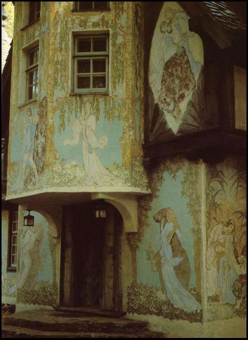
"NOT decoupage, lacca povera!" So went her adamant mantra. The difference? In theory, there isn't one— the concept is glue and lacquer. Lacca Povera refers to the 18th century, Venetian version of decoupage, later made fashionable and practiced by everyone from Victorian ladies to Lord Byron. However, Google image search tells a different story. Google "decoupage" and all vomitous horrors present themselves to you. Google "lacca povera" and you get something else entirely. As it turns out, lacca povera by any other name just isn't as sweet.


Happy to report that I am eating my words, I'm presenting the project as an (In)Decorous DIY. Considering my own preconceived notions of "decoupage," it's rather appropriate, isn't it?

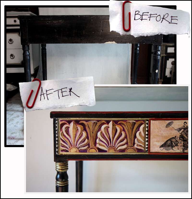
1. The table, before:


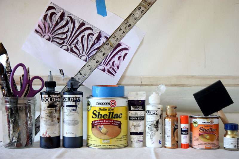
2. The supplies: At a bare minimum you'll need some acrylic paints, a few brushes, a straightedge, shellac (here, both amber colored and clear were used), a foam brush for applying the shellac, and a printout of the design you plan to apply.


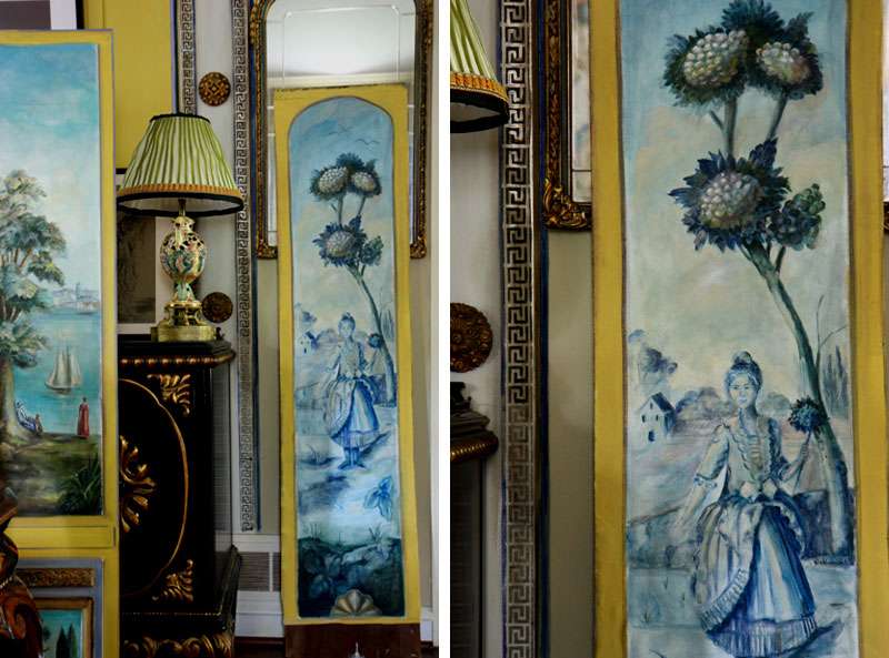
3. The design. This one came from a book on chinoiserie. I scanned it and then resized it appropriately before printing it out on ordinary computer paper, with a really awful bubble jet printer. The image should be a graphically simple line drawing in one color. Paint a thin coat of the clear shellac over the design. Let dry. This seals it so you can paint over the image.


4. Using acrylic paints, paint over the designs. Do whatever you want, the sky is the limit— you can even use metallics (metallic gold was used on the shells, for instance). Let dry.


5. The painted papers, taped to the table before being glued. You can take or leave this step.


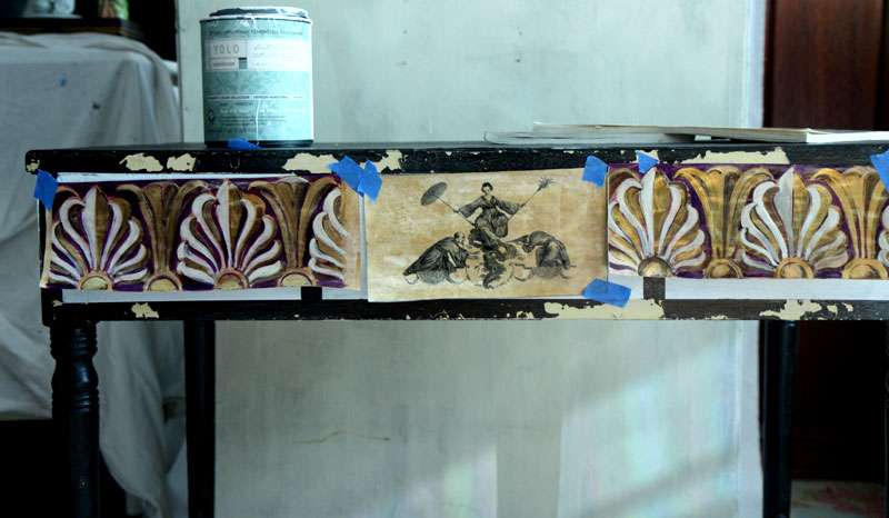
6. Glue the designs where you want them. Glue stick works well for this purpose because it isn't watery. What you want to avoid are puckers, so smooth over the papers to make sure they lie flat.


7. Add in details with paint.
Here, the top of the table was painted, along with borders around the paper cutouts. The borders help blend the paper in with the furniture. This is critical if you don't want an obviously "decoupaged" piece.

8. Finish with a coat (or several) of amber shellac. The amber tone ties the colors together and mutes the colors, contributing to an aged appearance.


One last word of advice: Feel free to experiment. This isn't pastry making, thank god. The Venetians used flour and water paste to attach the designs; we used gluestick. Sometimes it's good to switch things up, right?

9.18.2009

At Least Christ Won't Need to Shop at IKEA

Y2K computer glitch conspiracies be damned! In the days before millennial anxieties centered around planes falling out of the sky and banks losing access to money, James Hampton (1909-64) had a very different set of concerns. In preparation for the second coming of Christ, he spent the last 14 years of his life building a towering throne from anything he could find and afford on his janitor's salary: wastebaskets, lightbulbs, cardboard tubing, insulation board... and covered it all in a glitzy layer of tinfoil.


From the Schultheis piece on Hampton published in Art and Antiques, from which these images are scanned:
You couldn't ask for a more perfect piece of allegory: the furniture for the Second Coming of the Jesus of the poor and oppressed made from the refuse of the old, doomed world.
Schultheis also writes that Hampton's family knew about the throne, but were "reluctant to talk about it...It awed, almost frightened them." Yeah, that sounds about right.

All joking aside, it is a remarkable creative synthesis of absolute junk; you can even make out the hundreds of dead, foil encrusted lightbulbs dripping like stalactites from the alterpiece/icon/god-knows-what-it-is-part-Mr. T-part-Tibetan-reliquary. Obviously, in this case, pictures speak louder than words.


Luckily, the owner of the garage that Hampton was renting didn't destroy the throne when the artist died. Instead, he rented the garage to a sculptor, with the throne still inside. (What?!! Can you imagine renting a garage and finding THIS INSIDE?!) That sculptor apparently showed it off to several artists and curators, and eventually it gained quite a reputation— enough of one that it was purchased by an anonymous benefactor and then moved to the National Museum of American Art in Washington, where it still resides.

Scans from Art & Antiques, December 1984.

9.17.2009

I'd Like to Dine with Lichtenstein...

Actually, I'd like to dine from Lichtenstein. And Dali. It's a little known fact that both artists designed tableware, totally in-line with their respective aesthetics. Dali's fantastical flatware is a particularly heavenly concoction of silver doré, enamel, pearl, crystal, and sapphire. YUM. Who needs food when you have a place setting like this? I wouldn't want to obscure the beauty with a substandard soup, for instance. Dali diet, anyone? (Oh, and side note: my scanner is most definitely on the fritz, you can click on these images to enlarge them.)


I actually found the above place setting in an interesting little article (Art & Antiques, Dec 1984) about the decorative endeavors of famous fine artists. And while some of the objects are beyond bizarre (see Alexander Calder's allegedly functional toaster below), it's nonetheless interesting to see how the very familiar aesthetics of certain famous artists translate into objects of daily life.


Below, Thomas Cole's ivory playing cards and box. The author sums up this decorative impulse with a reference to Leonardo da Vinci. "In [da Vinci's] day," he writes, "there was no strict line between the artist and the artisan— for the Renaisance man, everything had to be beautiful." Spot on, 1984 Art & Antiques! Isn't this what makes the pursuit of style so much fun, after all?

9.16.2009

HEAVY METAL

Rococo and rock and roll: two approaches to excess, indulgence, decadence, drama, amusement, decoration. In this case, home decoration. An extension of personal style, a stage for personal drama, it's only fitting that the two worlds meet here. I wanted to keep things lighthearted, while obviously avoiding a cheesy or cheap interpretation of the sort that seem to abound. So, I brought out the 1896 Rococo revival candelabra (a favorite, for sure) for inspiration, along with much silk taffeta, brass studs, linen, canvas, and enormous (27") down filled pillow inserts.

I experimented with hand painted surfaces: canvas and worn in linen, paint on the former, dye on the latter. A pillow is ordinarily exclusively a soft affair, but I thought they might be more interesting with a little more contrast, some... tooth. A more aggressive take on the least aggressive item in a dwelling.


A lust for textural excitement expressed itself through a combination of disheveled, softened linen, sharp studs, coarse canvas, and slippery taffeta.


And of course, I lined them entirely in silk. A sort of hidden extravagance.

9.14.2009

Austria, 1935


Are you reading this, Mr. Louboutin?

Scan from SHOES : A Celebration of Pumps, Sandals, Slippers & More by Linda O'Keefe

The Bed, The Shoe, The Girl: A Style Profile


The mirrored bed set, now at L'Hotel in Saint-Germain, Paris, and the shoe, by André Perugia, both once part of the stylish world of Mistinguett (1875-1956), dancer of Folies-Bergère and Moulin Rouge fame, and once highest paid female entertainer in the world.

You might remember the Folies-Bergère from the Manet painting (1881-82):


What strikes me most is just how contemporary everything looks (well, everything except the Folies Bergèrge itself). That shoe could have walked right off a runway (and SHOULD walk right into my closet) and the bed set... Let's just say mirrored furniture has been everywhere for at least a couple of years and I haven't felt compelled to buy any, yet this makes me want to reconsider. I can't say I'd plop it in a room with extremely nondescript beige walls and curtains, but we can chalk that up to boring hotel design, right?

Scans from Beds by Diane Von Furstenburg and Shoes: A Celebration of Pumps, Sandals, Slippers & More by Linda O'Keeffe.

9.13.2009

Selling Smoke?

Above: One of photographer's Kyoichi Tsuzuki's "happy victims," a young girl living in a tiny one-room apartment full to the brim with Anna Sui merchandise.

If you haven't read it, I wholeheartedly recommend Dana Thomas's Deluxe: How Luxury Lost Its Luster. Her behind the scenes investigation of the luxury market raises some interesting questions and poses a refreshing look at the concept of luxury within our mass market global economy.

Luxury, she says, used to be about high quality and exceptionally crafted products custom-made for particular consumers, their tastes and lifestyles. Now, its about selling dreams for unjustifiably high mark-ups. And what of the craftsmanship, the individualization? It's gone to pot, says Thomas, and I gotta say, I TOTALLY AGREE.

Certainly, it's depressing to think that most people will never experience anything close to the old conception of luxury. Most of us will never have a couture dress made to our specifications, a pair of shoes cobbled for our feet, or a frame carved specifically for a family portrait, commissioned from an artist whose style we admire.

But hey, after the initial shock, redefining luxury becomes a liberating exercise.

Marc Jacobs' take on the situation: "For me, luxury is about pleasing yourself, not dressing for other people." Shocking, but I'll bite. Christian Louboutin also had an inspiring snippet to share: "Luxury is the possibility to stay close to your customers, and do things that you know they will love. It's about subtlety and details. It's about service...Luxury is not consumerism. It is educating the eyes to see that special quality."

What, luxury? About developing a personal aesthetic and taste? I couldn't agree more, and couldn't have said it better myself.

9.11.2009

Hansel and Hearst?


How is it possible that these two vastly different homes belonged to the same man?!

Top two images: Wyntoon, the summer retreat of William Randolph Hearst, Northern California. The murals are by Willy Pogany, an artist fashionable in the 20s. What I'm most curious about is the "grown-up Hansel and Gretel village" that apparently exists on the same site, according to the book from which these scans were taken. Said village was built by Julia Morgan and commissioned by Hearst after the original Rhenish castle his mother had built burned to the ground. This house is beautiful, but a grown up Hansel and Gretel village??? Seriously??

Bottom image: The famous Hearst Castle, located in San Simeon, California.

Scans from Summer Places by Brendan Gill and Dudley Witney, 1978.

WANT


Alpine Neo-Classical Goat Hair Stools. Italy, 20th century. Available through Coup D'Etat on 1stdibs.com.

I'm very much into my huge Mongolian sheepskin coat. This is clearly the next step.

9.09.2009

QUICKIE IN THE BATHROOM (Before and After)

PROJECT BATHROOM!!

THE CHALLENGE
: Makeover a tiny shoebox-sized bathroom (4'x6'!!!!) that has mahogany paneling, 50's turquoise fixtures, and faux marble floors. GOD AWFUL.
BUDGET: Uh, practically nonexistent?
This guest bathroom went largely unused for a long time, if only because it was truly a dark, dank hole with a weird turquoise toilet, sink, and exposed mirror lights, all original from the 50s. Time and again, family and friends advised the fixtures be removed and replaced with something more "in date." "At the very least, replace those awful lights!!," they insisted.

To be sure, there are some really fantastic bathroom fixtures out there in the grand world, but not so much on my budget. And the way I see it, there's nothing less exciting than a generic fixture. I'd rather chance it with the showgirl lights and turquoise toilet and sink than go the local hardware-store route. No one could possibly accuse them of lacking character, after all.


So what did I do?
1. Painted the dark paneling glossy white.
2. Moved the old mirror to an adjacent wall and replaced it with an old, baroque wood and plaster thrifted gem. Two walls covered in mirror are better than one.
3. Went wild stacking paintings, prints, silhouettes and old photos (you can find these very inexpensively on ebay, for instance) to increase the sense of height in the tiny room. All of those mirrors have to reflect something.
4. Used black and metallic accents for texture, to play against the turquoise. The only new item is the towel (from Target). I think it does a nice job of tying in the baroque details in the room while picking up the black accents.

Time this took: a day and a half, only because the paint was asphyxiating me.


And the result? Not too shabby. In fact, I think I've fallen in love with the classic exposed dressing room mirror lights!!! It would have been a HUGE MISTAKE getting rid of them; in the right setting they remind me of showgirl dressing rooms in the 40s. Ditto for the turquoise sink.

Skull Time

Scan from Art & Antiques, October 1985.

9.08.2009

Tourner à Droite

When I bought these panels they were unpainted and sporting a disgusting shade of greenish brown. Like bile. So, much like everything else in life, we painted them. Without a doubt, they're meant to be mounted on a wall flanking something— they're actually labeled "droite" and "gauche" in giant cursive script on the backs. Exciting, right?! (I enjoy speculating fabricating insane stories about the provenance of my junk shop finds nearly as much as I enjoy power ballads while plastered.)


Actually, we've painted them several times. There are only two panels, but as you can see, the one on the right in the above picture is a canvas panel glued onto the back of one of the panels. You can see the front of that one below:


Convenient, because I can rotate it when the mood strikes. Or repaint them, even. And clearly, the mood has been striking an awful lot.

9.06.2009

Red Alert!

Carolyne Roehm may have a passion for blue and white, but I have one for black, white, and red. And so does designer Anouska Hempel, evidently (all of the black/white rooms below are hers, the red is the boudoir of Maria Alexandrovna, 1853, in the Hermitage Museum). No one does stripes quite like Hempel:


The look is forceful, but sometimes we need a little punch in our lives, right?

My own
red hot voyage began with a couple of accent pieces Lydia has been working on: the pungent red pie table and the graphic striped silverware box.

My goal: Grunge it up with something glam, gilded, leathery... something... dirty.
Solution
: Painted canvas upholstery, painted canvas...pillows?
I played around distressing the metallic tones, tearing apart the canvas and sanding the matte damask motif that I applied over the gilding.


Rich red velvet and more painted canvas adorn pillows set against a bright, glossy white wall. The top pillow is an amalgamation of my favorite antique metallic embroidered textile fragments, mounted on cranberry velvet with some bizarre shots of robins egg blue and lavender ribbon. For the center pillow, I hand-dyed white linen and applied painted canvas straps at the sides. As for the textile at the bottom, it's of questionable origin. General consensus seems to point toward it being a horse blanket of sorts.


Oversize pillows are a godsend. Inspired by the antique metallic embroidered fragment on the cranberry pillow, I painted a larger-scale version of the very Turkish design, mounted it on black velvet, and trimmed it with striped silk and hand painted leopard print silk ribbon. (It sits in the center, behind the pillow by which it was inspired).

9.05.2009

Campari and Cope


One of my most insanely gorgeous and exciting purchases was this very old cope (of the ecclesiastical vestment variety). I acquired it on ebay, it shipped from France, and it found me on the hottest day of the summer drinking bitter spritzes.


Anyone who hasn't tried a bitter spritz absolutely needs to. Little bars in Venice serve these drinks by the pitcher, along with salty snacks. Mix: 2 parts prosecco (or other dry sparkling wine), 1 part campari, top with a splash of mineral water and a green olive. For a sweet spritz, replace the Campari with Aperol and add an orange slice instead of an olive. Incidentally, these were probably the reason why it seemed like a good idea to play dress up in the cope, but that's a story for another day.


I wasn't sure what I wanted to do with the cope. My first thought was that the back panel would make a lovely oversized and very Byzantine-inspired pillow complete with fringe, but ultimately, I didn't have the heart to cut it apart.


And then, a eureka moment! The cope fits perfectly on the sofa. It's like it was tailored for it. WHO KNEW.


9.04.2009

Crystal Clear


For an unexpectedly delicate table setting, why not pile on the glass and crystal? After setting this, I realized that I was sorely in need of glass plates! Luckily, they're easy to find and extremely cheap: Target, for instance, has a basic set of 12 for 24.99.

The look doesn't need to be extremely costly, either. Use whatever good crystal you have, pair it with cheaper glass where you need to fill in, and keep the silverware simple.

Oh, and for the love of god, no plastic.

9.03.2009

For the Love of Tools

In light of all the buzz surrounding Julia Child, I thought it might be interesting to share this scan of her kitchen from my 1977 edition of Architectural Digest Celebrity Homes:

Though there were also photographs of the other rooms in her house, I was fascinated most by the kitchen, because it reveals so much of Child's character. Her quote, "We rejoice in the shape of tools," says it all! If anyone has photos of a personal collection of tools displayed decoratively, I'd LOVE to see/ post them— interesting shapes and textures can render even the most functional objects beautifully decorative. (You might remember a post from a while back about the texture of a pair of levels I found, and another about the forms of forcolas... )

For me, the carefully chosen material possessions that comprise a person's "style" are interesting in that they reveal the character and personality behind those objects. I am just infatuated with characters who go to the ends of the earth to pursue a unique a
esthetic for their lives, even if it occasionally takes them off a cliff. The concept of "chic"? Frankly, I can take it or leave it (although probably leave it).

Yesterday, Scott Schuman from The Sartorialist wrote that Bruce Weber's character studies in A House is Not a Home made him aware that objects can say as much as words when it comes to revealing character.
And it's absolutely true. A picture is worth a thousand words? Try a beloved possession, or better yet, a collection of beloved possessions, arranged for life and action.

Bottom line: Indecorous taste, or in decorous taste... who even cares about the distinction, as long as the taste expresses personality, panache, character, and a personal aesthetic?

9.02.2009

Hot, Rich and Easy

Get your mind out of the gutter. This isn't about my latest date, it's about spicy chocolate truffles!


Tiffany Dinner Plate, antique Czechoslovakian creamer, cup and saucer.


Alice Waters has a gloriously simple recipe for truffles in her cookbook The Art of Simple Food that, provided you don't scrimp on ingredients, look and taste far more sophisticated than you'd expect for the amount of work involved (none). Feeling prematurely autumnal, I improvised and added freshly ground ginger and various other spices to the recipe. The result was oddly reminiscent of pumpkin pie, and completely delicious. The basic recipe:


1. Melt 1/2 lb of bittersweet chocolate and 10 tablespoons unsalted butter in a double boiler, or else in a heatproof bowl set in a shallow pan of simmering water.
2. Stir in 6 tablespoons heavy cream
3. Refrigerate mixture until firm (several hours) and then scoop out small balls with a melon baller or teaspoon. Roll in cocoa powder.
Store in refrigerator, bring to room temperature before serving.


A few notes: I added around a tablespoon of freshly ground ginger, along with a heap of curry powder, a couple teaspoons cinnamon, and a pinch of cayenne to the mixture along with the heavy cream. In hindsight, it might have been easier just to add a tablespoon or two of pumpkin pie spice... I used an 85% cocoa chocolate bar made for eating, not baking, as the bittersweet chocolate (two of my favorites are Kallari or Vivani, either would work perfectly), and rolled some of the truffles in a mixture of cocoa powder and cinnamon, others in shredded coconut, and others in chopped macadamia nuts.


Related Posts Plugin for WordPress, Blogger...