10.09.2009

Seductive Sythetics: Living in a Plastic Bubble

Decorating Ideas For Every Room In Your Home, 1969.  A GEM.  At least in the sense that the editors exhibit an unusual zeal for all things vinyl, Caprolan (??), rayon, laminate, olefin and nylon.   Their enthusiasm is infectious, yet I can't help but think that after the fact, some of these designers would rather have had the public not know about these deep, dark, design secrets.

Check out this upholstered room  by Mark Hampton, for instance.  Can you believe the nylon plaid that crawls right off the floor and UP THE WALLS!? I can only imagine it would be difficult to watch that tiny television. Surely, one's head would be spinning from all the plaid:


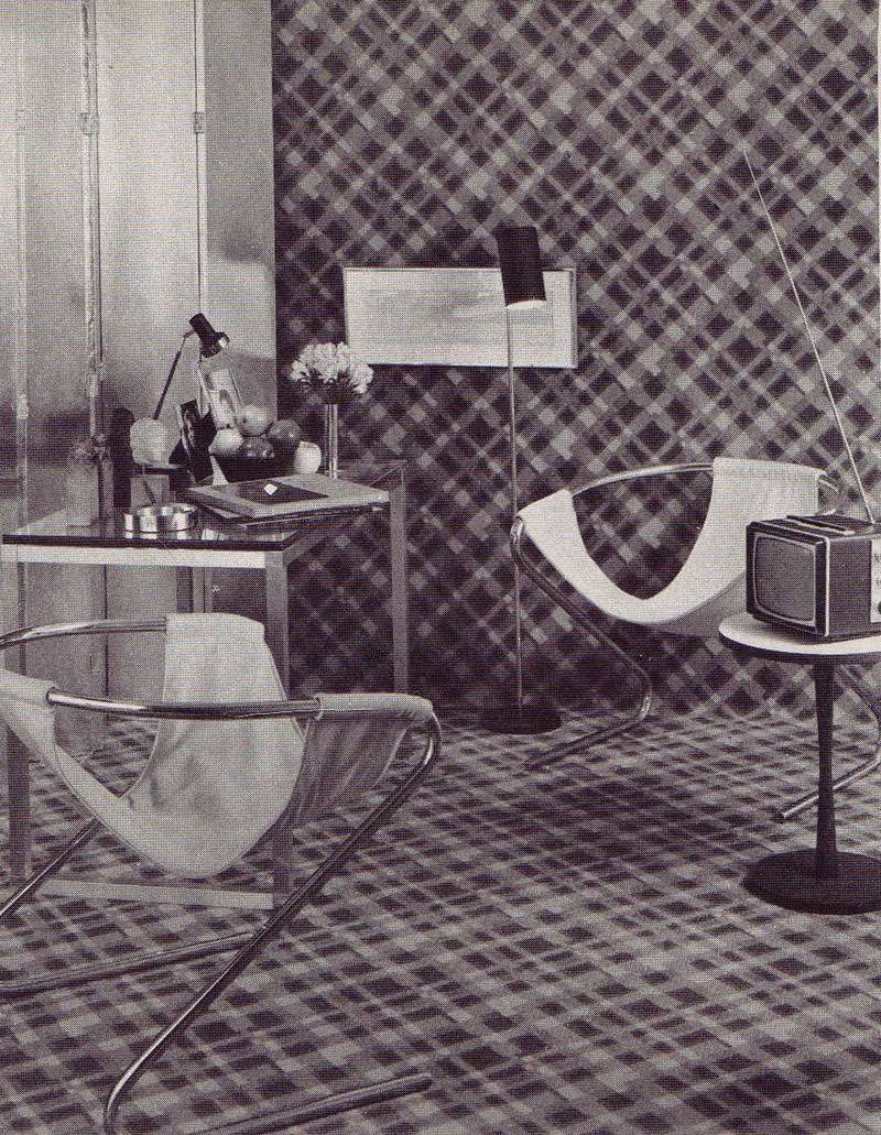
 Above "Bold plaid design of all nylon carpeting covers the floor and then goes up the wall; its splash of color echoes the steel-strong mood of the room." Design by Mark Hampton.


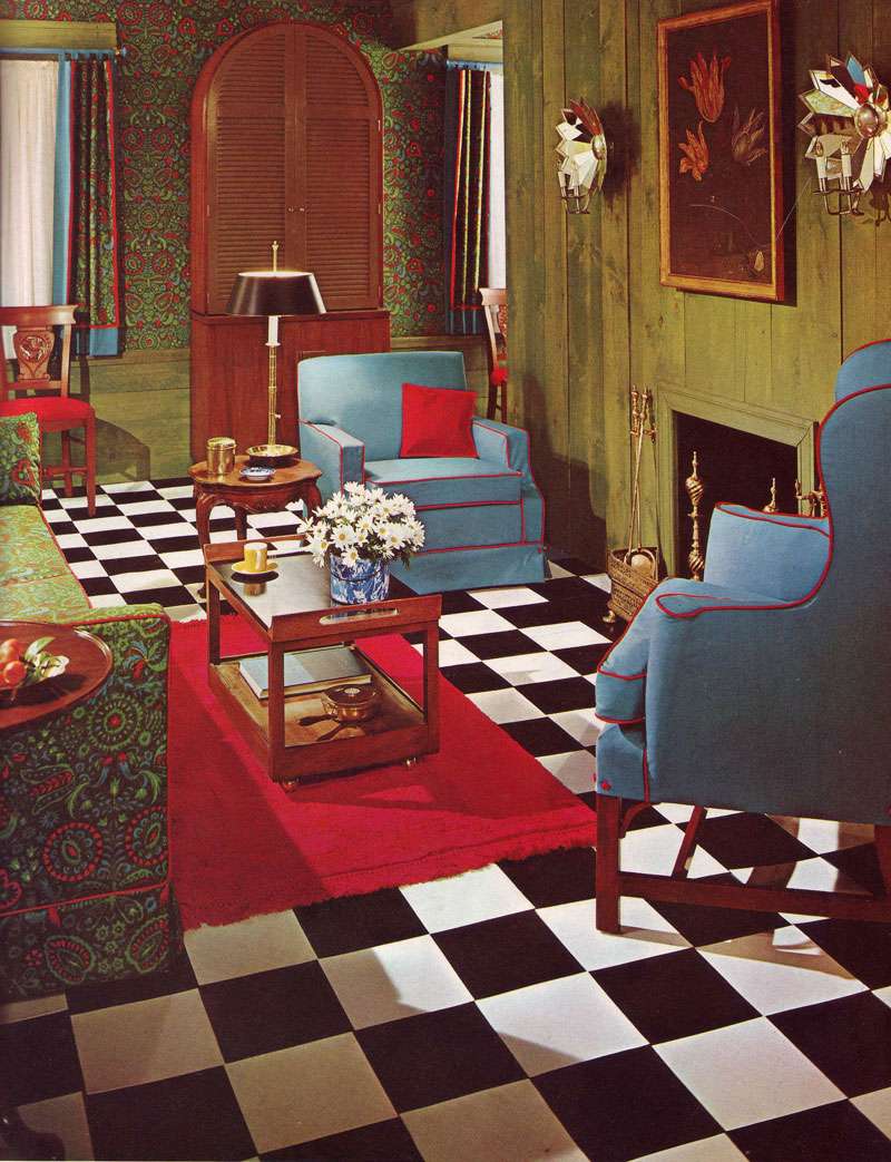
Above, "Fabrics lend flair to a living room made attractive and inviting by the well planned juxtaposition of pattern color, scale and texture.  The key print [is a] a weave of Avisco rayon and cotton [and] flooring is vinyl tile." No designer credited.  (Well planned juxtaposition? They're so serious!)


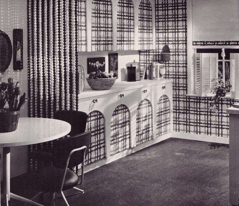
Above, "Dining rooms are formal and informal...Entire kitchen and bookcase can be closed off by wood-grained folding doors, but when they open (ed: get ready for it) they reveal plastic-faced cabinet screen printed to match fabric on upholstered pieces.  Red formica topped table serves for dining." No designer credited.


Above: "Vinyl floor by Amtico was custom-colored to match print and wall tones."


Above: "A great way to add style to your kitchen, and easy maintenance too— a wall to wall kitchen carpeting such as the bright blue carpet by Thomas Pride Mills, used in attractive kitchen [above]. Made of all-Herculon olefin fiber, carpet eliminates waxing, mopping and polishing..." A carpet in a kitchen is easy maintenance? Clearly, they haven't been in my kitchen while I cook.  I shudder to think what bright blue olefin looks likes.  Am I EVER glad this image is black and white. 


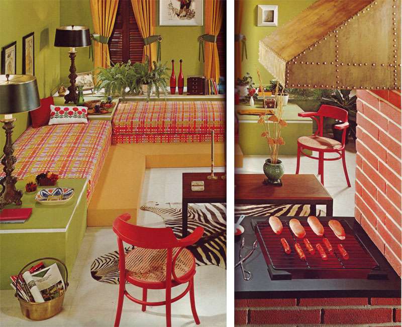
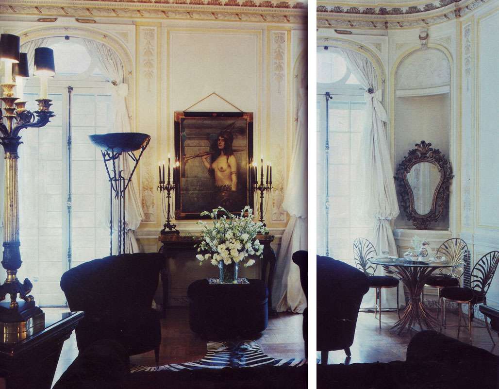
Above: "Family room sets the mood for fun and games...practical white vinyl floor... gets the punch of a zebra skin trophy..." Are those hot dogs vinyl too?

The Missing Stettheimer Furniture

A while back, I mentioned artist Florine Stettheimer (1871-1944),  to whom I regularly refer for whimsical, candy colored inspiration and witty quotes.  Surely, she was an interesting character (for one, she bucked social conventions and chose not to marry in favor of a career), and although her work was supported by some of America's most prominent artists (Marcel Duchamp was a close friend), art critics (Henry McBride wrote raving reviews), gallery owners (Alfred Stieglitz) and society figures, she is obscure compared to some of her contemporaries- Georgia O'Keefe and Charles Demuth, for example.


Above: Florine Stettheimer's apartment, including furniture designed by the artist, and her paintings Music (1920) and Portrait of Myself (1923)

Even lesser known than her paintings is the careful consideration she took in displaying them, designing each frame and even furnishings (consoles, benches) to complement her canvases. Stettheimer had no financial need to sell her work and instead displayed the vignettes in her fashionable (if slightly insane) New York City apartment overlooking Bryant Park.  Swathed in a VAST amount of cellophane and copious quantity of lace, one gets the sense that her apartment, and furnishings were an extension of her aesthetic- her paintings and especially the sets she designed for Virgil Thomson's Four Saints in Three Acts reflect the same brand of whimsy.

Above: Stettheimer's studio space, complete with cellophane galore, a crystal floral bouquet, and another of her trompe l'oeil drapery furniture pieces. 

Anyway, the voyeur in me LOVES a good, intimate peep into the life of an artist via her interior, and I've always found Florine's (oh, it's like we're on first name basis) interesting because of the scope of her aesthetic.  She didn't miss a detail!  What's more, I find it even crazier to think about this is the context of some of the more industrially influenced, modernist designs of her time- her frouf flies in the face of that, and yet, she was obviously... committed to her aesthetic.


Above: Sketches for furniture, and Florine Stettheimer's apartment, with Sun (1931) hanging over a commode the artist designed

Her divinely cool trompe l'oeil furniture reflects the aesthetic of her paintings. Tragic that it was all donated to Columbia's student theater, where every single piece has since gone missing over the years. 


Above: Sun (1931)

Above: Portrait of Myself (1923)


Above: Portrait of Marcel Duchamp (1923), in the frame that the artist designed

Above: Portrait of Virgil Thomson (1930)

10.07.2009

The Hope Settee

YUM.


First Image, A Regency Egyptian revival settee designed by Thomas Hope (1769-1831) for the Egyptian Room at his Duchess Street residence in London, c. 1802, and Second Image, a drawing of the Egyptian Room.

A wealthy (the Hope Diamond was in his family, hence its name) art collector and architecture enthusiast from a family of bankers, Hope was particularly interested in arts from the Ottoman Empire.  He designed many classicist pieces in addition to the rooms he fashioned for his residence at Duchess Street, and notably published a book of his own designs, called Household Furniture and Interior Decoration, in 1807.

Less notably, there's a lot of bizarre Hope-related ephemera floating around the internet. Wikipedia, for instance, dubiously cites him as the inventor of the Battenberg cake. While I would like for this to be true (it is, after all, a square pink and yellow checkered cake covered in marzipan), I very much doubt it.

There's also this little interactive site hosted by the Victoria and Albert Museum, where you can design your own Hope-inspired room by placing his sketches of furniture, ornaments, ceilings, and other items, in one of the four Duchess Street room backdrops, and then digitally coloring them.  All I can say is: embarrassingly time consuming.

The Silver Lining

A detail as small as red drapery lining can make a room. This actually reminds me of a photo The Sartorialist posted a while back, of a woman in a monochromatic outfit, back turned to the camera, the only color in the shot a sliver of red on the soles of her Louboutins.

And how fantastic is the decrepit canvas?

Southside House, near Wimbledon Common.  From Interiors, ed. Min Hogg and Wendy Harrop, 1988.

Also, thank you (thank you, thank you!!) to both Little Augury for listing (IN)DECOROUS TASTE as one of her "12 (new to me) blogs I love" (in great company, very humbling) and to Prêt à Porter P for making this the new "site of the moment."  I am extremely appreciative. 

10.06.2009

The Barton Court Roller Disco

Sir Terence and Lady Conran's Gardener, Jonathan Chidsey, at Barton Court.  From House & Garden, April 1991.

Gardening photos are inevitably ridiculous, but this... this was one of the finest I've seen.

Rocking a shirtless, hairy chest, wavy poof of blond hair, tennis socks, dangerously teensy hot pants (okay, fine, but they're close) and a neck bandanna, I wonder if Gardener Jonathan Chidsey rushed back from a skanky 70s roller disco, just in time for his shoot. 

Then again, perhaps that's why Sir Terance and Lady Conran hired him.  I'd like to think he actually gardened (and still gardens, for that matter) in this (lack of) attire.

10.05.2009

A Gustavian Experiment

Has anyone seen that I Love Lucy episode where Lucy makes a deal to trade apartments with another tenant and connives to switch out all of the furniture before Ricky comes home? Let me tell ya, Lucy, I can relate.  Moving furniture like a madwoman is my specialty!  One of the upsides to living in a design laboratory/studio/office is the ability to switch things up at the drop of a hat.  Actually, it's more of a compulsion, and a compulsion can't really qualify as an advantage, can it?

After I posted the bathroom, a few of you asked to see some more of the collaborative projects I've undertaken with my mom.  Since I've been home, we've undertaken turned upside down and fought our way through the entire house, experiment after decorative experiment.


Take, for instance, the kitchen.  I've got a love affair with velvety, soft matte walls, like the kinds you see so often in Swedish Gustavian interiors, with their powdery grayish blush palette (see another, more brightly colored version here).  So, we used that as a starting point, but of course, we didn't stop there.  We've been changing the look, switching out furniture left and right.  A blue and white cabinet, a jeweled and leopard commode... it all depends on how much bling we feel like digesting with breakfast. Thoughts?  Opinions?

Anyway, back to the wall! It is, after all, the backbone for the entire kitchen.  It looks like fresco, right? Alas, we have a dirty little secret!  We didn't apply pigments to wet plaster (requirements for a "true" fresco). Instead, we applied a watery coat of paint over a porous (and dry!) virgin plaster wall, with no effort to remove the dips, stains, divets, and irregularities that make it so wonderful.
 

However, there are other alternatives for texture.  For those who desire to paint the town velvet, a chalky finish can also be achieved with casein paints:
Casein was once milk/ And then it was cheese/ And now it is pictures/ How wonderful/ At noon came my "Meister"/ In white tie and tails/ To look at my work/ How wonderful/ Casein looks like fresco/ and Herr Apotheker F. said/ "red vill last foreffer"/ How vonderfool/ I shall paint the walls/ For tout New York/ On my return/ Most wonderful.
                                                                                                                -Florine Stettheimer


10.04.2009

Escapism and Eye Candy: Movies to Watch

Eight films to watch when you're craving a visual feast.  Most of these aren't serious, just purely fun and fancy for the end of a weekend.  Whimsical, over the top sets never fail to captivate me.  After all, what is interior design if not at some level fantasy?

1. City of Lost Children (La Cité des Enfants Perdus) (1995). If you aren't familiar with the work of Marc Caro and Jean-Pierre Jeunet (Jenuet did Amélie), this is most certainly worth looking into. A dark twisted fantasy about a mad scientist who kidnaps children to steal their dreams.


2. Metropolis (1927), Fritz Lang.  A dystopian classic with positively ominous cinematography.


3. Delicatessen (1991).  Another visual feast by Marc Caro and Jean-Pierre Jeunet.  A surrealist black comedy about a landlord who cooks cannibalistic meals for his tenants.


4. Marie Antoinette (2006). Sofia Coppola. A silky, pastel-colored, cake filled vision inspired by a royal figure's luxurious lifestyle and beautiful possessions. 


5. Brazil (1985). Terry Gilliam. A surrealist comedy based on Orwell's 1984. If for nothing else, watch it for Ida Lowry's Schiaparelli-inspired shoe hat. 


6. Un Chien Andalou (1929). Luis Bunuel and Salvador Dali. Dali's surrealism in motion.


7. The Age of Innoncence (1993). Martin Scorsese. Golden-age decadence.


8. The Addams Family (1991). Barry Sonnenfeld. Nominated for best costume design, watch it for the set.

10.03.2009

The Creator of Ambience

This morning, the postman woke me with a delightful surprise: House & Garden's 1987 Best In DecorationAnd when they say "best," they're not kidding.  It covers everyone from Bennison and Baldwin to Mongiardino and Molyneux, residences designed for the Rothschilds, to residences lived in by the designers themselves.  It baffles my mind as to how there are forty three used copies floating about Amazon for around $2.00.  TWO DOLLARS! It also begs the question why you don't see so many fantastically layered interiors like these anymore.  Who made the decision to forgo fantasy and mood in favor of the clean and pristine? I'd like to have a word with them.  Bring them to me, please.

Truly one of the best of the best, Renzo Mongiardino's (1916-1998) apartment is inspirational in every sense of the word.  Just as inspirational was his approach to design:  "I'm not a decorator, I'm a creator of ambiance, a scene designer, an architect, but not a decorator."  Mongiardino used deceit in all forms—faux wood bookcases assembled by his assistants and painted to look old, leather chairs distressed after the fact, and busts that are far from antique— all for an aesthetic effect.  Antiques and "authenticity" be damned!

From the House and Garden article:
His theatrical sense enables Mongiardino to evoke a wealth of atmosphere. Just as a stage designer immerses himself in the atmosphere of a play, Mongiardino immerses himself not just in the architectural nature of the house or apartment he has been commissioned to embelish but in the personality of the clients and the atmosphere they generate around them. 


Scans from House & Garden's Best in Decoration, 1987.

10.02.2009

Fool's Gold

When I posted photographs of designer Norma Kamali's apartment, a reader asked what kind of finish I thought the ceiling might have, commenting that she loves leopard and metallics.  And, while I can't be sure about the ceiling in Kamali's living space, I am most certain regarding my feelings on the marriage of leopard and metallic (and metallic ceilings): YES. YES. YES.  I'd venture to say they look better together than Jennifer A. and Brad Pitt in their prime, and surely, more stable a match too.

Actually, I'll lump tortoise right in there with leopard, and wood inlay as well. They're so sumptuous against a nice, grungy old metallic.  My metallics sure get around, don't they?


Above, A bathroom done in collaboration with my mother Lydia.  We painted faux wood inlay on the cabinets, and gave the ceiling an oxidized metallic finish. 


Above, an oxidized metallic finish in the foyer, again paired with (painted) inlaid wood.

All images created, styled, and photographed by (In)Decorous Taste.

10.01.2009

From Russia, with Love

I was admiring (with GREAT zeal) the enormous, frizzy heaps of hair that have, for the past couple of weeks, been gracing the Spring/Summer 2010 catwalks, like this particularly fine knot on model Ali Michael's head, outside of the Luella show (which was considerably less fine, but that's another story):

Model Ali Michael outside of the S/S 2010 Luella show, via The Fashion Spot

Anyway, I was in the midst of wondering how I could re-acquire one of those weird foam donuts to amplify the size of a bun (whatever happened to those things?) when I was reminded of a drop-dead-gorgeous image of the last Imperial Russian Czar's children.  Maybe it was a combo of the frizzy hair and romantic bow, maybe the youthful topknot, but I'm glad I thought of it.   Clothing, jewels, carriages, palaces and all (oh, the DETAIL!) — the entire Romanov family is truly a style inspiration. 

The four daughters: Olga, Tatiana, Maria and Anastasia. Image from A Lifelong Passion, by Mayalunas & Mironenko

Grand Duchess Tatiana, 1910.

Of course, I don't even need to mention the hair. It's very contemporary in a way. Like a carefree, messy rock-star do, on the head of a Romanov. What more could I ask for? Other than a good nautical stripe and a dramatic hat, and there's plenty of that to go around:

Romanov Children with Empress Alexandra, 1909.


Maria, 1908

Above four photos from The Romanov's: Love, Power & Tragedy.  Ed: Bokhanov, Knodt, Oustimenko, Peregudova, and Tyutyunnik.

9.30.2009

Coco Kamali

Is it just me, or does Norma Kamali's apartment in 1988 look an awful lot like her Spring/Summer 2010 collection of clothing? Sort of like the models teleported out of her ruched and ribboned residence,  c. 21 years ago?

Ribbons? Check. Ruching? Check (times 10). Gauzy fabrics? Black accents? Check and check. Strangely, I'm not really into the S/S2010 collection, but I SURE AM feeling it in the form of an apartment.  Recognize Coco Chanel's glass-top table in Kamali's living room, anyone? Kamali reproduced it as part of her furniture line in the 80s, along with her deep black velvet chairs and ottoman from the image below. (Anyone else feel the urge to reupholster things, ANYTHING, in black velvet? This looks so lush.)


Love the leopard and zebra here— they give the apartment TEETH.  And is that crystal bouquet another reference to Coco?


Norma Kamali's apartment, from House & Garden, December 1988.

9.29.2009

Life in Lilliput

Long before Barbie and Ken shacked up in a clumsy pink plastic hunk of a house complete with pink convertible corvette, shag carpeting and shaggier yet bean-bag chair, dollhouses existed outside the realm of childrens' playthings, captivating the imaginations (and bank accounts) of adults who took them very seriously and relished the meticulous creation of their extravagantly detailed lives in miniature.

Not only were they not created for children, but hell, they weren't even created for play, at least not in the sense of reaching inside and having Barbie make Skipper lunch at the kitchenette; they were purely succulent visual feasts. The game was making them as juicy as humanly possible, often requiring an army of craftspeople larger than the one most people use on their full-sized homes today, and the result was total decadence:


Above, In 1743, Sara Ploos van Amstel-Rothé, a Dutch merchant's wife, employed a different craftsman each for the ivory work, copper and brass, earthenware, and ironwork in her two dollhouses and Below, then commissioned another artisan to build a cabinet to encase it.
 
Above, the cabinet that Sara Ploos van Amestel-Rothé had built to house her dollhouse, and Below, the entrance hall(complete with once functional clock), impressive "Collection Room" filled to the brim with fashionable blue and white porcelain, and bedroom, complete with furnishings specifically designed for a pregnant woman.


Above, sumptuous colors and fabrics punctuate a miniature by James Payne and Thomas Chippendale, c. 1740-45.

Below, Jeanne Overbeck built Overbeck Fantasy Castle in the 70s to "delight children" with a theme of "when Knighthood was in Flower." Interestingly, some of these rooms remind me of Tony Duquette's work.


Images from: Connoisseur, December 1984, House & Garden, November 1985, and The Collector's Guide to Dollhouses and Dollhouse Miniatures, 1974.

Gorey's Gardening 101

Most people will recognize Edward Gorey (1925-2000) as the American artist known for his macabre illustrations, darkly comedic, nonsensical stories, and Masterpiece Theater animation.  What is little known, however, is that he had a thing or two to teach us about gardening:
House & Garden, November 1985

9.28.2009

Piranesi's Architectural Fantasies

Venetian born artist Piranesi (1720-1778) may have been trained as a builder, but his greatest architectural feats exist in his engravings, scenes of fantastical architecture that he sold to tourists in Rome during his youth.

"Piranesi shows us that fantasy can have a more lasting impact than a concrete monument to the ego," says Nicolai Ouroussoff, from a New York Times piece on Piranesi.

From the Carceri d'Invenzione (imaginary prisons) series, 1761

"The Drawbridge," from the Carceri d'Invenzione (imaginary prisons) series, 1761 image via Artchive


One of Piranesi's furniture designs. Image via New York Times.
Related Posts Plugin for WordPress, Blogger...