2.27.2009

Blue and White

I've been feeling inspired by blue and white lately. It's classical, cool, and somehow, simultaneously conjures up images of hot summers and heaps of snow. Kind of fabulous how drastically one can alter the effect just by changing the shade of blue, right? Powder blue and white looks dreamy and ethereal (think Gustavian interiors), navy is nautical, and prussian blue lends itself to chinoiserie motifs.

Enough said. Since I'm not actively trying to put anyone to sleep here, I will prevent myself from further waxing poetic about blue and white.


Hand painted secretary, vase, and canvas/silk/linen pillows and frescoed raw plaster wall: maisonarchinard.com.

Hand painted vase and decorative box, antique cloisonne boxes: maisonarchinard.com.

2.26.2009

Ode to Isabella Blow

Words cannot express how much I adore the late Isabella Blow (1958-2007). As if her patronage of undiscovered talent (Alexander McQueen, Sophie Dahl...), her penchant for sculptural hats (as Philip Treacy's muse, this is no surprise), and her fearless style weren't enough, World of Interiors featured her Belgravia apartment in the March '09 issue. And, at the risk of sounding utterly insane: I AM BURSTING AT THE SEAMS WITH JOY. That's how much I like it.


World of Interiors, March 2009

World of Interiors, March 2009

World of Interiors, March 2009

World of Interiors, March 2009

World of Interiors, March 2009

I'm especially in awe of the way she integrated and displayed art in the apartment (clearly, this has become an ongoing fixation for me)— it's so seamlessly tied to the decor, and furthermore, the personality of its owner, that you don't even question its presence. Sure, it's over the top, but I've noticed that this "personality factor" has been saddly absent from design published in magazines lately, especially in the realm of home decor. Apartments like this make me wonder: why has so much of design become so boring, so generic???!


2.24.2009

A Bunch of Kale For You, Babe

February is nearly over, Valentine's Day has come and gone, and frankly, I'm sick of roses. Right about this time of year, when even the least floral flower arrangement looks too floral, make like Constance Spry (revolutionary florist extraordinaire, 1886-1960) and beeline it to the produce section of the grocery store. In an era when women were concerned primarily with decoding the meaning of their lovers' bouquets, full of lilacs and lilies (love and purity, respectively), it's amazing that Spry could find beauty in the structural drama of kale:


Kale Leaves, 1937. Constance Spry Ltd.

It's even more amazing to me that Spry achieved the level of fame that she did; her commissions included society weddings (for one, she used only cow parsley to decorate a church) and Syrie Maugham's interiors. Alternately, if kale isn't your cup of tea (or you find that you'd rather eat your bouquet than look at it), an unconventional and interesting vessel will toughen up a more, shall we say, flowery, assortment of flowers. Sort of like throwing a motorcycle jacket on a sickeningly frilly dress. I digress, but you know how it goes.

Constance Spry with bouquet, Condé Nast Store.


2.23.2009

Devil's in the Details

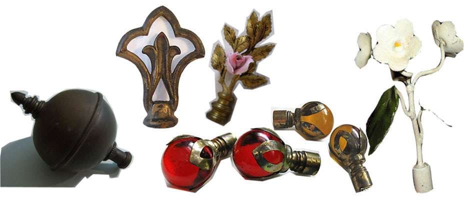
If the devil is in the details, then the best way to give him a run for his money is by. . . changing the finials on your lamps. All of them. Even the new ones. ESPECIALLY the new ones. Old finials make lackluster lamps look more expensive and worldly. A few of my favorite antique gobstoppers:

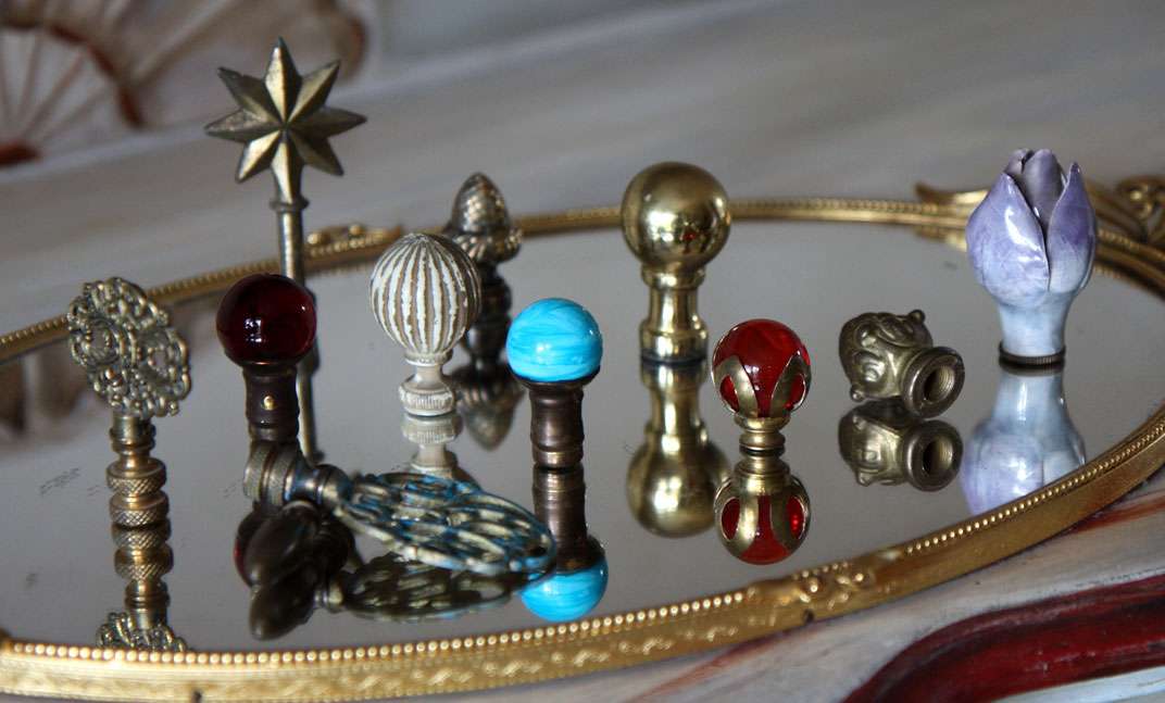
Lamp finials, all vintage

And then a little secret. The best play to find old, heavy, cracked and otherwise interesting finials is secondhand. Rip them off ugly lamps, scour the internet, search eBay regularly, dig them out of the trash! Some of my finials were seriously a steal. A cursory search on Ebay and then Etsy yielded these:

Left to right: Etsy,ornate brass finial from myohmymaggie, $12.00, Ebay fleur de lis finial, Etsy porcelain rose finial from mothtoaflame, $32.00, Ebay ruby glass finials, Ebay amber glass finials, Ebay tole flower finial.
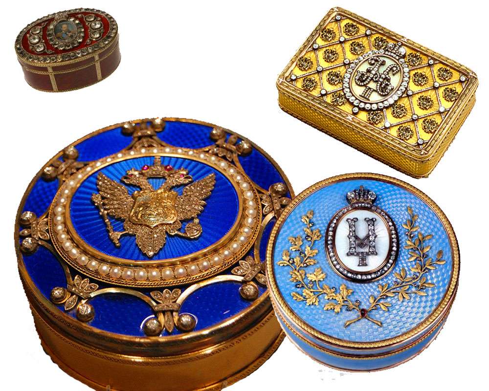
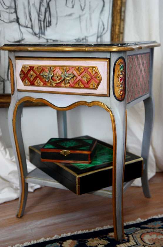
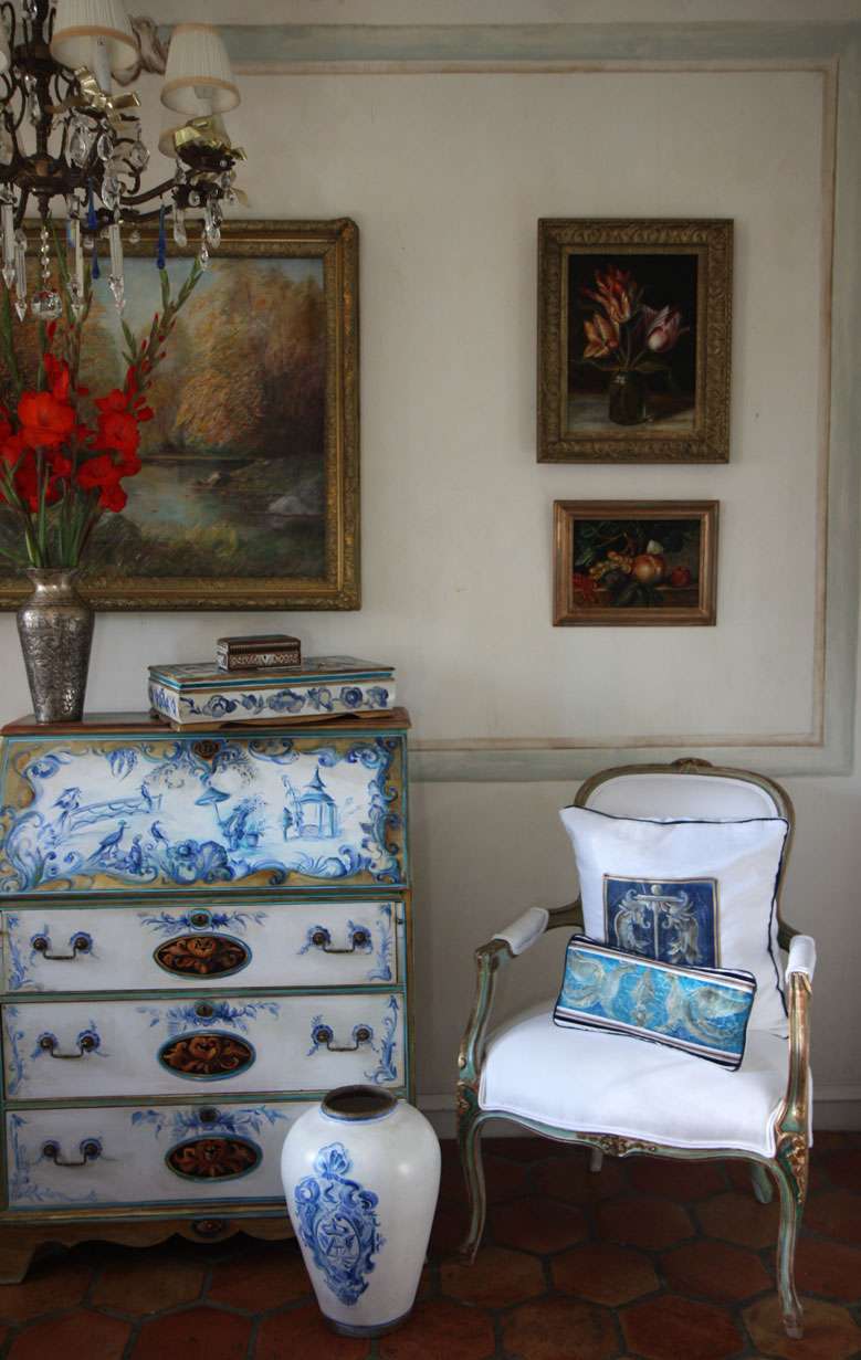
2.22.2009

Siegfried and...Saddam?

Bear with me today. I tend to be reticent in calling even the ugliest of taste a "crime" but sometimes this is the only word that comes to mind.

First: One of Saddam Hussein's many palaces, from Dictator Style by Peter York.
No surprises here. Exactly what you'd expect from a Middle Eastern dictator:


And second, Siegfried and Roy's Las Vegas abode, in House and Garden, May 1991:


And yet another gem of a collage from the Siegfried and Roy shoot in House and Garden, May 1991:


My first thought when I saw these images was whether Saddam Hussein shared a decorator with Siegfried and Roy. Then I wondered: was it Saddam who called Siegfried asking for a muralist specializing in 70s style renditions of porn star demigods, or the other way around? Witness Saddam's prized painting of Medusa the stripper unleashing a giant green snake upon Rocky who is incidentally missing his gold lamé booties, all while being supervised by a blueberry colored Mr. Clean who has sprouted devil horns:


From Dictator Style, by Peter York

Part of me wants to forgive at least Siegfried for these monstrosities, being that it was '91 and just 2 years past the hurdle that was the '80s,
but honestly boys, don't we have to draw the line somewhere?! And if there is a line, surely it has been LONG crossed by the time you reach Siegfried's Wonka-goes-to-Never Never Land Ranch gates and open your eyes to the wonder that appears to be an animated version of the Sistine Chapel. As for the panoramic view of the neon-lit TIGER WATER FALL, well, I won't even go there. It's as bad as a wolf shirt except with no ironic value and about 6,000,000,000,000 times the size and cost.

Oh Siegfried and Roy, how I hope things have changed since 1991...

2.18.2009

Inspired by Fabergé

Assorted Fabergé enamel boxes


Left: Painted jewel accent table with faux malachite boxes. Right: Painted tortoise accent table with faux malachite boxes.

Painted malachite box detail

Painted decorative box

Ebonized turquoise table

Ebonized turquoise table detail

It's undeniable: Fabergé, the Russian imperial jeweler, knew how to put together drool-inducing objects rich in texture, color and minute detail. And those lumpy briolette diamonds? What bling should be. So, naturally, Fabergé has been serving as my latest muse and inspiration.

Why stop with jewels? I figure the world could use some Fabergé inspired furniture. I wanted these to be extremely decadent, to approximate the mouth watering nature of Faberge's work.  To avoid tackiness deluxe, I incorporated a fair share of patina, a hefty dose of age. My apologies in advance for the lack of briolette diamond encrustation. I do what I can, my dears.


All furniture and painted boxes created, styled and photographed by (In)Decorous Taste.

2.15.2009

The Old Hatter


Images from February 2009 World of Interiors


Right after I made my last post about boiserie, I happened upon this example in February's World of Interiors. The building was formerly the P&C Habig hat shop in Vienna, designed by Holzmann and Adam in 1896. Seriously, what's not to love?
  • Red and blue crests are reminiscent of Fabergé jewels. They look delectable; I want to eat them.
  • Ditto for the porcelain white walls paired with the worn antique gold latticework. My mouth is watering as I type this. Ideally, this is what a cake should look like.
  • I. Love. Hats. I also love the idea that at one point in time, people felt that hats were of great enough import to warrant such a grand space.
  • And what about the contrast between the ornate Beaux Arts style and the weird "Taraxacum" chandeliers by Flos? I think what makes the effect is that they vaguely replicate the light refracting effects of a traditional chandelier.
The only thing I'm not entirely sure of are the secretarial/dental looking Jasper Morrison work tables flanking the room. I suppose the bizarrely sterile touch has something to do with the fact that this building now houses an events planning firm. I can't decide if I love them or hate them (although this usually indicates that I will slowly, or quickly, tend toward the former).

2.12.2009

Glamorous Decrepitude


So I'm officially obsessed with this editorial on Guillaume Féau of Féau & Cie Boiserie. I haven't been able to get the gorgeous, dusty panels out of my head since I saw them ages ago in the Sept '06 issue of House & Garden (oh man, I'm STILL mourning the loss). There's just something so architectural, so cubist, so...contemporary... about wooden panels, sans gold gilding, stacked and piled in all of their angular glory. There's also something really graceful about the contrast between the panels and that amazing exposed steel structure of the sky light. An interior with these elements could be so grand, in such an undone way.

I especially like the idea of grungy matte white/charcoal panels of boiserie, haphazardly layered and propped up against a wall as opposed to properly installed.

Despite my affinity for all things darkly romantic, I've really been feeling white lately. Is this a cause for concern?

2.10.2009

C'est Mon Plaisir

There’s something extremely gratifying about a character who emblazons the motto “C’est mon plaisir” (It is my pleasure) above her front door. This may in part explain my unhealthy obsession with Isabella Stewart Gardner, the Gilded-Age socialite who amassed an extremely eclectic collection of art and built a museum (house? palace?) in which to keep it.

Things that make me giddy with joy:

• A woman who takes it upon herself to build a Venetian inspired palazzo in...Boston. Gardner used a range of old columns, capitals and windows frames purchased from Venetian art dealers at the time, and had the walls painted pink and white to resemble battered Venetian plaster.
• Anyone with enough guts to pair priceless works of art of extremely varied eras with lesser known works and even replicas (??!) as Gardner did when she couldn't find the historical artifacts she needed to complete her palazzo. (High/low styling at its best?)


There isn't anything more wonderfully unfussy than ditching the distinction between art and decor, making an aesthetic vision or a mood a priority and using whatever it takes to realize it. Actually, it makes the fantastical vision at large a sort of work of fine art in and of itself.


" Titian's Rape of Europa...was displayed next to a sixteenth-century Persian carpet...two eighteenth century Venetian consoles, and a length of silk fabric that had originally been her Charles Frederick Worth dinner gown." (In Vizcaya by Rybczynski and Olin):


I like to imagine that Gardner was something akin to a real life version of Auntie Mame. But with a despotic side— in her will, she specified that nothing in her museum was to be moved or otherwise altered. Hence, the empty frames were left on the walls after a major art heist in '90:


Interesting in the face of the white box aesthetic that dictates the display of art in most museums today, no?

Related Posts Plugin for WordPress, Blogger...