8.29.2009

Let Them Eat Cake


Lately, I've been shamelessly drawn to the idea of living life in varying shades of pastel. Think thick gobs of cake icing, Florine Stettheimer paintings, and jordan almonds.

Light aquamarines, pale pinks, nudes, golds and grays; there's something delightful and fantastic about embracing such an overtly...feminine...color scheme.

Here are a few of my favorite pastel "moments," where good design transforms what could easily become a child's playground style disaster.


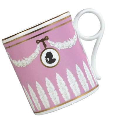
1. Wedgwood Pink Cameo Archival Mug. This was actually recently featured in a British Vogue feature of Plum Sykes's favorite things. However, it's near impossible to find as Wedgwood discontinued it a while ago.


2. Marie Antoinette with Kirsten Dunst is like fashion photography in motion, a giant layered cake full of aquamarines, pinks, peaches, frosty whites, ruffles, tulles, silks, and crystals. It's divine. Unfortunately, it's a miserable movie on most other accounts (plot: it has none; acting: lackluster).

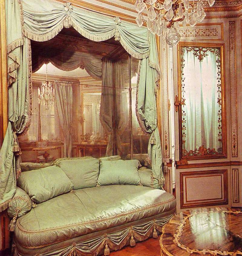
3. As it turns out, Marie Antoinette's actual rooms were more glorious than the movie's sets that they must have inspired. Below, the Méridienne, a small room decorated by Richard Miqué for Antoinette in 1781. The delicately luxurious couch is to die for. Scan from The Grand Tour: Homes of Kings, 1977.
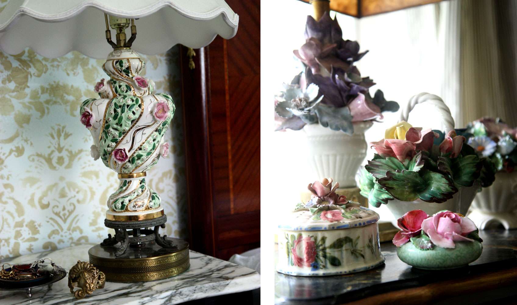
4. Antique Capodimonte porcelain lamps and ceramic floral bouquets. The lamp on the left is quite possibly the best lamp that ever existed, that's how much I adore it. Every night before bed, I contemplate eating it, since it could pretty much double as a cupcake.

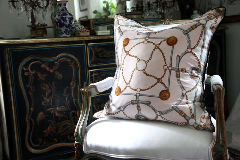
5. At the moment, I'm very much into oversized silk scarf pillows. I made this one with a delicate Oscar de la Renta scarf, and backed it in a bold gray/white stripe.
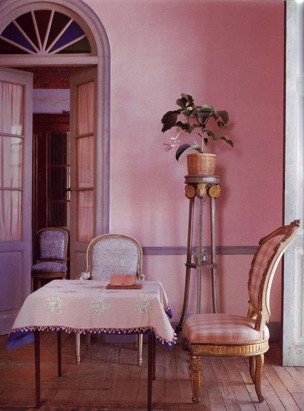
6. The dusty pink walls and blue gray woodwork of this room by Christophe Gollut mimic the palette of a sunset. It's a subtle use of pastels, and he makes the color scheme work brilliantly. Scan from Textile Style by Caroline Clifton-Mogg, 2000.
8.26.2009

Purple Haze


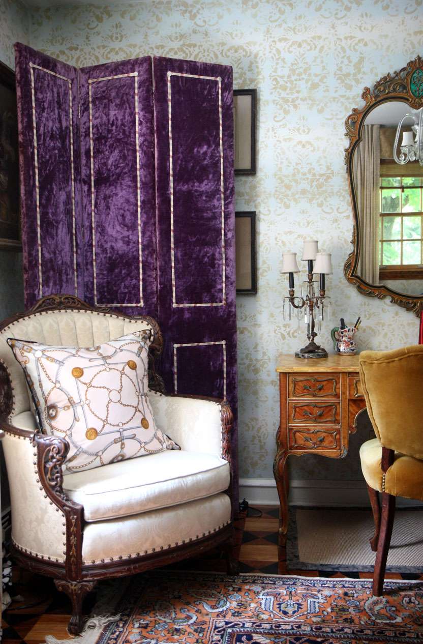
Picking up this purple velvet screen from a thrift store was probably one of the better decisions I've made this week. It's old, partially falling apart, made from cotton velvet, and weighs a freaking TON. Someone less inclined toward the hideous might have turned down an Elvis-esque screen upholstered in skinned muppet.

But hey, I love a challenge, pieces that really dare me to make them work, you know?


I knew I had met my match by the horrified snickers that my fellow shoppers shot me upon seeing my zeal for these gems (yup, there's another one, haven't decided what to do with that one yet).

I love items that straddle the line of bad taste. The saving grace for this screen is really the age, patina (worn patches and yellowed areas), weight, and quality of the materials (no polyester here, kids). And I think it's working out pretty well. I'm contemplating painting panels for the inset areas. We'll see where it goes.


8.24.2009

Seeing Stars

The library of Lord Byron, in his palazzo in Pisa, Italy.


Obviously, this moody image speaks for itself, especially the metallic ornaments on the ceiling that have a way of floating above the dustiness of the rest of the room.

Lord Byron moved to this palazzo in Pisa, Italy as an exile. Legendary poet and self-promotional womanizing rock star of his day that he was, Byron quickly turned the house into a meeting place for romantics and revolutionaries, including Percy Bysshe Shelley, who also lived in the city.

Aside from the fact that this room (and its provenance) is just really superb at inspiring fantasies of all kinds, I love it also because of its color palette. The dusty blues, lavenders, taupes, grays and aged metallics make a divine combination that could easily be put to use in any room, regardless of size or palazzo status.

8.23.2009

Bathing Beauties


What are these caravan-type deals lined up on the beach for, you ask? They are, of course, bathing machines from the turn of the century! Ever the overwrought contraption-loving lot that the Victorians were, they devised these canvas covered horse drawn wagons so that ladies could maintain modesty while bathing in the sea.

At first I think, dear god, this is HORRIFIC! I mean, what's the beach without the babes, right? Also, something about utilizing what is essentially a portable turn-the-sea-into-a-cavernous-tub device is inherently unappealing (these things have no windows!!!). But then my mind wanders towards the weekly summer tabloids awaiting me in the grocery isle, with all the botched triple-stapled stomachs and dimply lipo jobs (think Tara Reid- she's an old classic in this genre, for sure), and suddenly these machines are looking pretty glorious.

8.22.2009

And They Partied Themselves into the Ground


"Contrary to the image of high society, it was the fad of the day for lady guests to fling their lingerie to the winds as they passed the gates upon leaving. Local folk still recall seeing chauffeurs ceremoniously retrieving their ladies' undergarments in the wee hours of the morning."
- Monica Randall, on the parties that took place in early 20th century Long Island, New York.


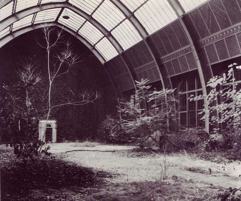
Former tennis court adjoining the indoor swimming pool, Harrison Williams Estate, Long Island, NY.

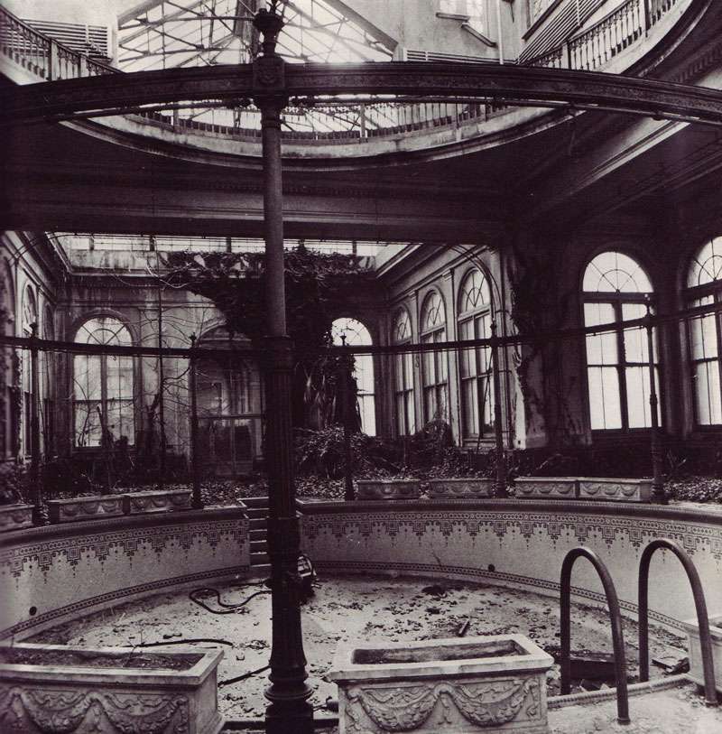
Mosaic gold swimming pool at Pembroke, Long Island New York

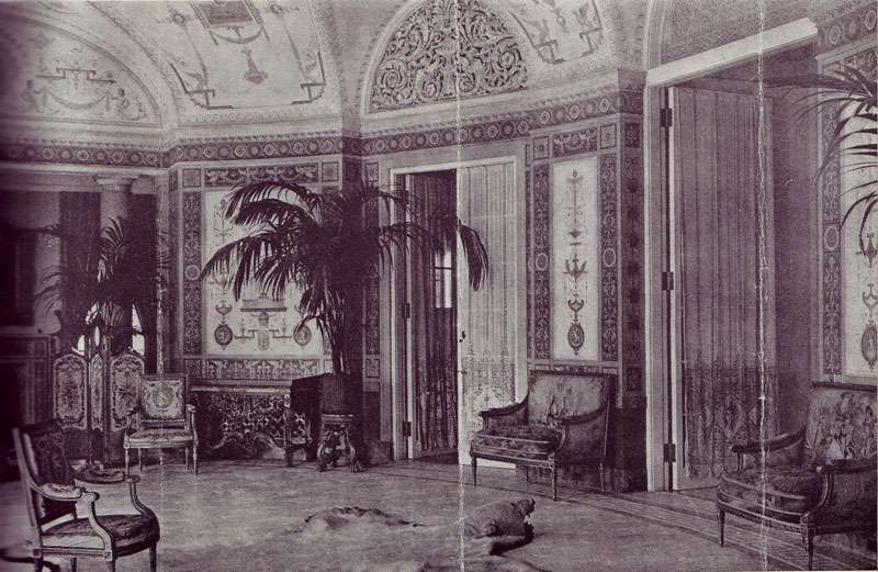
W.C. Bird Estate Oval Room, height of its grandeur, Long Island, NY

W.C. Bird Estate Oval Room, after 20 years of neglect. Long Island, NY.

Scans and quotes from
The Mansions of Long Island's Gold Coast by Monica Randall, 1979.


A fantastic find at the thrift shop turned up these images of dilapidated grandeur, all taken in the once palatial homes of 1920s Long Island, New York (the setting for Fitzgerald's The Great Gatsby) before they were demolished in the 60s and 70s. As you can see, many were abandoned and fell carelessly into ruin; there are stories of mansions being bulldozed with tiffany chandeliers still hanging from the ceiling.

That the parties were so overly decadent makes these images that much harder to stomach. Highlights includes the Kahn's yearly easter egg hunt where each egg held $1000.00 and Bradley Martin's "Come in the most expensive costume you can devise" party, given at the height of the depression, of course. And then there were the ducks that one mansion owner had a chauffeur personally deliver south for the winter, rather than have them fly, commenting, "...of course they can fly; thank God they don't have to."

8.19.2009

Inspired By: Donald Deskey

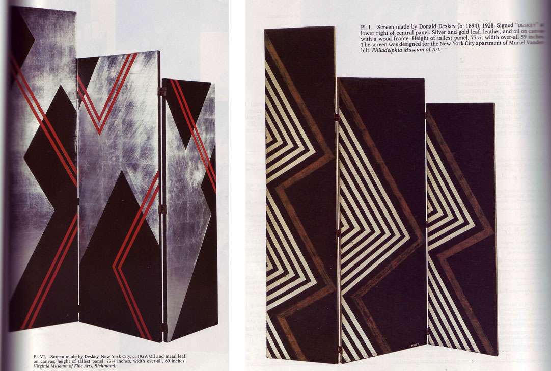
Came across a fabulous article in the May 1987 issue of The Magazine Antiques about artist Donald Deskey's (1894-1989) screens:

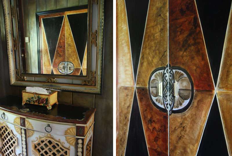
Which were a source of inspiration in the creation of my closet doors:


Deskey was primarily a set and window designer, who created his graphic, art deco/streamline modern screens and paintings for everyone from Muriel Vanderbilt to Saks Fifth Avenue, and became famous for the decoration of Radio City Music Hall in the '20s. He also did ad work in his later years— Deskey was behind the Tide bullseye and the Crest toothpaste packaging. It makes sense considering the graphic nature of his designs but it's surprising nonetheless.

A quote from the article in Antiques:

As a reviewer commented in 1929:

Screens have many uses that are utilitarian; the concealment of passageways, the shielding from drafts, to mention a few, but as a rule their present day use is an artistic one. They shorten the too long vista of a great room; they deepen the shadows in the corners in which they stand, and their angled surfaces offer a peculiar variation of light and shade that in itself is decorative.
Well said, reviewer from 1929; that is positively the most poetic way I've ever heard someone address the topic of a screen! More people should use screens. Even though not all of us have the problem of needing to shorten a "too-long vista of a great room," most could probably benefit from that peculiarly modern pattern of light that screens cast. Or the sense of enclosed intimacy they create.

8.10.2009

A tiger at Sotheby's, 1999

The reason you should buy some quality tiger upholstery, NOW:

Link
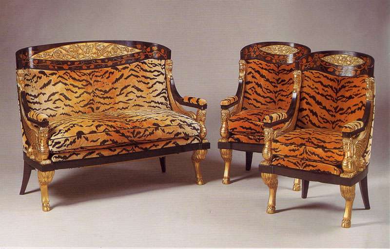
19th Century Continental, Neoclassical settee and armchairs, auctioned at Sotheby's May 4, 1999. Estimate: $20,000-$30,000.

A while back I did a post about Laura Bush's decision to upholster a particular settee in tiger print. She was RAILED for this decision, both by People Magazine (who compared it to Elvis's jungle room) and apparently her mother in law.
I didn't see what the big deal was then, and I still don't now. The concept of using tiger on classical pieces 1. isn't new and 2. doesn't necessarily indicate that one harbor's dreams of Elvis plopped on said settee, singing "Heartbreak Hotel" clad in white polyester.

This image of a 19th century settee auctioned at Sotheby's in '99 reminded me just how exciting tiger can be, minus the Elvis imagery and shag carpet, of course.

8.05.2009

Venetian Safari


Nautical + Leopard. Unlikely combo, but leopard does a nice job of punctuating a sternly graphic nautical motif. Thoughts?


Created, styled and photographed by (IN)DECOROUS TASTE

Wednesdays with Wackos


Eben-Ezer Tower, Belgium.

In accordance with the ongoing fascination I have with eccentrics and people that otherwise show no inclination towards self-censorships and instead tend toward indulgence, (although this may be an understatement), I present you my first addition of "Wednesdays with Wackos." Loveable wackos, to be sure. This week, we have a little architectural folly constructed by Robert Garcet in the 60s, located in Bassange, Belgium.

Let's see what we're dealing with:
-Four horsemen of the apocalypse
-Sitting atop a tower built by a self-declared pacifist obsessed with biblical numerology (think number grids that add up to "666" in all directions... you get the picture)
-Situated on an ancient, and ENORMOUS, labyrinth of tunnels that may or may not have at one time existed as an entire city
.

I love people who take it upon themselves to materialize their own fantasies. Even if those manifest themselves as a dungeons and dragons plot.

And, as a sidenote: Will you look at the sheer SIZE of those four horsemen in relation to the tower itself?! Amazing.

8.03.2009

Happy Birthday To Me

Except, super belated, because my birthday was on the 22nd.

Simple outdoor dining, with my FAVORITE hand painted antique green striped Czech plates, an ebay steal from ages back. Somehow, I think greens are well suited for outdoor dining in that they bring out the texture and color of surrounding shrubbery and foliage. And of course, a little metallic and crystal never hurt anyone.

What you DON'T know is that it started monsooning a mere, oh, 4 minutes from when this baby was taken. What a scene. Good thing my guests were quick on their feet. I kid you not, the whole table experienced a god like resurrection that took place as quickly as the rain started coming down. Much thanks to everyone who came!


7.07.2009

Glam Rocks For a Room

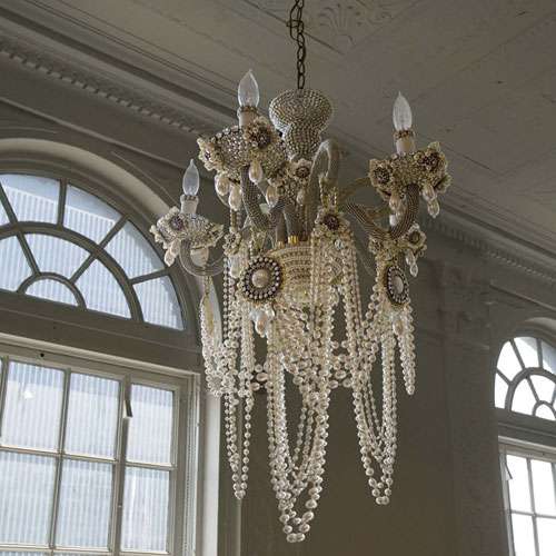
This decadently bejeweled and dripping glam rock orgasm of a chandelier by jeweler Erickson Beamon is still available at Vivre. WHY? Please take note, my birthday is rapidly approaching:


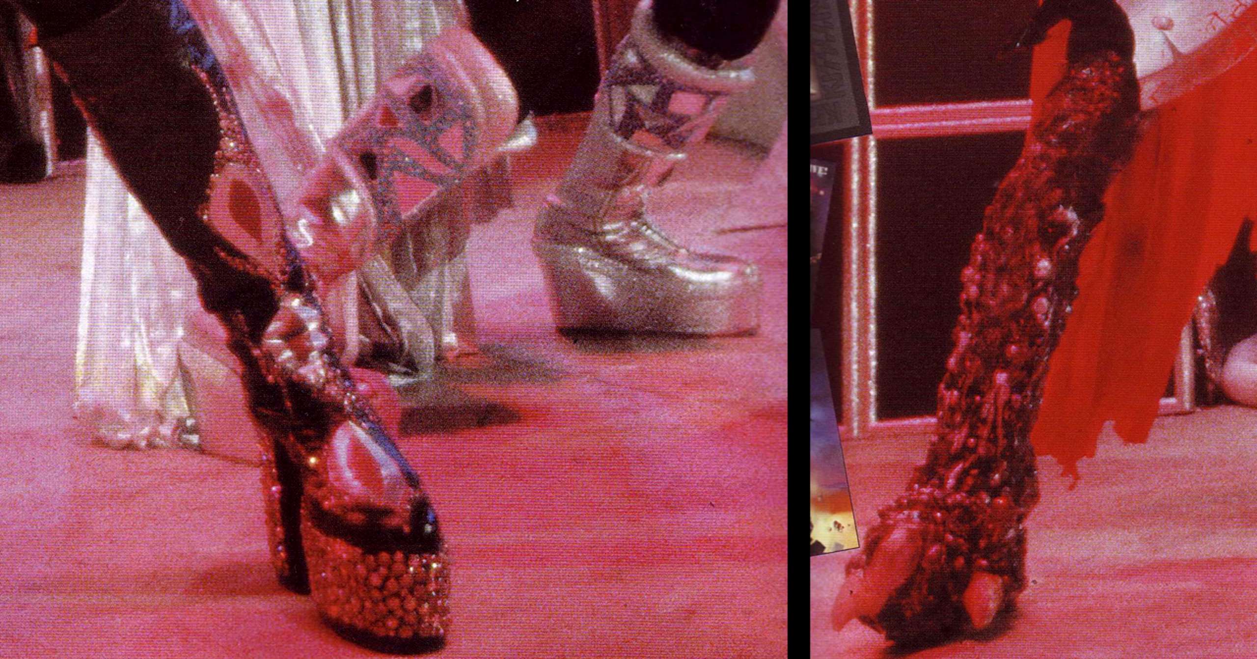
Alternately, these old school platforms from KISS are also an option. They look suspiciously like the Erickson Beamon chandelier, no?


Scan from Encyclopedia of Heavy Metal. Quality reading material, for sure.

6.30.2009

All Tied Up...

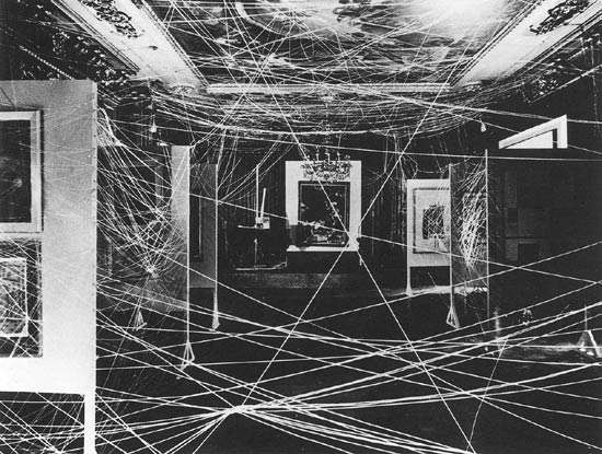
LinkMarcel Duchamp, Sixteen Miles of String, 1942

BACK after a brief hiatus in blogging.

Lately, I've been tied up like the gallery Marcel Duchamp wrapped in 16 miles of string (except I don't look nearly as fabulous or haphazardly elegant). A couple of new things to watch out for in the near future:

1. New collections for MAISON ARCHINARD. Think jewels, blue and white porcelain, and richly layered organic materials...

2. The addition of an online shop! Hello e-commerce.

So excited.

X Lauren


6.08.2009

Paint it Black

Style rules are made to be broken. Especially the one that mandates that small rooms can't be painted in dark colors. I don't know how many times I've heard this, but it makes me sick to the stomach each time.

It's always been my philosophy that the smaller a room is, and more importantly, the less light it gets, the more it could benefit from a dark treatment. Dark colors provide a backdrop for objects, accents of color, light refracting crystals, and metallics. They also make small rooms feel cozier—softer—and do a nice job at concealing a lack of architectural bone structure.

So my question is this: why the obsession with trying to "open up" small spaces?!?! EMBRACE THEM! Paint them dark; a glossy black is a great place to start! Why not take advantage of the small size and turn a tiny room into an intimate, cozy and cavernous jewel box? Small spaces can be magical in a way that large ones—even with killer bone structure— can't. Most people don't have enough objects and furniture to fill large spaces that lack decent architectural structure anyway. Harsh, but sometimes the truth hurts.

This gorgeous interior is a perfect example of what I'm talking about. Small black rooms are extremely sexy:


Andrew Tauber's one bedroom Manhattan apartment, from Architectural Digest: Traditional Interiors, 1979.

6.05.2009

Boxed In

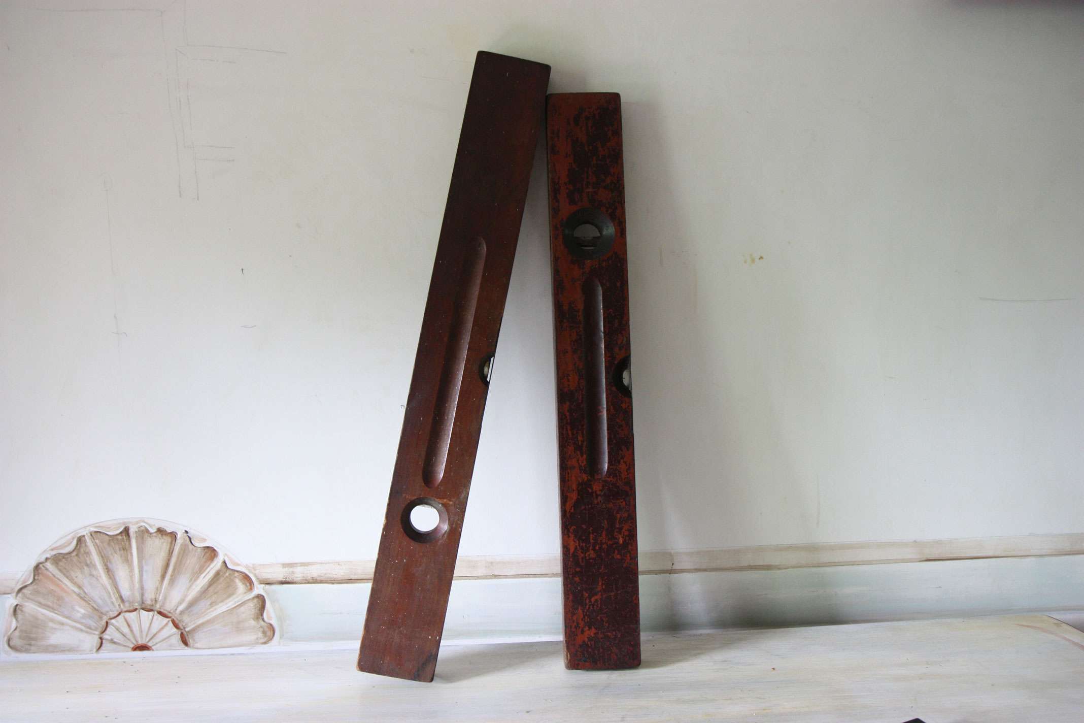
Lately, my adoration for all things dilapidated has reared its head as a frenzy for sturdy old boxes and random old tools.

Sometimes, you find that ideal combo of structure , texture, and story in the most unlikely places. Sure, it would be nice to purchase a forcola a la architect I. M. Pei, but architectural forms abound in places other than Venice; one just needs to look!

As a plus, the coke box feels a little pop-art, and the insanely textured patina is ideal for contrasting with prissier interior elements— say, all things crystal, gilded, silk, pristine, clean, you get the idea.


6.03.2009

Matchy Matchy Much?

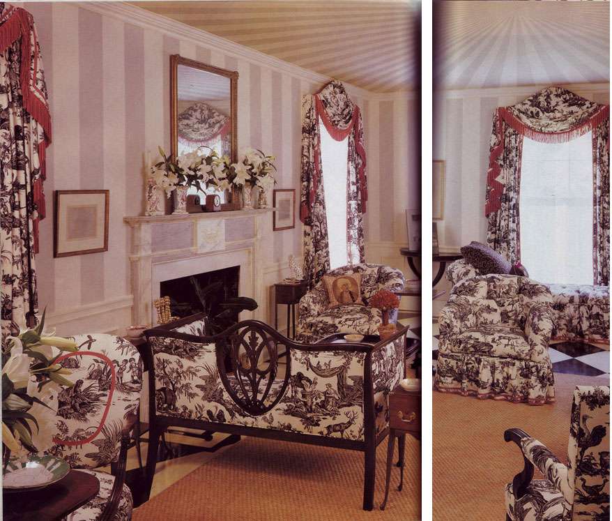
TOO. MUCH. TOILE.

Lest you ever get the idea to use those 200 yards of remnant toile in ONE ROOM, I kindly offer you this, as a reality check.

And, from the caption: "Black and white toile adds a crisp, lively touch." This is a pinch more than a touch, my dears.

Photo by Langdon Clay. Southern Accents, January-February 1994.

6.02.2009

The Art of Artichokes

I haven't quite figured out what to do with these babies in the kitchen, but I do know that they look quite elegant in a vase.

In fact, I can't decide whether I want to eat them or look at them more.

They're aggressive, they're architectural, and that's how I'm taking my bouquet today, thank you very much.

Oh, and except for the fact that they're organic, did I mention that they're about 10 times cheaper than roses? But, you know, since I'm a firm believer that one needs to "own" the economic crisis, this isn't about "making do", it's more about... doing better.

And artichokes, in my opinion (which is king around here), are definitely superior to your humdrum grocery bouquet, cost entirely aside.

X Lauren

6.01.2009

Domestic Graffiti?

Add to the list of things I am reconsidering (rapidly becoming obsessed with): graffiti.

A year ago, I would have called you insane if you had suggested putting this raucous art form in a domestic setting. But seriously, what's wrong with me? Why wouldn't I like it? It's aggressively DIY at its core. And plus, there's something fundamentally compulsive about painting on —embellishing— everything. Is graffiti a contemporary Rococo, a more recent manifestation of that same compulsive decorative impulse?

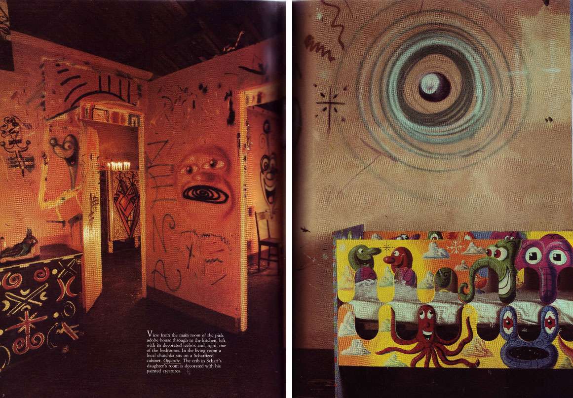
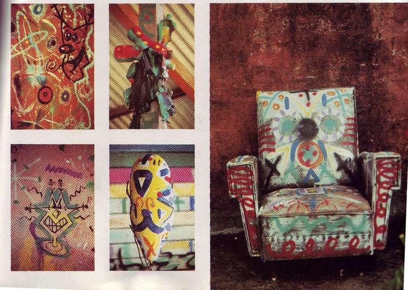
New York artist Kenny Scharf's Brazilian retreat is covered (and I mean covered, down to the chairs) in graffiti. Admittedly, graffiti in the home is a bizarre concept. While I appreciate his attempt, I have to say that I would do it differently. The fact that the house itself is without electricity and generally lacks in furnishings makes it feel a little too authentically crack shack for me:


Scans of Kenny Scharf's home from House & Garden, October 1985

This work, by Blek Le Rat (who was trained at the Ecole des Beaux Arts, interestingly enough) is, in contrast, a nice balance of grandeur and decrepitude: the architecture of the building, decrepitude due to age, classical nature of the graffiti figure, and then the underlying element of vandalism that comes as part of the graffiti territory:

From Graffiti World Street Art from Five Continents, by Nicolas Ganz

Or how about this wallpaper given the graffiti treatment by Australian artist Rok 2? Definitely an innovative way to incorporate this into an interior, I love the way it looks like the wallpaper is chipping away to reveal a weirdly sinister graffiti-dimension beneath it:

From Graffiti World Street Art from Five Continents, by Nicolas Ganz

I'm interested to know what other people think about this- Y / N to graffiti in a domestic setting? Gaudy mistake or brilliant exercise in contrasting elements?

5.27.2009

A Day in the Life (of a Stepford Wife?)

According to Amazon, customers who bought a vacuum cleaner also bought:

1. A pillow, filled with gel (??!!!!)
2. A CD: "Just a Little Lovin'"
3. A blender
4. A book: "Passionate Marriage: Keeping Love and Intimacy."

Really? And this is my reaction before I even stopped to consider the concept of a pillow filled with paste.

Dearest Amazon, please tell me you're joking!


5.19.2009

Gimme an A for Attitude

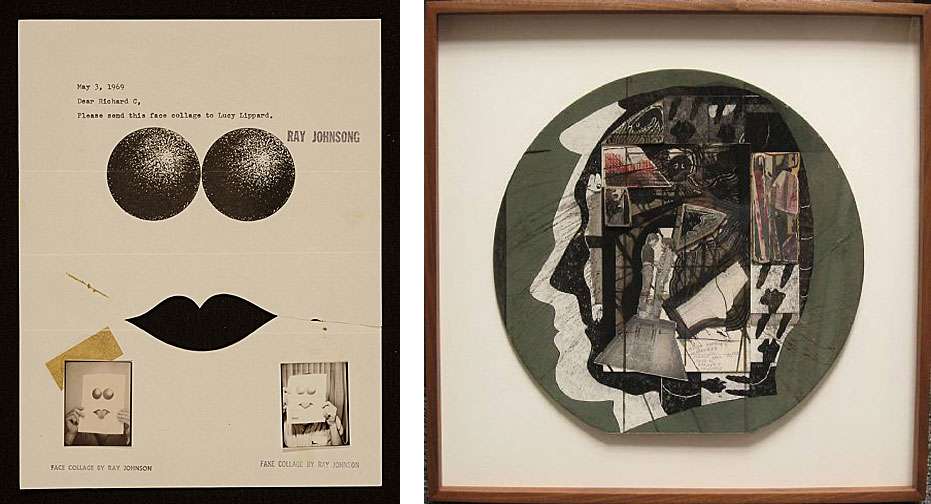
Above Left: Ray Johnson Letter to Lucy R. Lippard, 1969, Smithsonian Archives of American Art. Above Right: Ray Johnson collage, artnet.com.

"I chose a profile portrait of Andy Warhol. Ray told me the price and foolishly I made him a counteroffer, maybe 80 percent of the price he'd quoted. Ray agreed and said he'd send me the piece in about a week. And of course a week later the Warhol profile arrived in the mail with 20 percent missing from the bottom right corner. I still have the bill here somewhere, charging me for 'most of a Ray Johnson collage.'" -Peter Schuyff, on artist Ray Johnson.


Ray Johnson, I heart you. If you haven't seen How To Draw A Bunny, I highly recommend it. Really interesting, extremely humorous.

XX Lauren

5.18.2009

Tractor Love, Tom Ford, and Hermès Orange, Oh My!


"...this is the guy who had an orange tractor at his property in New Mexico spray-painted black because he couldn't stand the color,
okay?" -
New York Magazine , on Tom Ford.

One of my favorite little anecdotes. I feel ya Tom, I really do. If I were subjected to this unsightly horror on a daily basis, I would also feel compelled to crack out mass quantities of spray paint and put the construction crew to work doing something useful:


Sometimes, small (large) details make all the difference. Case in point: the '97 Martha incident (you remember, when Martha Stewart tried to run down her neighbor after he erected an 8 foot fence and put in shrubs that "suburbanized" the neighborhood?). I used to have one of these babies (see image below). No joke, I threw it out because the concentrated field of candy corn pumpkin orange was nauseating to me.


Are Tom and I alone in our phobia of this color? Certainly, my sentiment isn't shared by everyone. Take, for instance, the orange tractor fanatics ,who, for sheer viewing pleasure, upload photos of themselves merrily using their orange equipment. (The internet turns up all sorts of gems.)

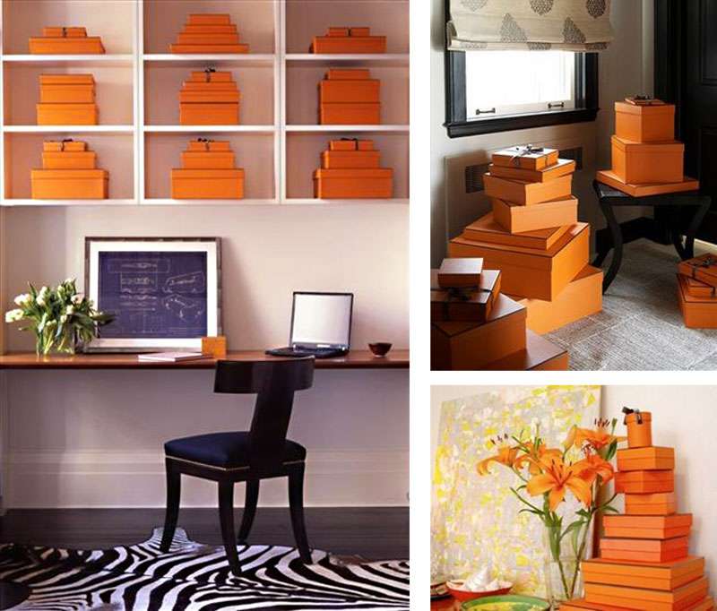
Of course, you can dismiss our friends over at the orange tractor site as a truly isolated segment of the population, far removed from design concerns of any sort, but then what excuse can you make for people who decorate with Hermès boxes?

Is this a trend or something? Or have boxes replaced books in the world of props that are meant to attest to the cultivated tastes of their owners? If a book (used as a prop) is meant to convey diversity of taste and education, is a logoed box intended to convey taste through association with a brand, or else association with cost? That's almost as vomitous as this color orange.

Developing brand identity is not a replacement for developing taste, kids. And decorating with logo laden cardboard boxes= so not chic. An exception can be made for Andy Warhol's Brillo containers.

Here, I present you with a compulsion to brand oneself at its very worst (see below). Seriously, what's this woman stashing in all of her boxes!? She must have a collection of horse scarves to clothe an army. Either that, or she's bedecked in enough colliers de chien to approximate a couture version of Johnny Rotten. (I sincerely hope it's the latter, in which case, someone send me a picture. Stat.).

Above, Designer Sara Story's creations, originally published in Domino.

Admittedly, the effect isn't quite as bad when the box doesn't take center stage. It's passable as a pop of color. Questionable, but passable. :

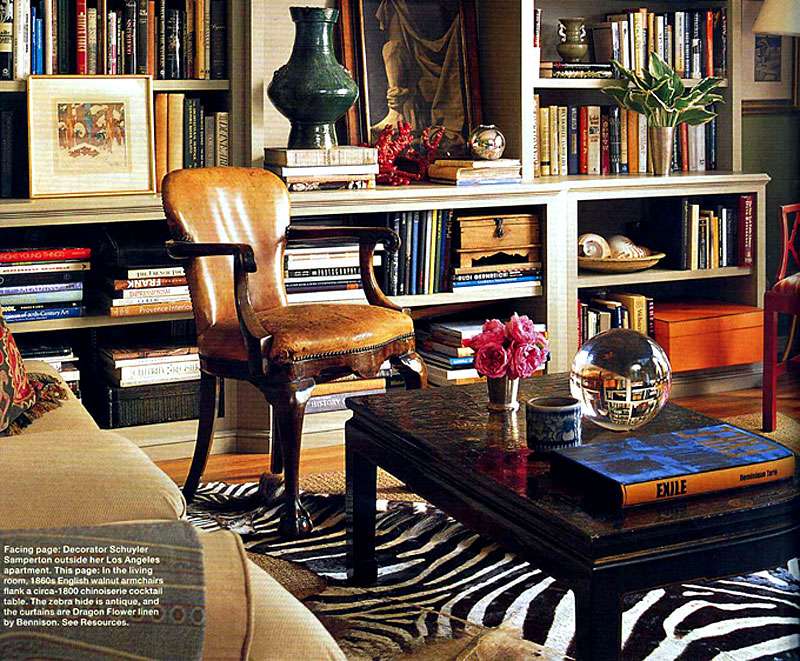
Designer Schuyler Samperton's apartment, from Elle Decor


I wonder what Tom Ford would say.

5.16.2009

NEVER.

Lately, I've been an avid subscriber to the "never say never" philosophy. This is probably due to the realization that I've embraced (with ZEAL) things that were once solidly in the "never-ever-EVER" category (or so I thought). Take, for instance, shoulder pads. Or fringe. Or cellophane drapes. Or minimalism. Or neon patent. It's gotten to the point where if I hate it, I have to conquer it. The worse it is, the more I want it to work (fanny packs, anyone?).

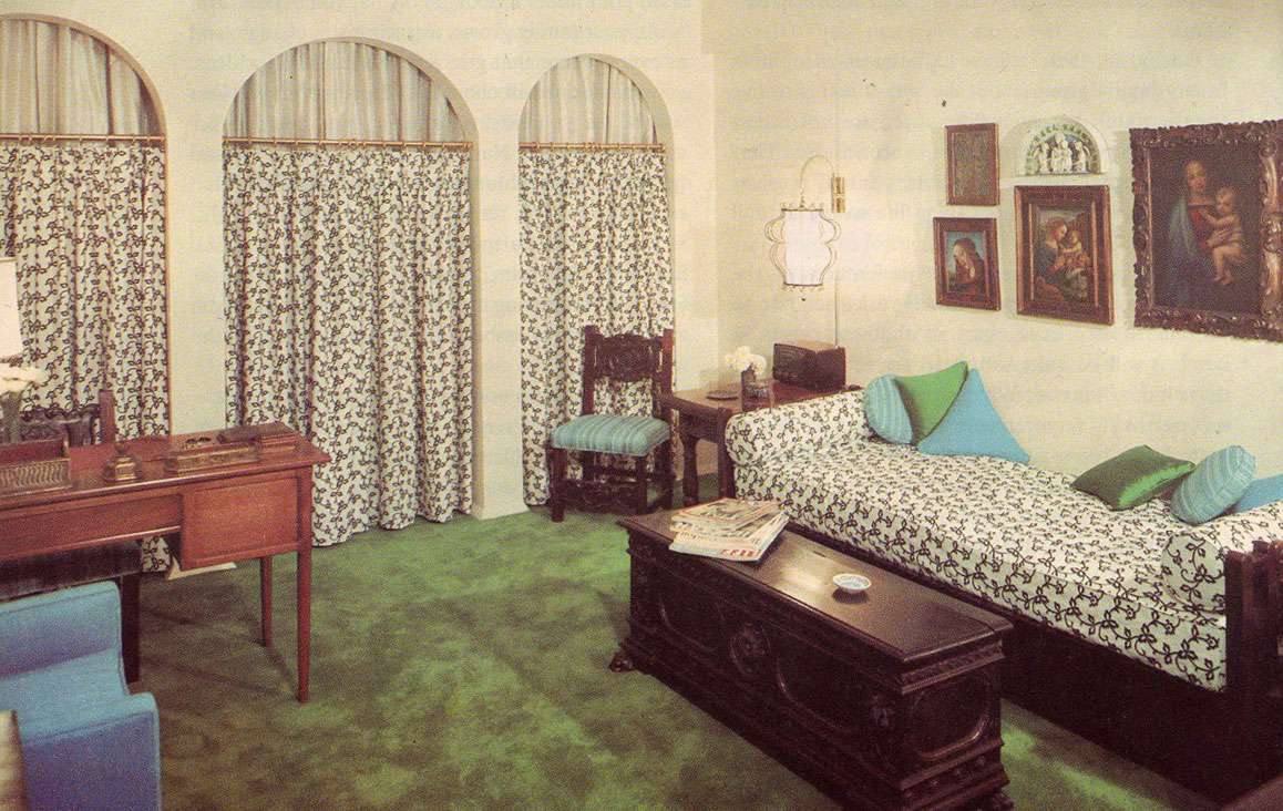
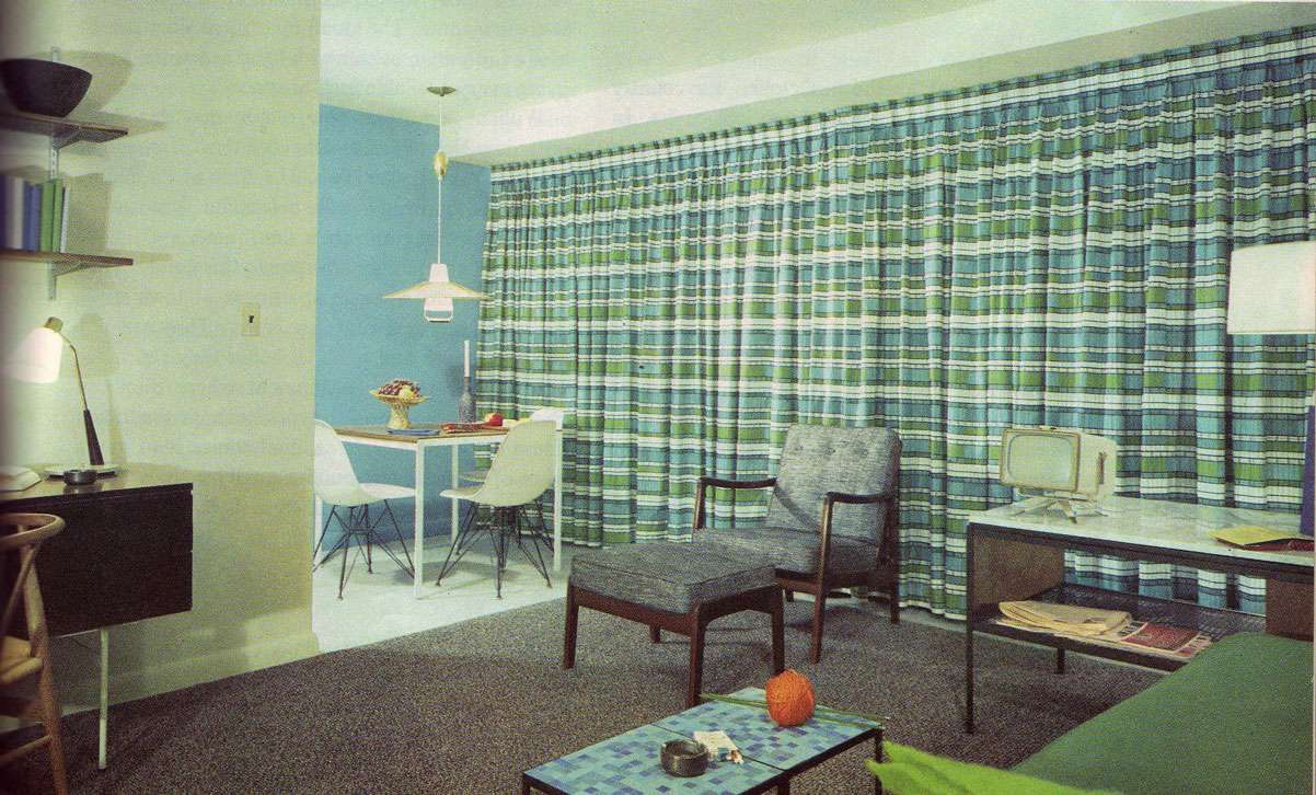
However, flipping through this gloriously authoritative Doubleday Book of Interior Decorating from 1965, I hesitantly realize that perhaps some things are best left untouched. Forever. For example:

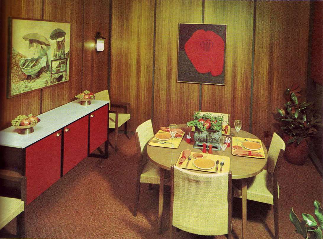
1. Weird greenish brownish wood plastic paneling. Actually, anything that replicates the color of bile. Especially anything synthetic. Please Google image search "bile"— the closeness of the match is truly disquieting.

2. Paris Hilton's bathroom. I jest. But seriously, you know you've taken color coordination too far when you have a MATCHING PINK BIDET.

3. Astroturf is NOT a proper substitute for a rug, no matter what the Doubleday chapter on "Good Taste" insists.

4. Similarly, cheap shower curtains are not functionally or aesthetically equivalent to actual curtains. And industrial nylon carpeting? This is not Loehmann's dressing room, it is a living room. Or so I imagine it was intended.

Lesson learned. Sometimes it's okay to say never.

Scans from The Doubleday Book of Interior Decorating by Albert Kornfeld, 1965.

5.15.2009

Faucets in Space


Scan from World of Interiors, May 2009.

Please tell me I'm not the only one who found this market story particularly humorous. Yeah, kitchen hardware in itself doesn't really float my boat, but hey, at least it floats in space, courtesy of The World of Interiors.

Two questions.

1. Why is it that faucets-as-satellites in orbit around Earth are so much more interesting than their silhouetted-against-a-white-background counterparts? Something to consider.

2. What substances were the editors that produced this using? Please inform, I would like some too. And send some over to the U.S. while you're at it. Our shelter mags are in need of it.

Yours truly,

XX Lauren.

5.13.2009

Yoes, Yes!


Scan from May 2009 World of Interiors.Photo by Annie Schlechter.


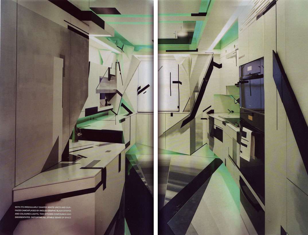
One look at this fantastic perspective-bending, spatially disorienting Modernist masterpiece of a kitchen in the April World of Interiors saw me FEVERISHLY Googleing its maker, artist Amy Yoes.

Of course, I wonder how I'd manage to prepare my morning coff
ee without some degree of vertigo, but then, my love of the space doesn't necessarily stem from my desire to live in it. It does, however, provide comfort to know that there are people who relish taking tea in a work of art!

That having been said, at the crux of my appreciation is Yoes's melding of decorative and structural elements.

The space is ambiguous and confusing: it's not clear what's protruding, what's receding, which surfaces are flat, and which are bent and shattered. And this whole effect is achieved with a combination of structural protrusions and painted blocks and angles, a dialogue between paint, form, and 3d space that ultimately jumbles, shatters, and warps something as functional and common as a kitchen.

Count me impressed.

5.11.2009

The Gates of Hell

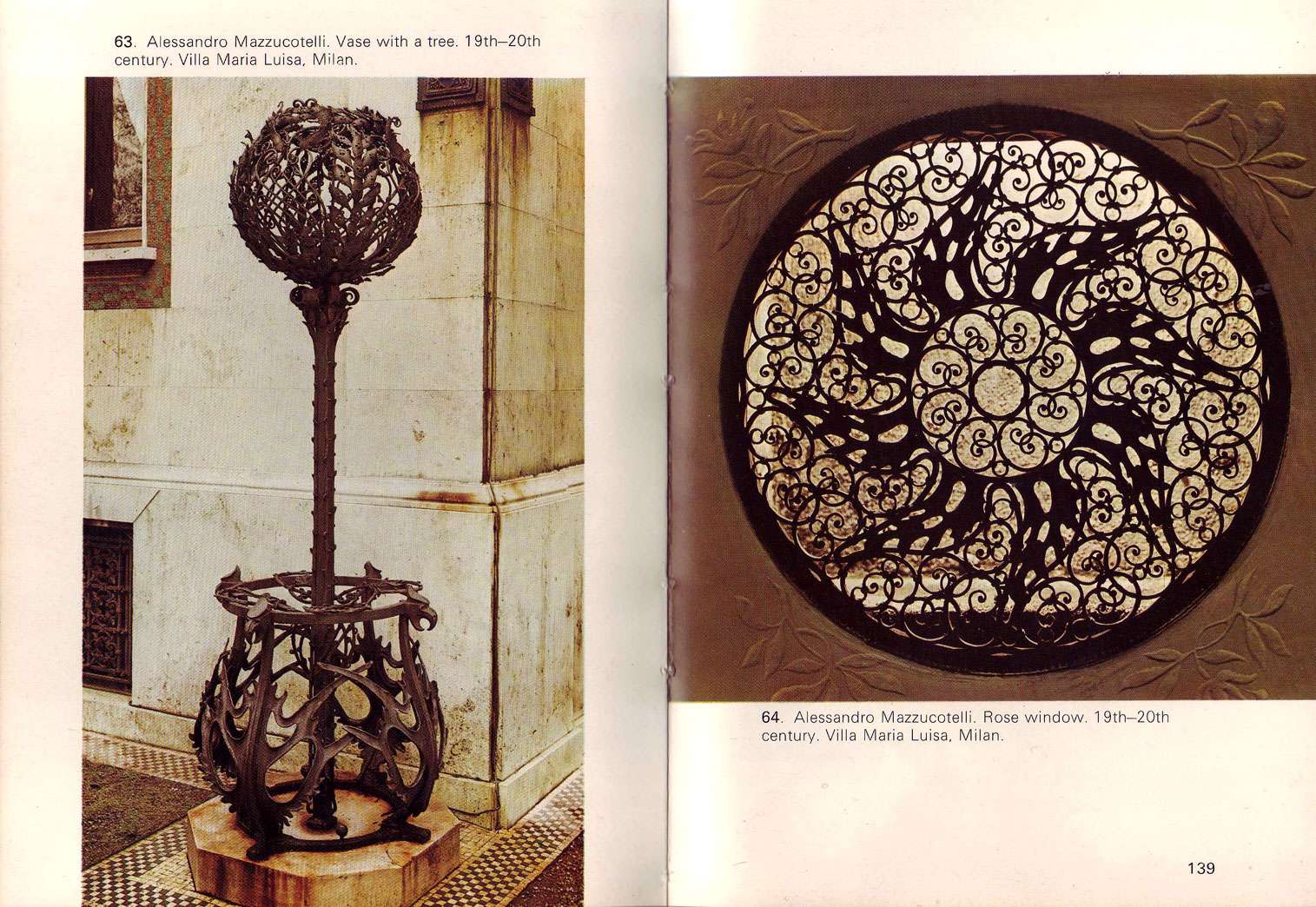
Well, not quite. But these ironwork monstrosities (in the VERY best way, and you know I mean that) are so sublimely beautiful I needed to share. Gothic font, quatrefoils, arches, rococo waves, art nouveau forms, forged ironwork... how I love you. And how interesting is the perspectival illusion of depth in the below right image?!


Screen, 18th century. Church of St. Ulrich, Augsburg


From Decorative Ironwork by Umberto imelli and Giovanni Vergerio.

5.07.2009

Context is KING


"Although these things, heirlooms, portraits, furniture, silver, etc., are in themselves both beautiful and interesting, they seem to me to have a great deal more significance when seen as an integral part of the house. When we see them in their original settings, and against a background in which they were originally used, they mean more; there they seem to tell their whole story, not only of how they were used, but also of the kind of people who created and used them."

-Henry F. du Pont (1880-1969), horticulturist and American decorative arts and furnishings collector, in The Fifty Best Historic American Houses

Couldn't have said it better myself.

5.04.2009

Notes on Color: I Want To Stroke Your Walls

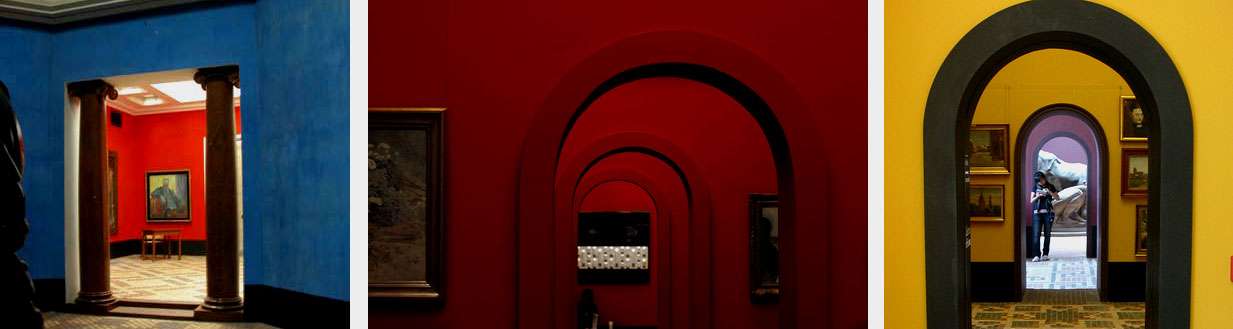
One of the best uses of color that I've ever encountered is at the Fåborg Museum of Art in Denmark. The museum (incidentally, located in the middle of nowhere) left quite an impression on me, indeed.

It wasn't just the neoclassical simplicity of structure combined with the subtleties of color framing, but the texture of the color. I know I've been going on about texture a lot lately (and plaster, too, for that matter...hm), but this color is so rich, so velvety and translucent you just want to TOUCH it. The secret? The walls were painted fresco style! Meaning, the pigment is applied to wet plaster, allowed to dry, and polished after the fact. Check out the cobalt and the subtlety of the pink/gray combination. It seems that these nuances are really what separate amateur from artful in the use of color.


Fåborg Museum of Art, Denmark. Images from Flickr.


As for the use of velvety rich color in an interior , Axel Vervoordt's Venetian palazzo instantly came to mind. His terracotta colored walls seem to have the same matte depth as the museum at Fåborg, and they play well against the deep blue oil by Verheyen and cream slipcovers:

Photos by Mario Ciampi, from Architectural Digest September 2008
Related Posts Plugin for WordPress, Blogger...